Avora — A welcome rooted in place
A visual identity for an eco-stay rental platform, connecting the ease of finding accommodation with the character of historic places.
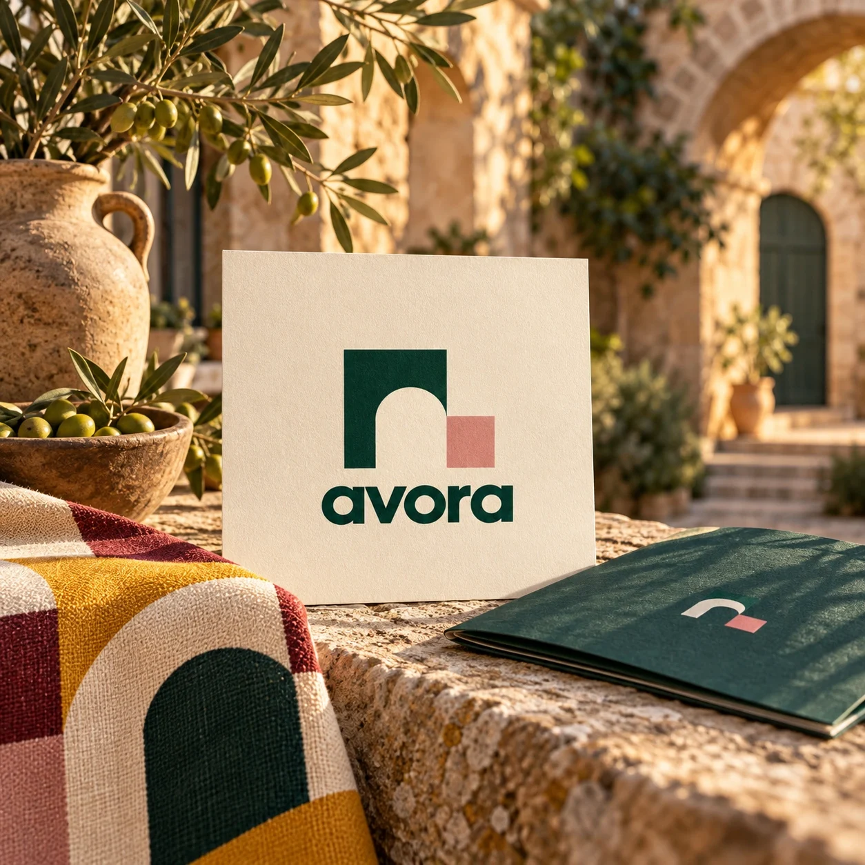
Avora is an accommodation rental platform focused on eco-stays and historic heritage. It serves travellers who want the place they stay to be part of discovering a destination.
Give a rental platform a recognisable identity that welcomes travellers while leaving room for the architecture, local character and history of each destination.
Visual identity and brand applications
Logo and wordmark Colour and graphic system Wayfinding and hospitality mockups Guest collateral
The identity connects a compact arch symbol with a flexible graphic language across guest materials, signage and hospitality settings. The presentation demonstrates visual consistency; launch and booking performance were outside the supplied evidence.
Visual identity: Ali Komeili. Applications shown as presentation mockups.
The stay is part of the destination
Avora brings accommodation rental into the context of eco-tourism and historic places. The identity needs to belong on a booking platform and in a physical welcome. Its audience is united by an interest in the character of a place, with architecture and local surroundings shaping the experience.

An arch becomes an invitation
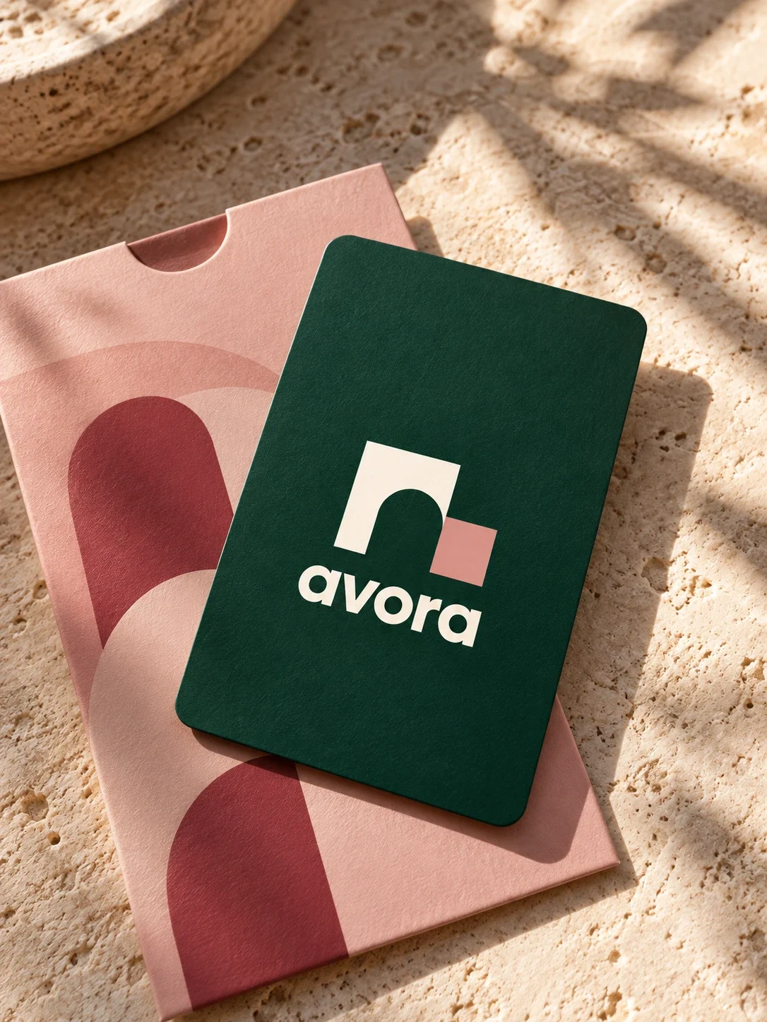
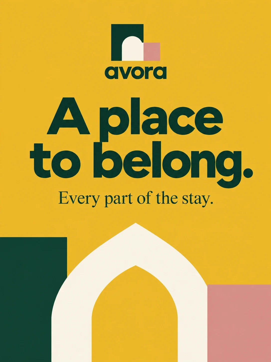
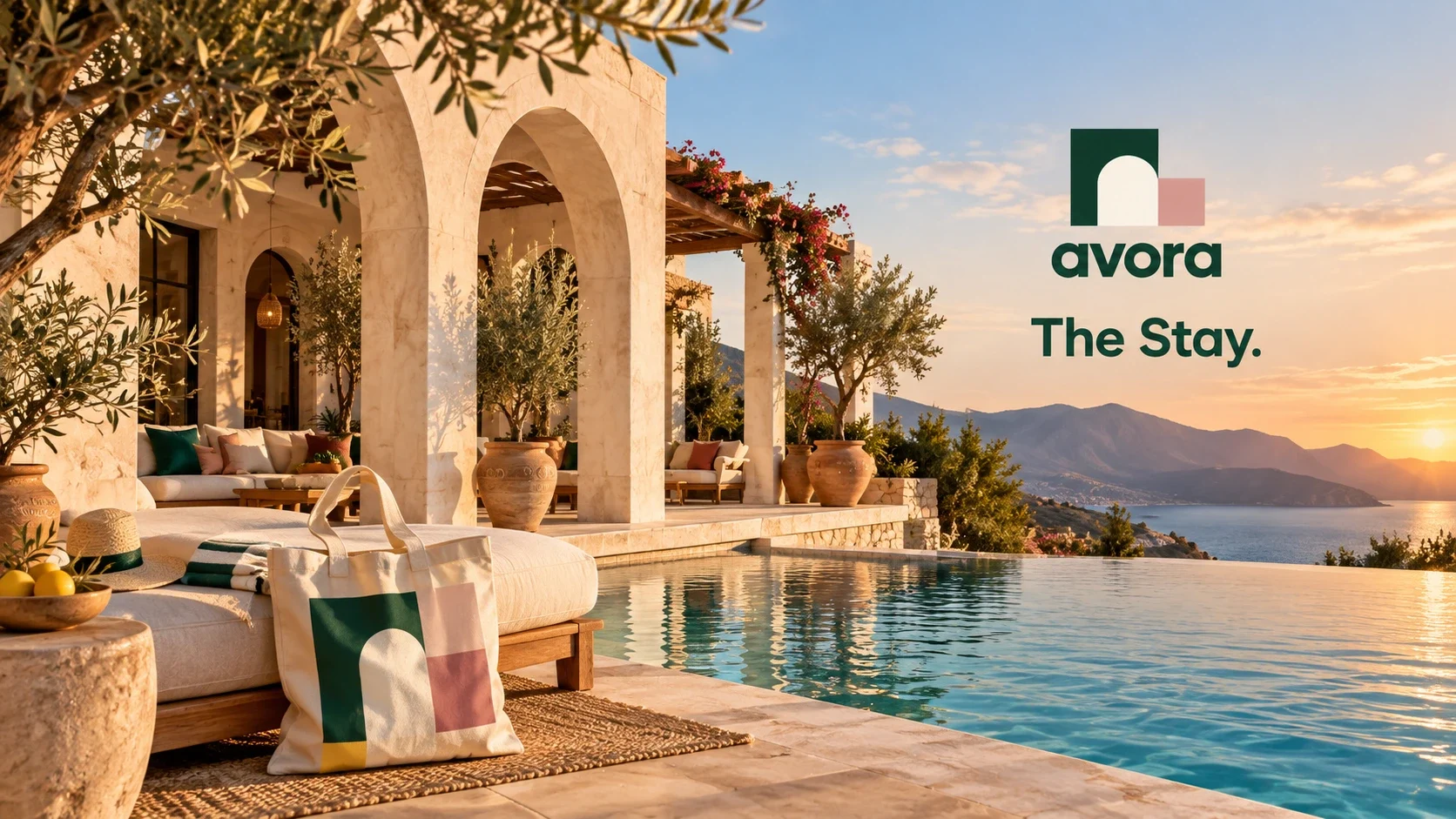
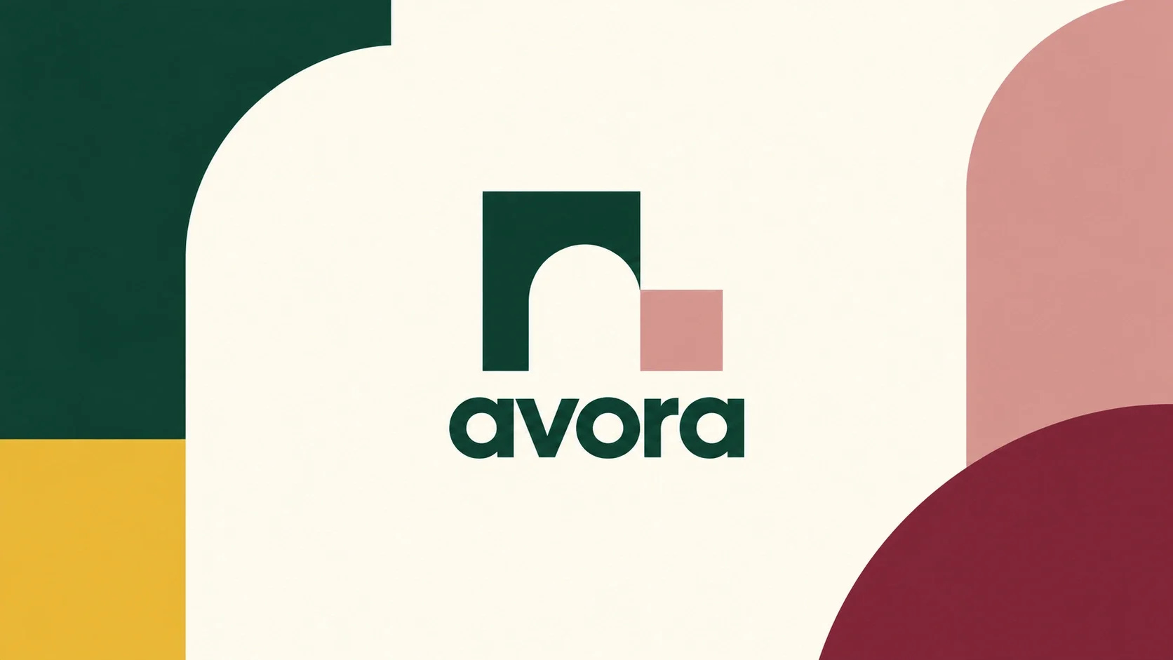
The symbol reduces an architectural opening to a clear geometric shape. Its rounded void suggests entry, while the adjoining pink block gives the mark an asymmetric silhouette. The same curves expand into graphic panels, linking the small logo to the larger arches visible in the hospitality mockups.
Warmth with a clear anchor
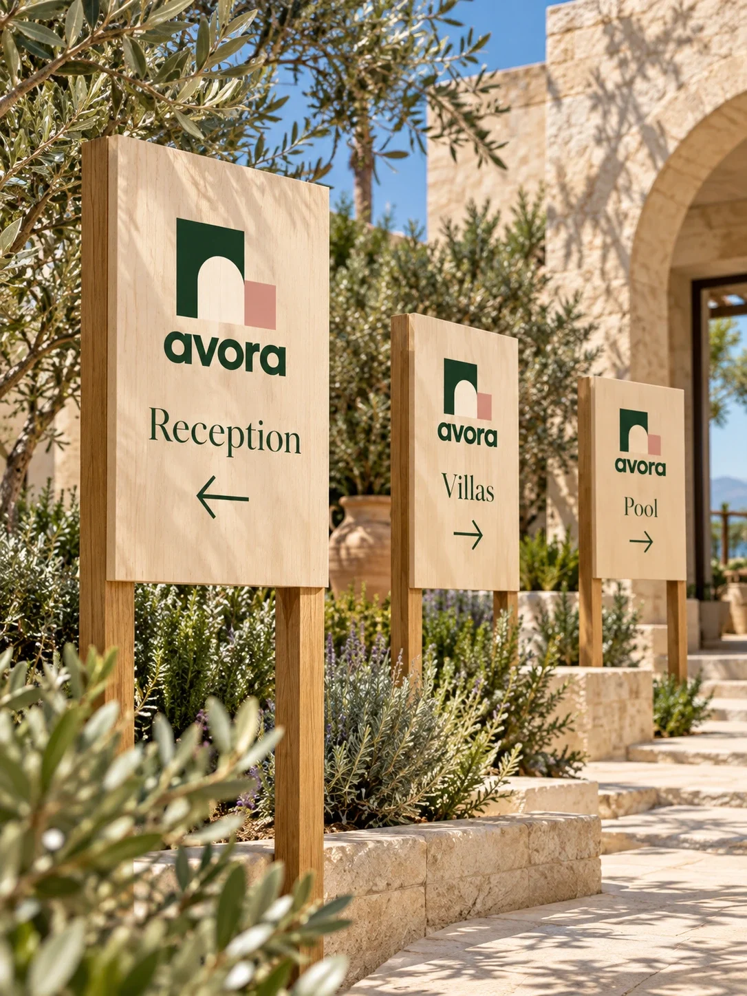
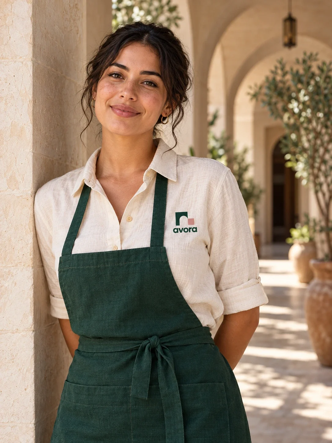
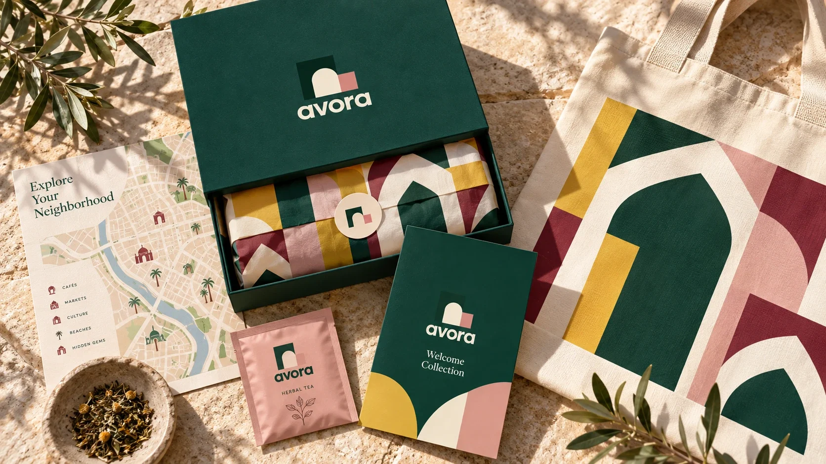
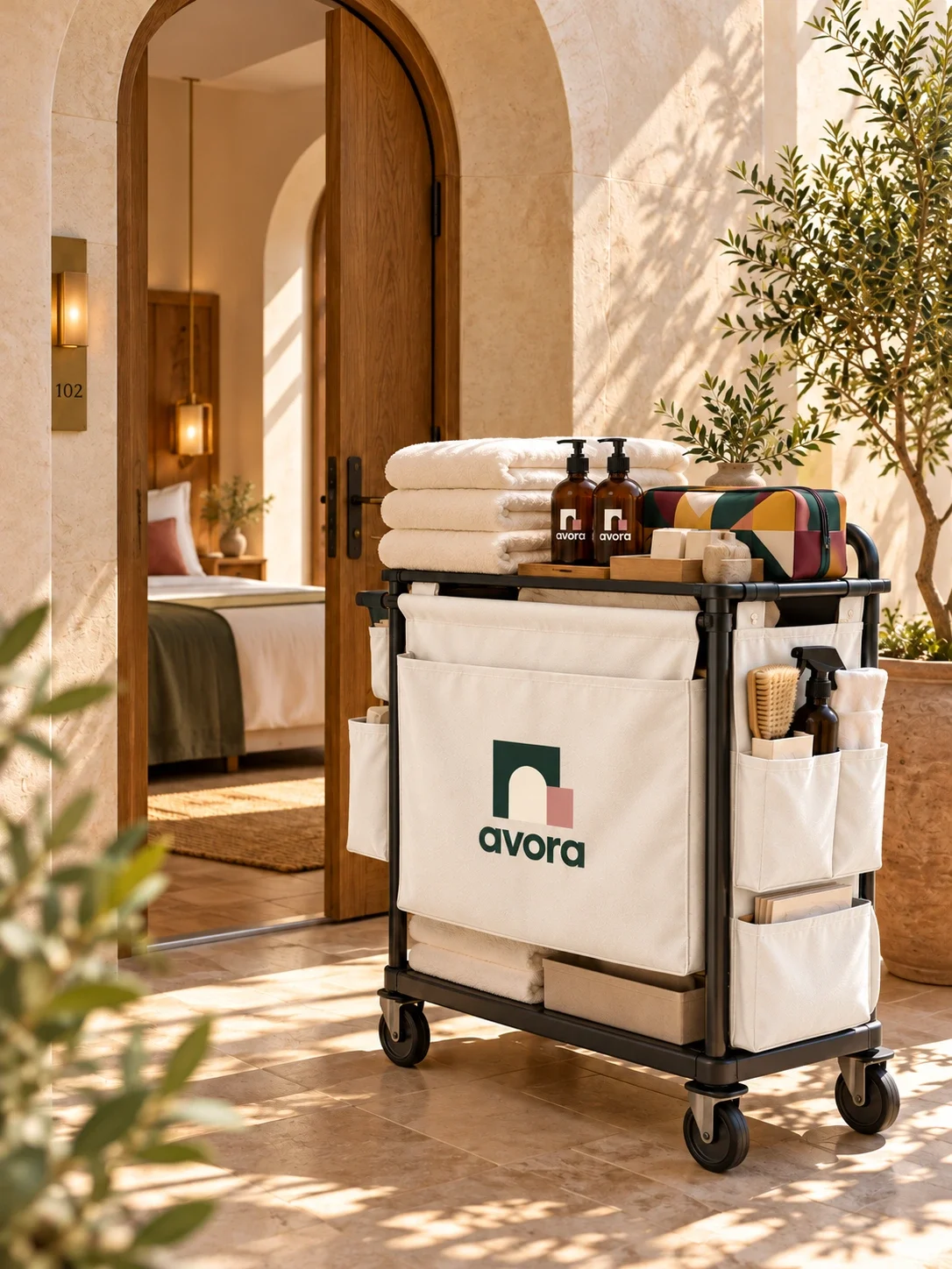
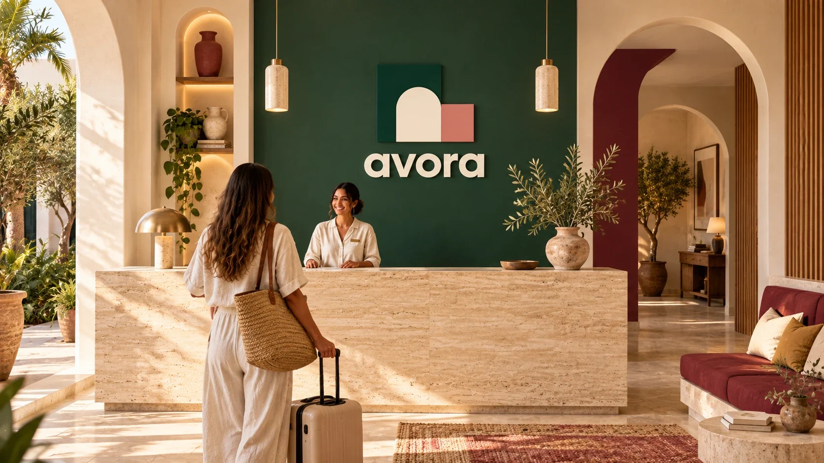
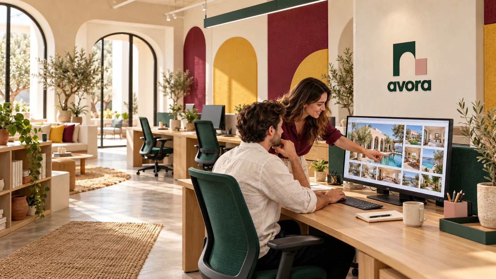
Deep green anchors the wordmark, uniforms and signs. Cream leaves space around the symbol; mustard, dusty pink and burgundy bring variation to the graphic surfaces. Rounded, heavy lettering keeps the name approachable, while the serif supporting line adds a quieter change of pace.
A consistent welcome at different scales
On a directional sign, the logo sits above practical information. On guest materials, the arch grows into a pattern or a framing device. The reception and service applications use the quieter green-and-cream pairing, letting the surrounding stone, plants and warm light remain visible.
The welcome begins before arrival
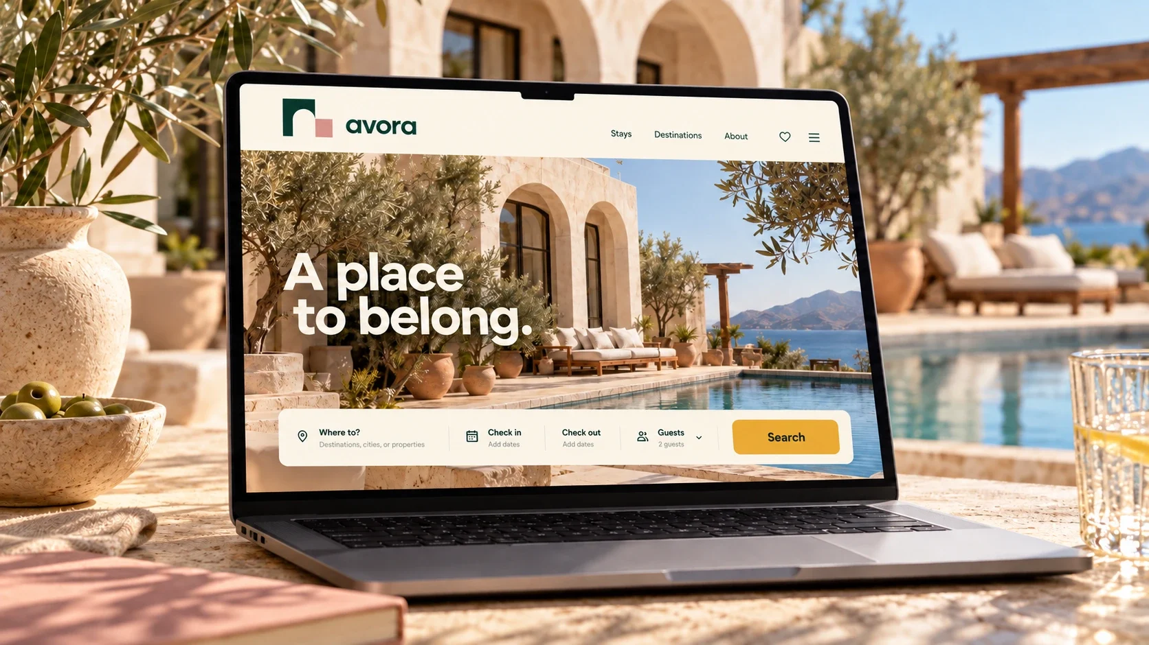
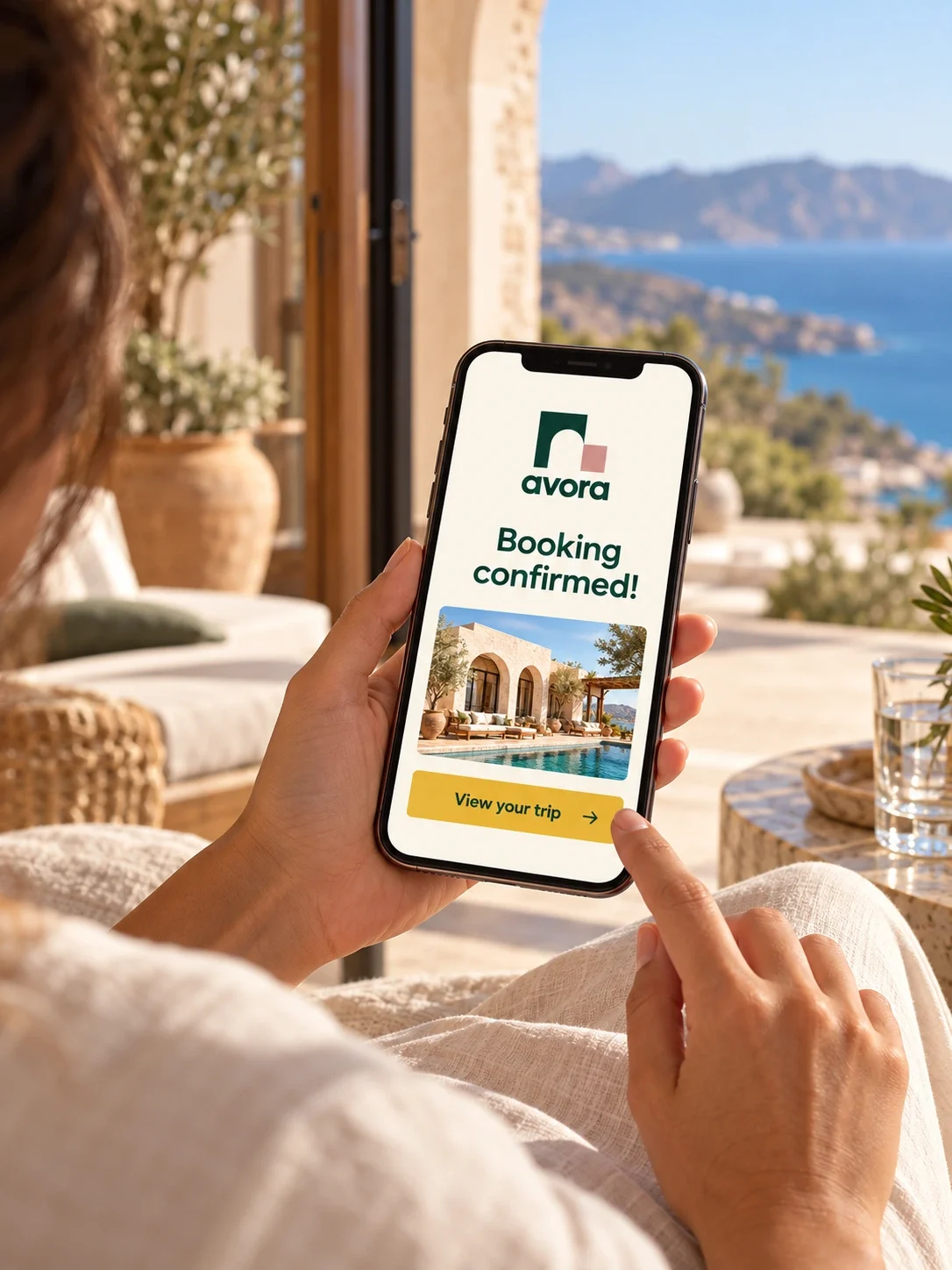
The laptop and phone mockups carry the same arch, colour palette and direct tone into a booking context. They show how the identity can frame property imagery and a confirmation message. These are visual brand applications, rather than evidence of a working or tested reservation flow.
A visual system for belonging
The delivered identity connects an architectural symbol with a warm palette and a repeatable graphic language. Across signs, guest materials and digital mockups, the same elements create a consistent welcome while giving the setting room to define the experience. The study documents the visual system and its intended applications.