blubank · Everyone Wins
A campaign proposal uses a wheel of blue bank cards and one gold winner to bring collective rewards into a minimal billboard.

Banking brand represented through its blue cards and restrained visual language.
Communicate rewards for everyone and a larger prize for one winner, while reconciling the brief’s playful energy with blubank’s restrained visual language.
Concept development and art direction
Key visual, illuminated billboard proposal, urban mockups and alternative visual explorations
The selected proposal connects the reward message, card motif and wheel-of-fortune mechanic. Supplied artwork and mockups demonstrate the direction; production and campaign performance are outside the documented scope.
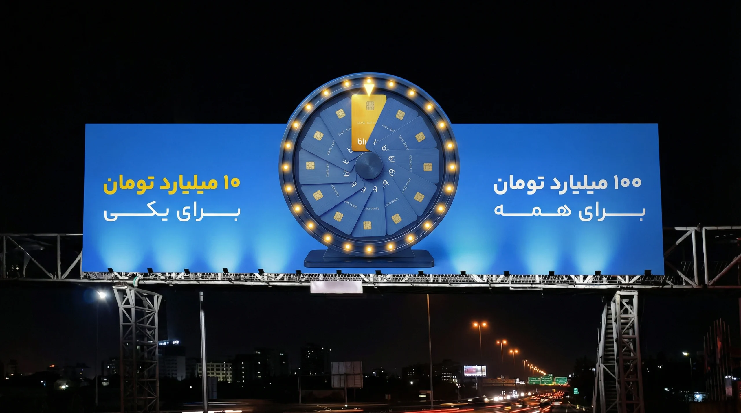
Everyone wins. One stands out.
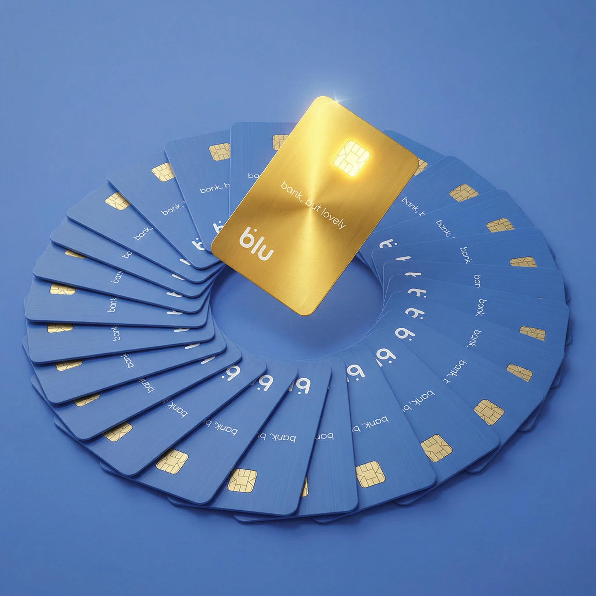
The brief asked for two ideas to coexist: a reward for every participant and a larger prize for one main winner. I brought them together through a wheel of blue blubank cards, with a single gold card marking the exceptional prize.
Play within a restrained palette
The campaign needed excitement, but its visual language had to stay close to blubank’s minimal blue palette. For people passing urban billboards, I wanted a clear focal point and a short reward message. Adding more colour or graphic detail would work against that restraint.
One gold card among many
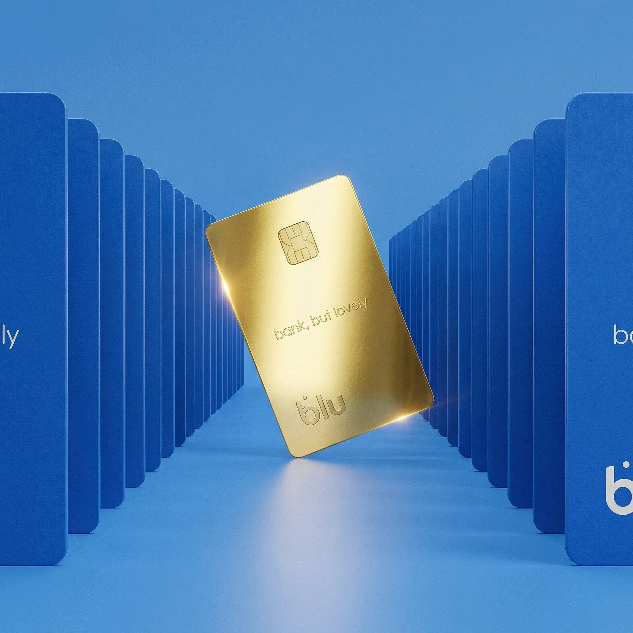
“Stand out from the crowd” gave the campaign its visual starting point. Repeated blue cards represent the collective, while the gold card creates an immediate distinction. In the selected artwork, that contrast sits beneath the wheel’s pointer and echoes the two messages: 100 billion tomans for everyone, 10 billion tomans for one.
A familiar game, a shared reward
Within the one-day exploration window, I considered games that could give every participant a sense of winning. I selected the wheel of fortune because its simple, recognisable structure could accommodate a reward for everyone and a chance at the main prize. The card arrangement makes that game mechanic part of the key visual.
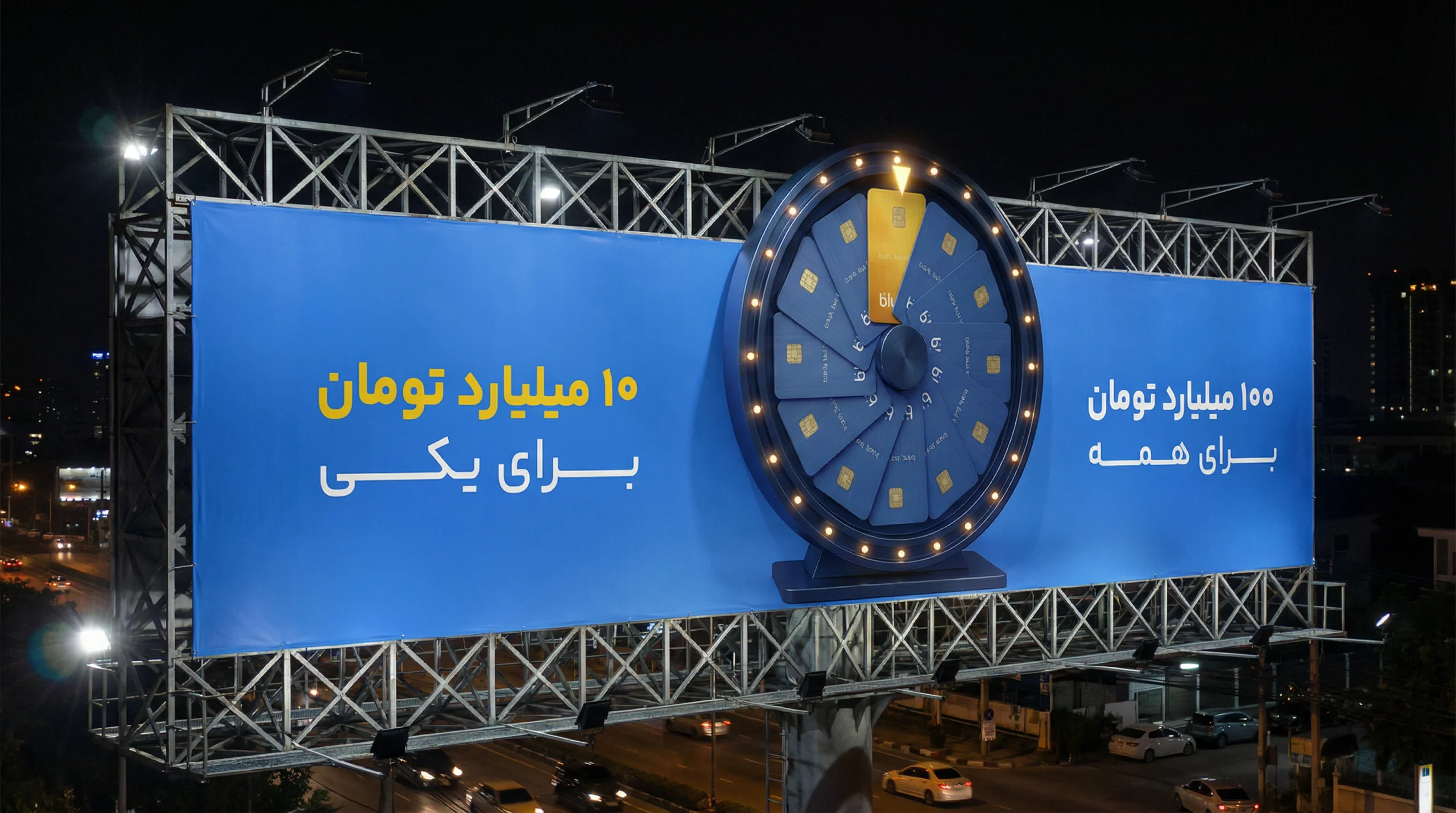
Let the wheel leave the frame
My billboard proposal moves the wheel beyond a flat graphic. Its circular silhouette extends above the rectangular panel, with physical lamps mounted away from the wheel’s surface. The intended light and movement concentrate the playful energy in one element while the surrounding blue field and copy remain simple.
The proposal in an urban setting
Two night-time billboard mockups show the front and angled views of the selected direction. They explain the intended scale, illuminated rim and relationship to the support structure. These are presentation mockups; they do not document an installed billboard, daylight visibility or a tested mechanical system.
What the quieter explorations missed
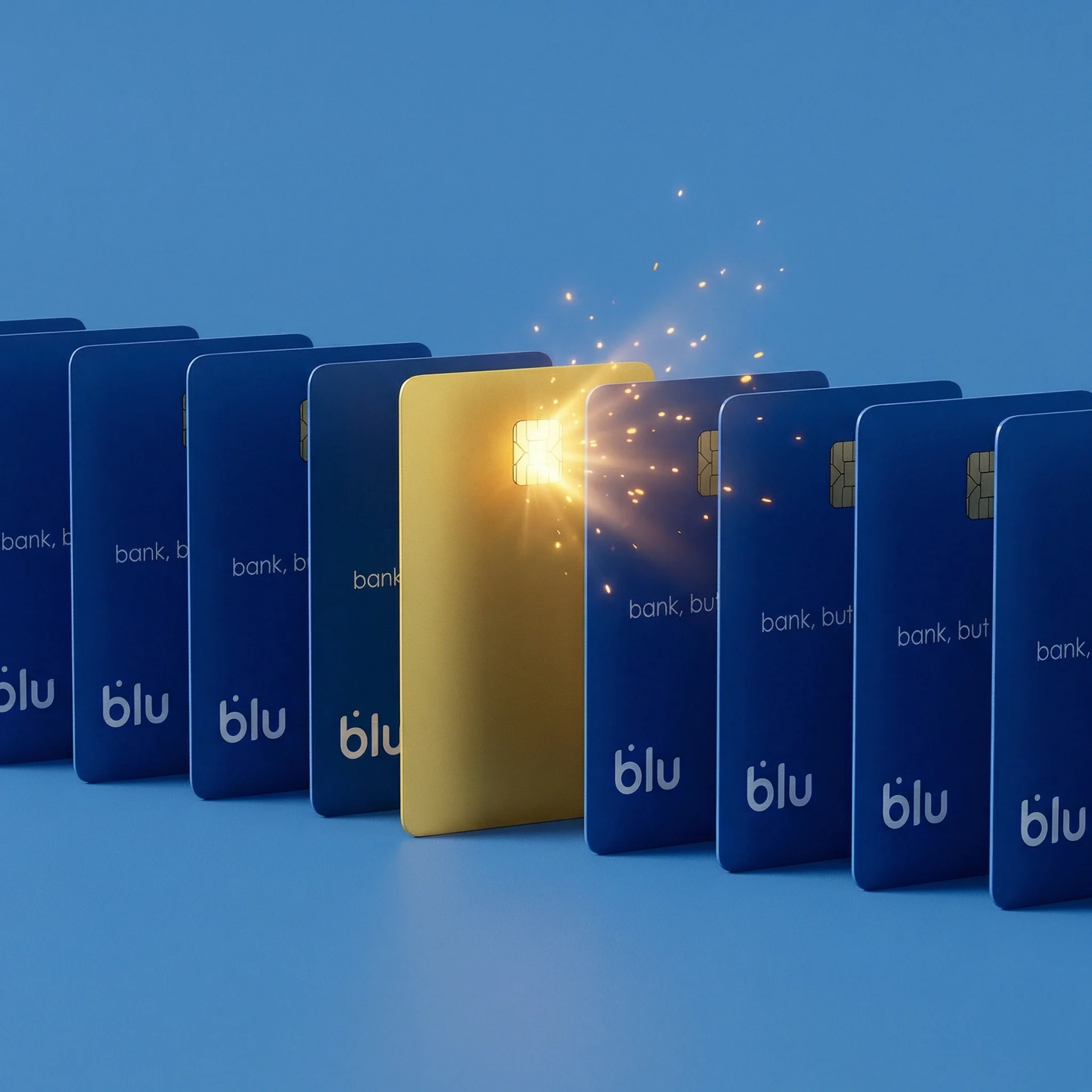
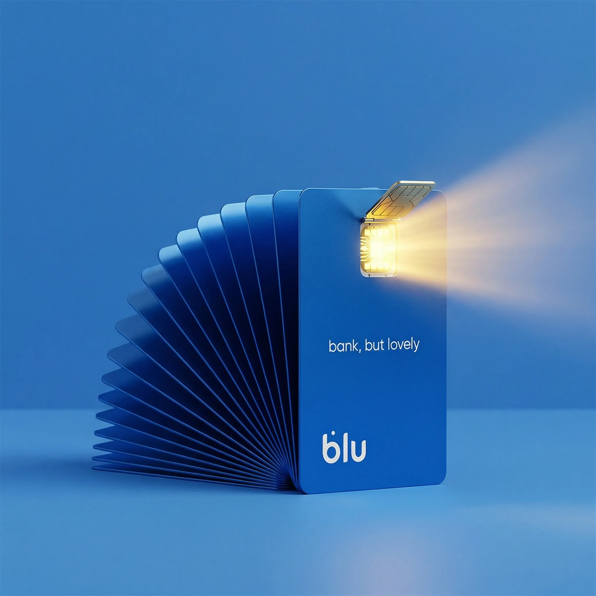
I also explored a gold card within a row of blue cards, a luminous chip, a gold card between two repeated rows and a circular fan of cards. Some were simpler and closer to the brand’s minimal language. I chose the wheel because it expressed the brief’s game, chance and excitement more directly.
A selected direction for further development
The completed proposal brings the collective reward, exceptional winner and wheel-of-fortune mechanic into one visual direction. The delivered material includes a key visual, two urban mockups and four alternative explorations. Production engineering, physical motion and campaign results remain outside the documented scope.