Chapar — carrying connection
A postal identity concept connecting graphite storytelling with stamps, varied packaging and the everyday spaces of delivery.
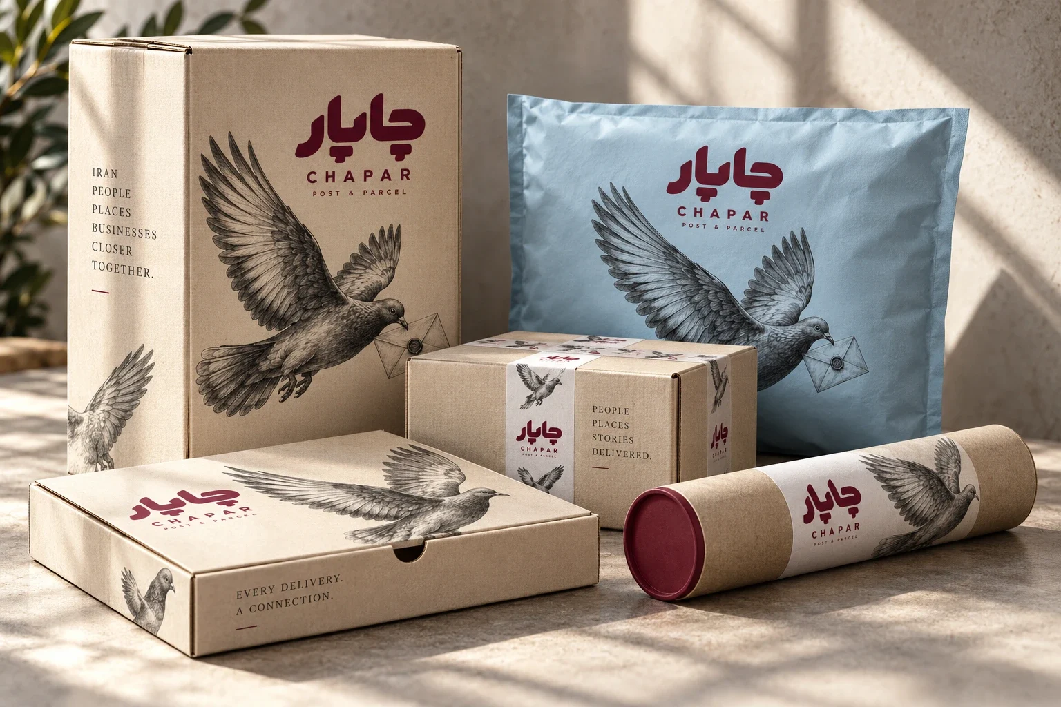
Chapar is the postal-service brand explored in this concept. The system addresses sending and receiving parcels, from a personal envelope to a business shipment.
Build a coherent postal identity that carries the warmth of correspondence across small stamps, varied parcel formats and operational spaces, while keeping the brand visible beside detailed illustration.
Graphic Designer & Art Director
Visual identity study; graphite illustration language and patterns; typography and palette studies; postage stamp concepts; packaging family; environmental branding; courier uniforms and staff accessories.
The study delivers a connected visual system across fifteen presentation images, linking stamps, parcels and workplace applications. These are concept visualizations; production testing, client approval and commercial performance are outside the documented scope.
Concept development and art direction: Ali Komeili. AI-assisted visualizations: OpenAI imagegen, developed from the identity reference supplied for this study.
A familiar act of connection
A parcel moves between people before it becomes a logistics task. This concept for Chapar gives that exchange a recognisable visual language for individual senders, recipients and businesses. The supplied identity reference sets the starting point; the study extends it into a family of postal objects and working environments.
Three messengers, one visual language
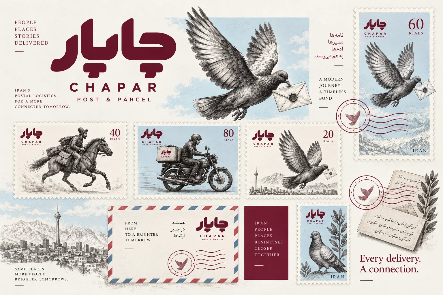
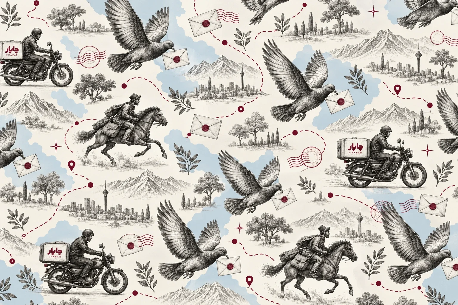
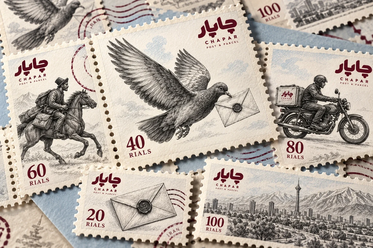
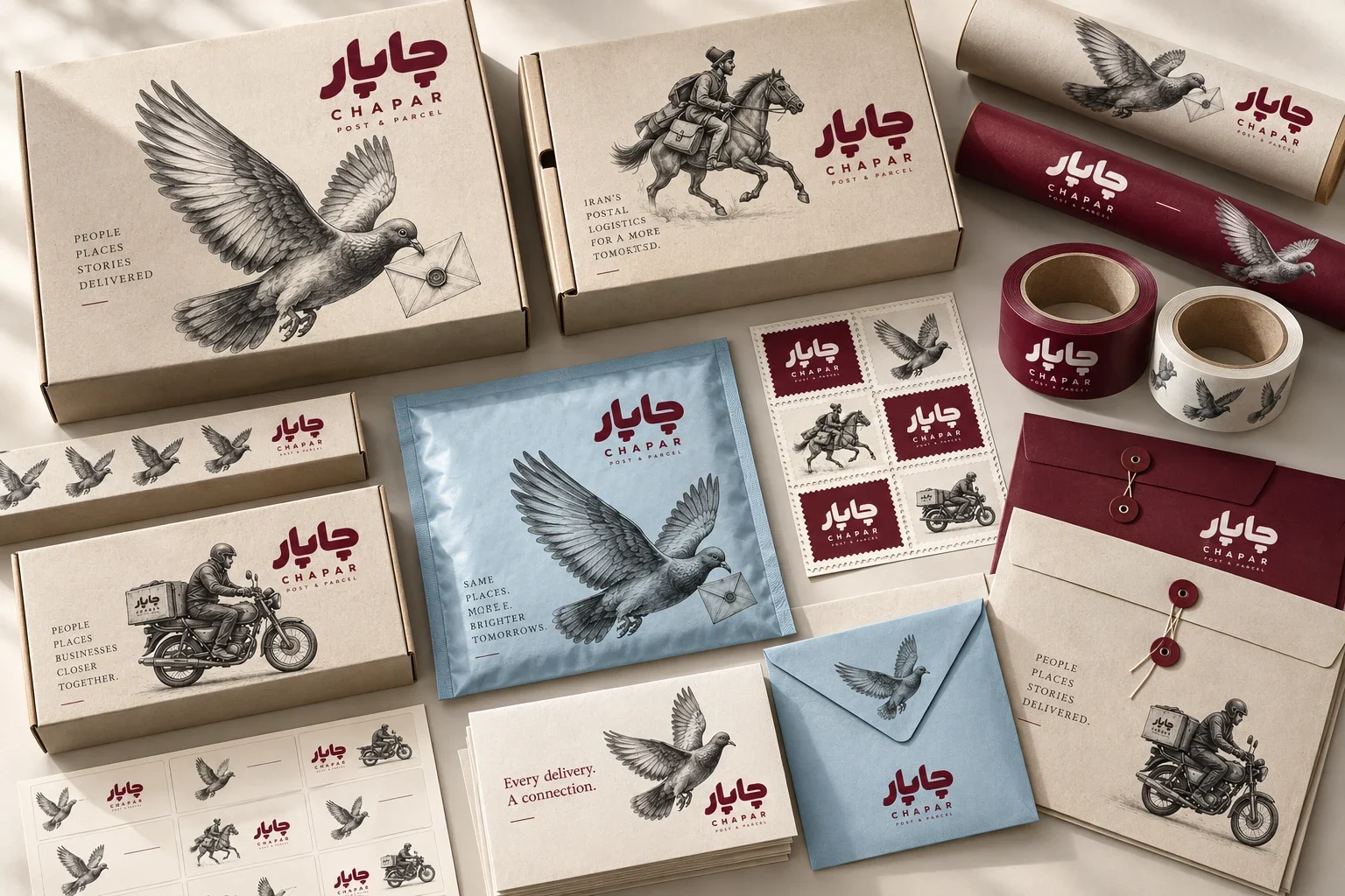
The carrier pigeon, mounted courier and motorcycle rider provide a narrative of movement across different eras. Graphite shading and cross-hatching hold these subjects together. Repeated on tape, stamps and parcels, the drawings turn individual scenes into a graphic vocabulary rather than an illustration reserved for a single poster.
Strong lettering, room for detail
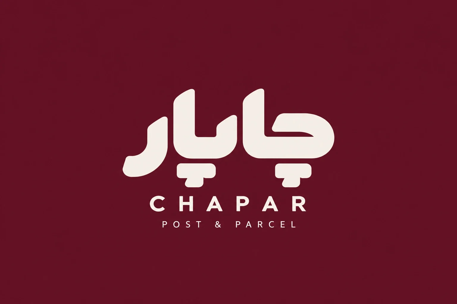
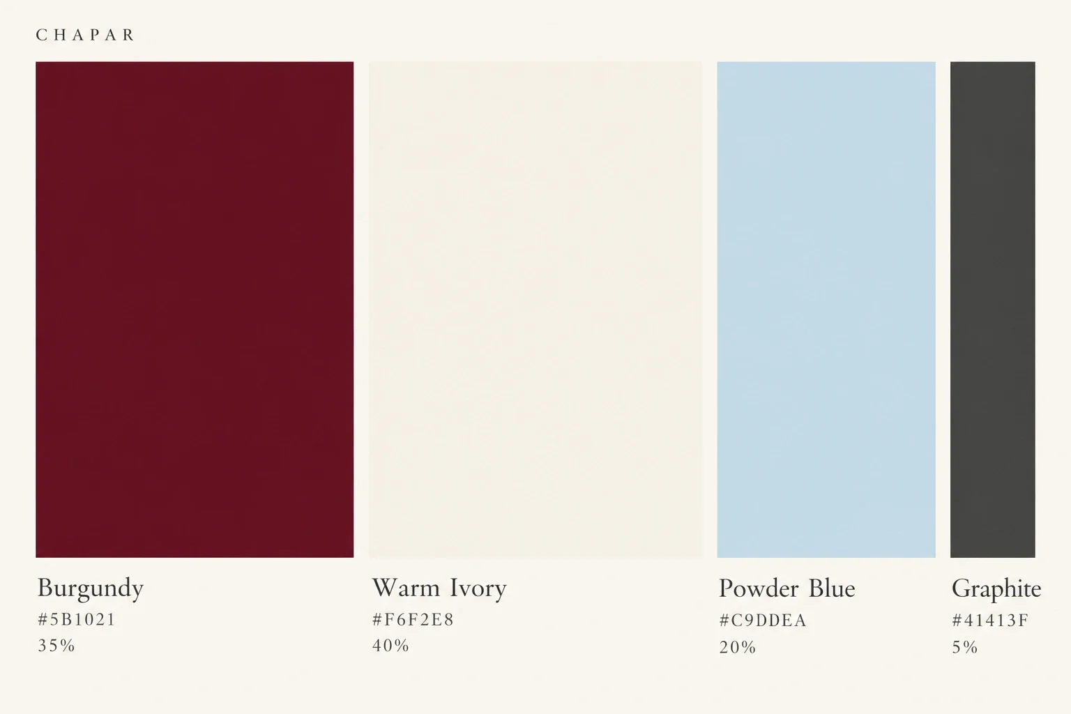
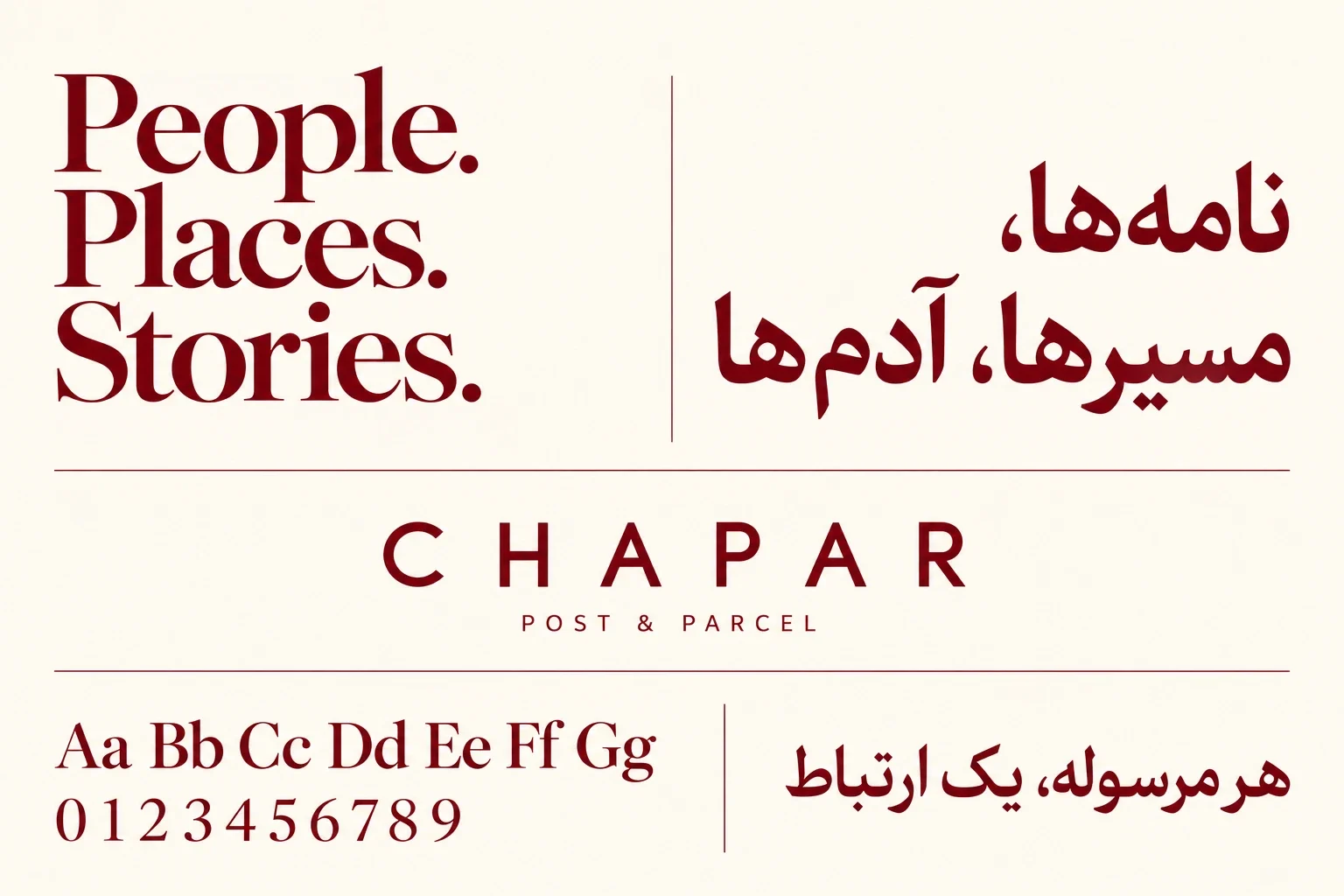
The broad Persian wordmark gives the identity a solid anchor beside fine pencil marks. Burgundy supplies emphasis; warm ivory leaves the drawings space, and powder blue creates a lighter field for mailers and interiors. The bilingual type study contrasts expressive headlines with spaced uppercase captions to establish different reading levels.
Small formats with their own stories
The stamp collection gives each messenger a distinct frame while repeating the logo, limited palette and perforated edge. Horizontal and vertical formats vary the rhythm of the set. Their illustrated subjects can also appear outside the stamp boundary, linking this small postal object to the wider identity.
One family across different parcels
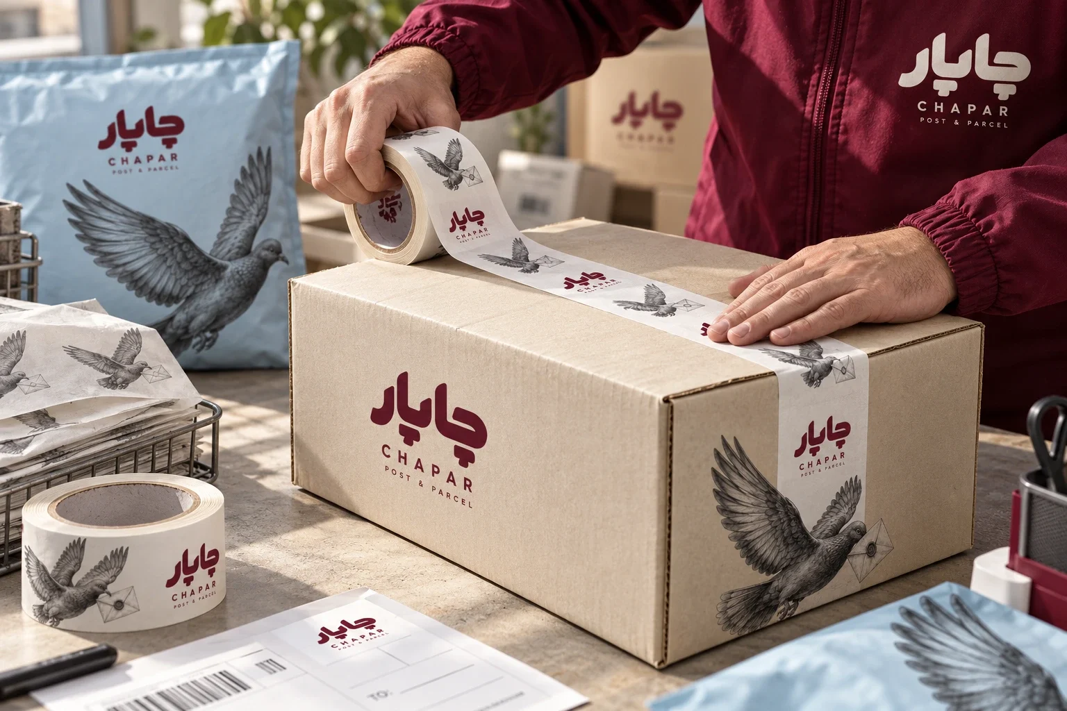
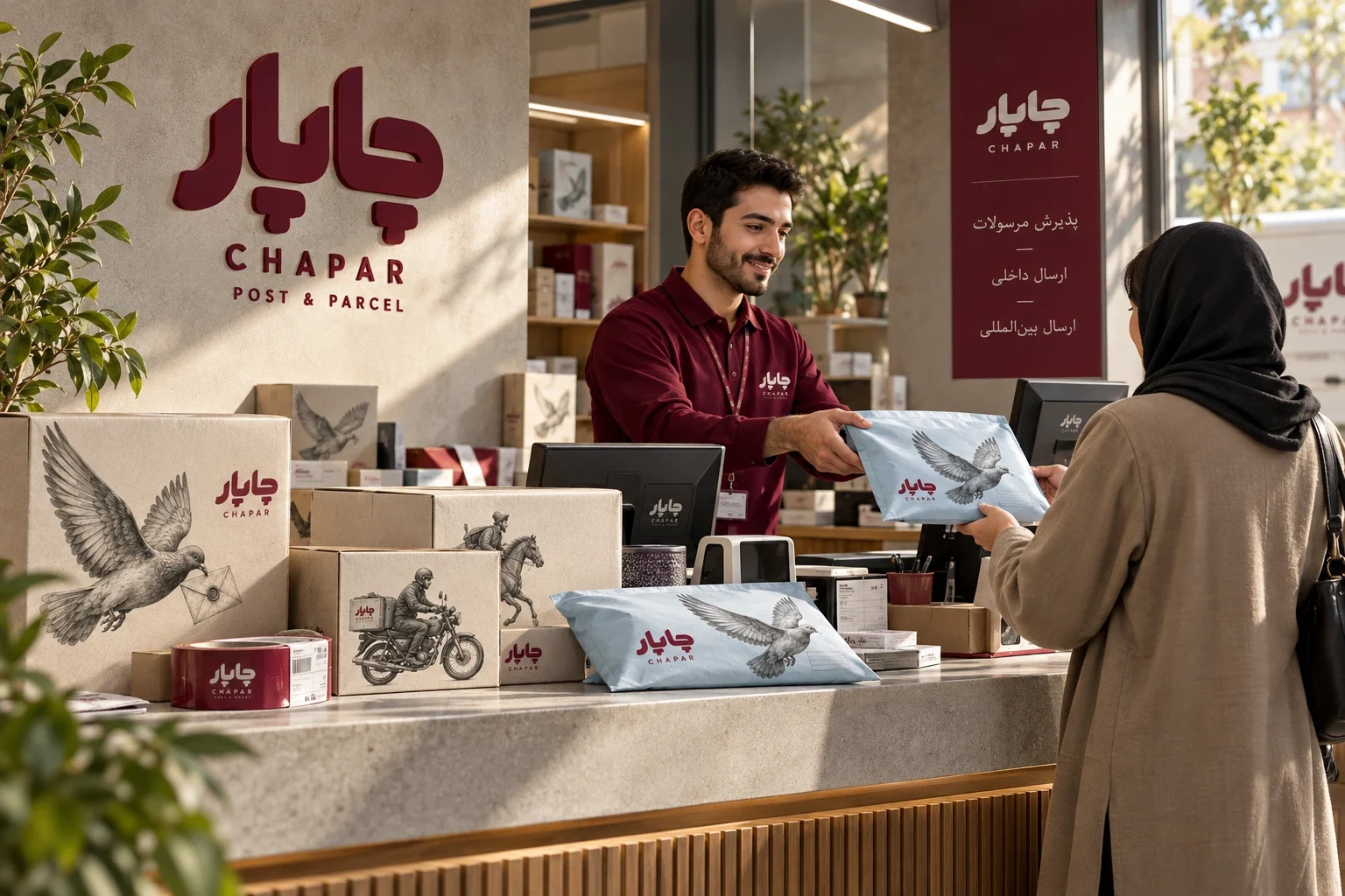
Tall cartons, shallow document boxes, compact parcels, mailing tubes and padded envelopes carry the same logo and illustration language. Large drawings lead on broad surfaces; repeated motifs work on narrow sealing tape. The packing and counter scenes show how these elements meet during a handover, with shipping information in separate label areas.
The identity follows the delivery
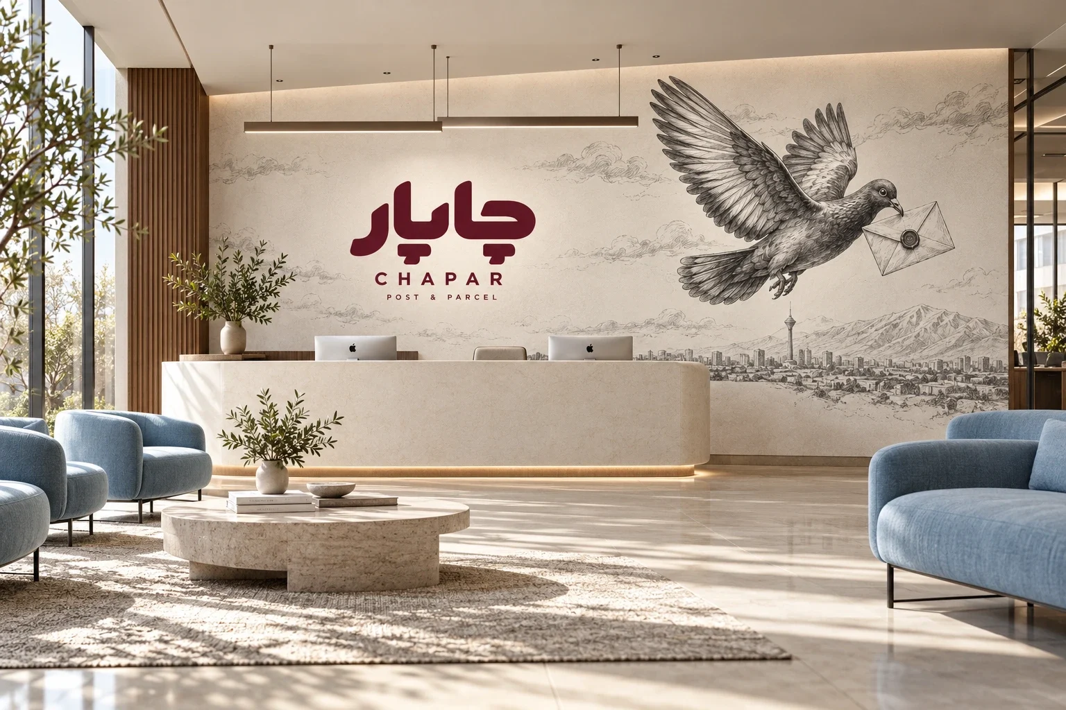
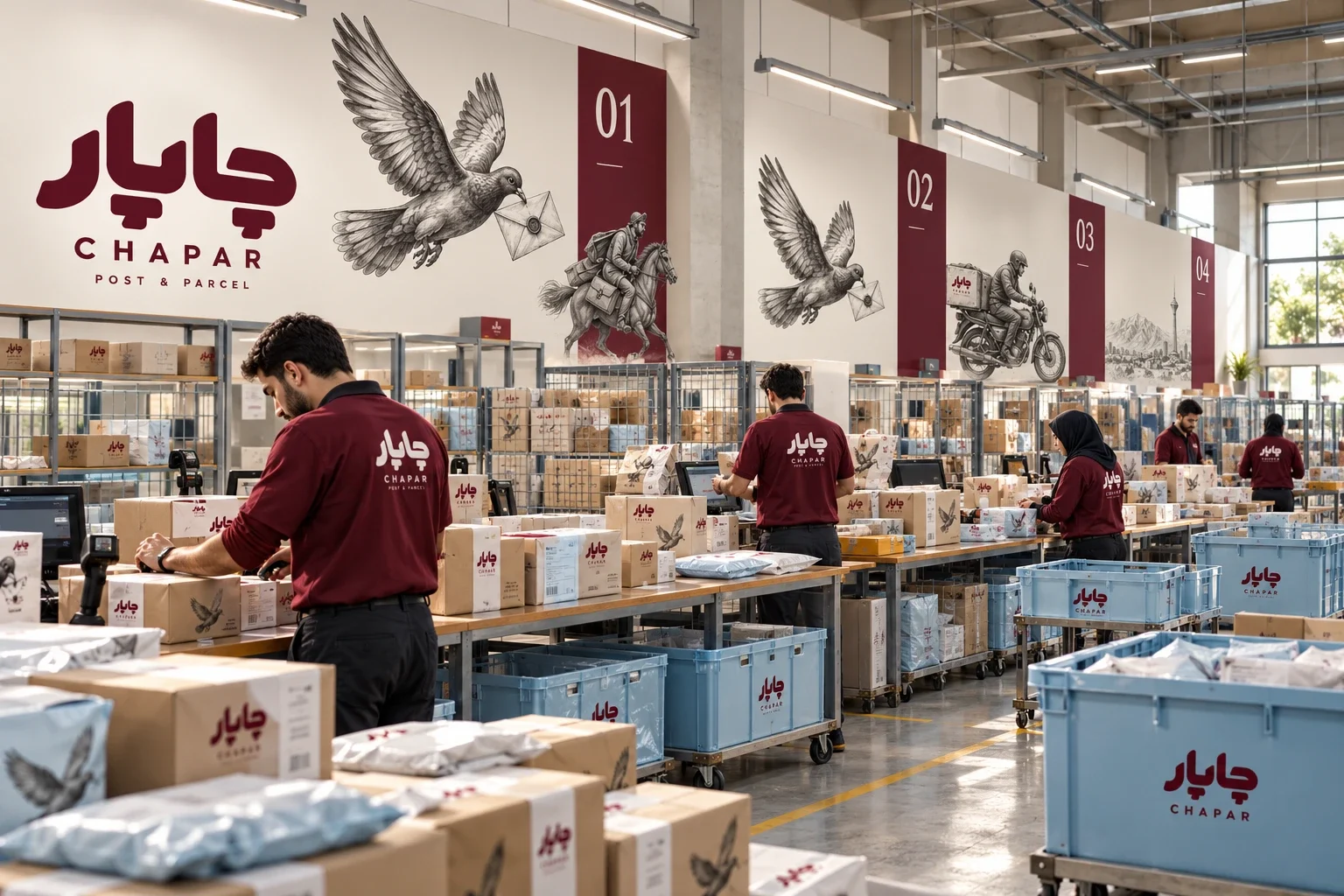
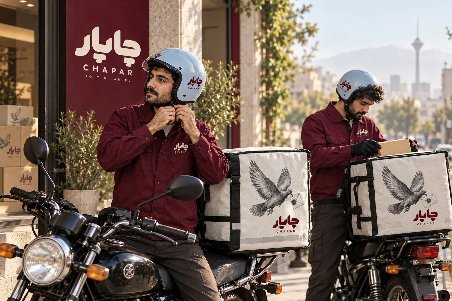
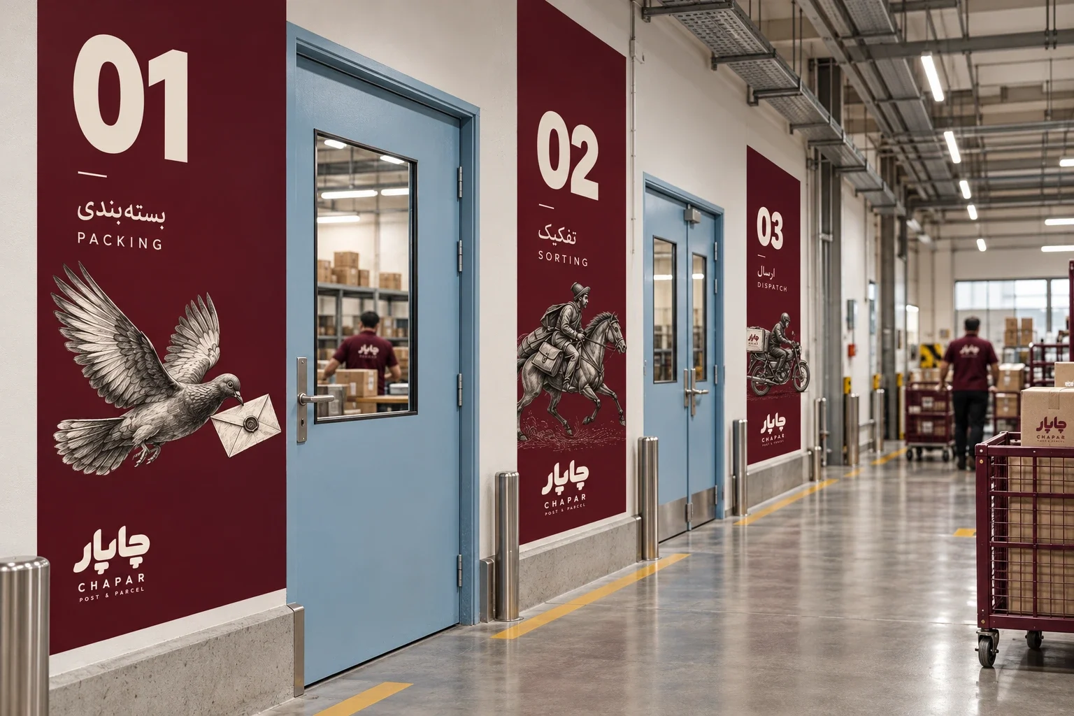
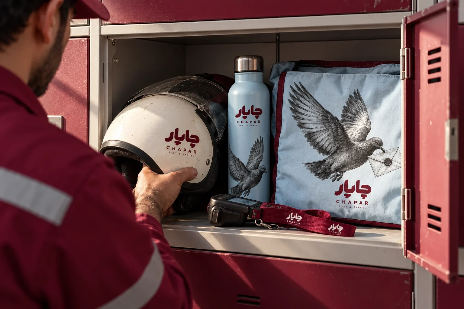
The applications extend from a reception mural to sorting bays, directional signs, courier clothing and staff equipment. Burgundy establishes visible markers, while powder blue and graphite drawings connect the spaces to the packaging. These scenes explore how a shared visual language remains recognisable as its scale and material change.
A system shown in context
The result is a visual study spanning identity artwork, packaging and organisational applications. Physical scenes are AI-assisted mockups, not photographs of an implemented rollout. The next production stage would require final vector artwork, verified operational copy, print specifications and testing of small text, materials and uniform applications.
- Postal identity
- Packaging
- Graphite illustration