Flightio · Travel in One Clear Flow
Flightio’s circular brand symbol becomes a travel portal, connecting destination imagery, transport campaigns and a booking-interface study.

An online travel agency focused on digital booking for flights, trains and intercity travel.
Connect destination campaigns, transport products and an interface study through a recognisable visual idea drawn from Flightio’s brand symbol.
Art direction, campaign key visuals and product imagery.
Portal campaign, environmental applications, travel imagery and a glass interface study.
The circle provides continuity between travel imagery and a more practical interface hierarchy. The result is a connected art direction and interface study, with prototype behaviour distinguished from an operational booking product.
Visual direction and design by Ali Komeili.
What the work needed to connect
Connect destination campaigns, transport products and an interface study through a recognisable visual idea drawn from Flightio’s brand symbol.
A brand symbol becomes a portal
Flightio’s circular symbol provides the starting point for the campaign imagery. A portal connects a familiar foreground to a different destination. Light and perspective make the two settings feel part of the same composition.

Moving from a symbol to a journey
The circular mark becomes a portal in the campaign imagery, then the transport scenes broaden the travel context. The interface study translates the palette into a booking surface so the visual and functional layers can be compared.


Connecting two places through light
A night-time courtyard opens onto sunlit Petra in this execution. The portal holds the transition between the settings, while colour and perspective connect them. The contrast provides another expression of the same campaign idea.


Testing the campaign in public space
A mall lightbox and a pedestrian-bridge banner show the artwork in different viewing contexts. These mockups explore scale, cropping and surrounding light. They present possible applications rather than evidence of a live media placement.


A family across transport modes
Air, rail and road share a coastal setting and a common horizon. Each mode has its own subject, while composition connects the series. The approach gives different travel products a consistent campaign structure.


Bringing the palette into an interface
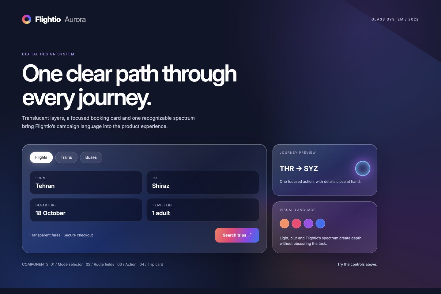
The Aurora interface study carries the campaign colours into a booking card. Translucent surfaces separate route fields, travel modes and the main action. The interactive example demonstrates the component direction rather than a connected booking service.
Flightio Aurora animated glass design system
What I take from this direction
The circle provides continuity between travel imagery and a more practical interface hierarchy. The result is a connected art direction and interface study, with prototype behaviour distinguished from an operational booking product.