Gloobz — Space-Flavored Gummies
A playful identity for a Chinese sugared-gummy brand, built around expressive creatures, bright color, and a packaging family that reads as one world.
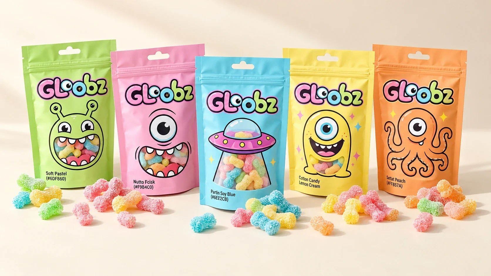
Gloobz is a Chinese brand of sugared gummies with a space-flavored concept.
Gloobz needed a recognizable look for a range of sugared gummies. Each pack had to feel like its own small encounter while staying connected to the larger brand.
Design and art direction by Ali Komeili at Al Nadhara Studio, Qatar.
Visual identity, character system, packaging design, and brand applications.
A coherent identity and packaging system extends across individual pouches, a multi-pack box, and illustrated brand applications.
Ali Komeili — designer and art director; Al Nadhara Studio, Qatar — studio.
A candy range with its own universe
Gloobz is a Chinese brand of sugared gummies built around a space-flavored idea. At Al Nadhara Studio in Qatar, I designed and art-directed an identity that lets each pack introduce a character while keeping the range visibly connected.
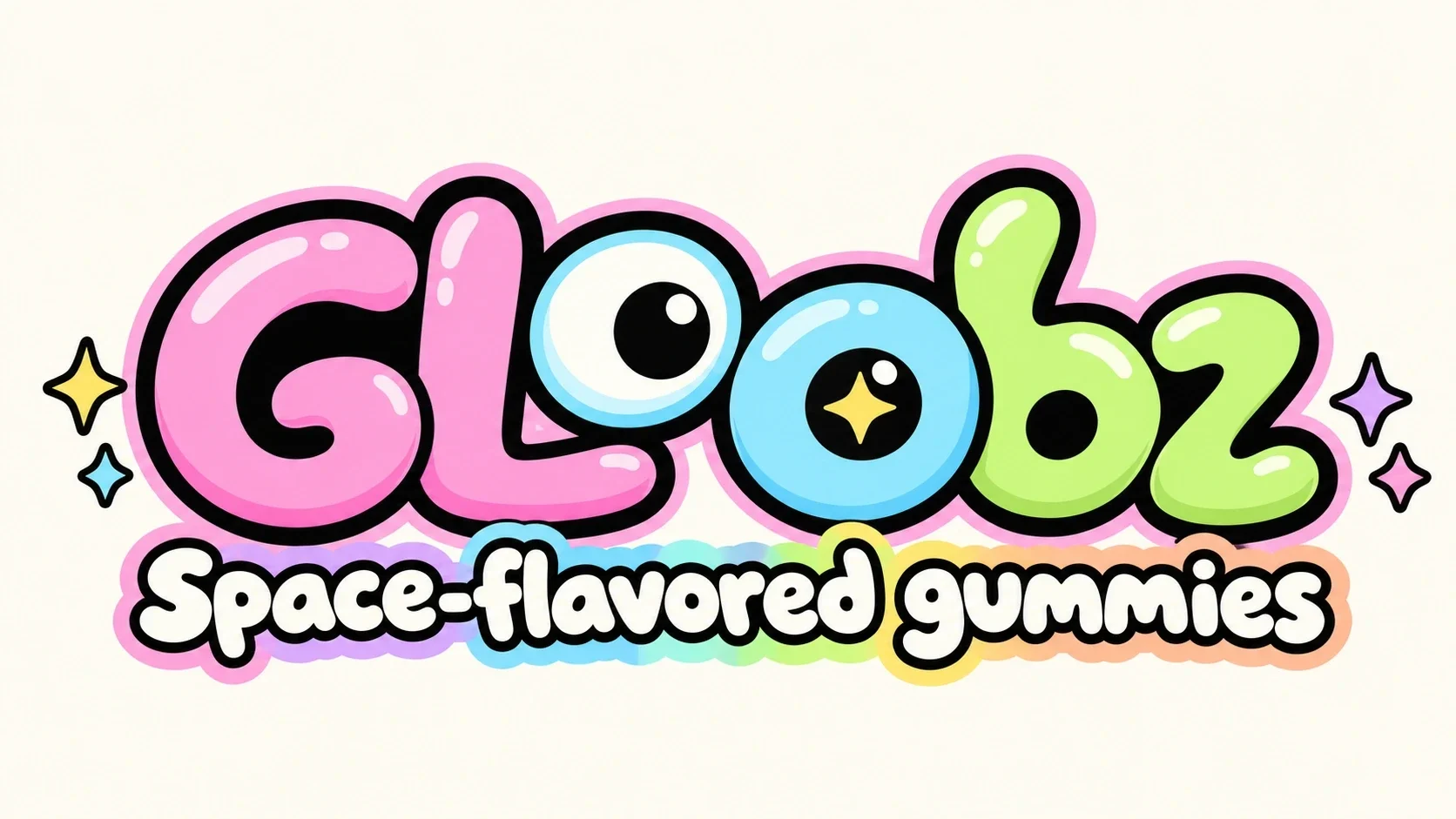
The wordmark looks back
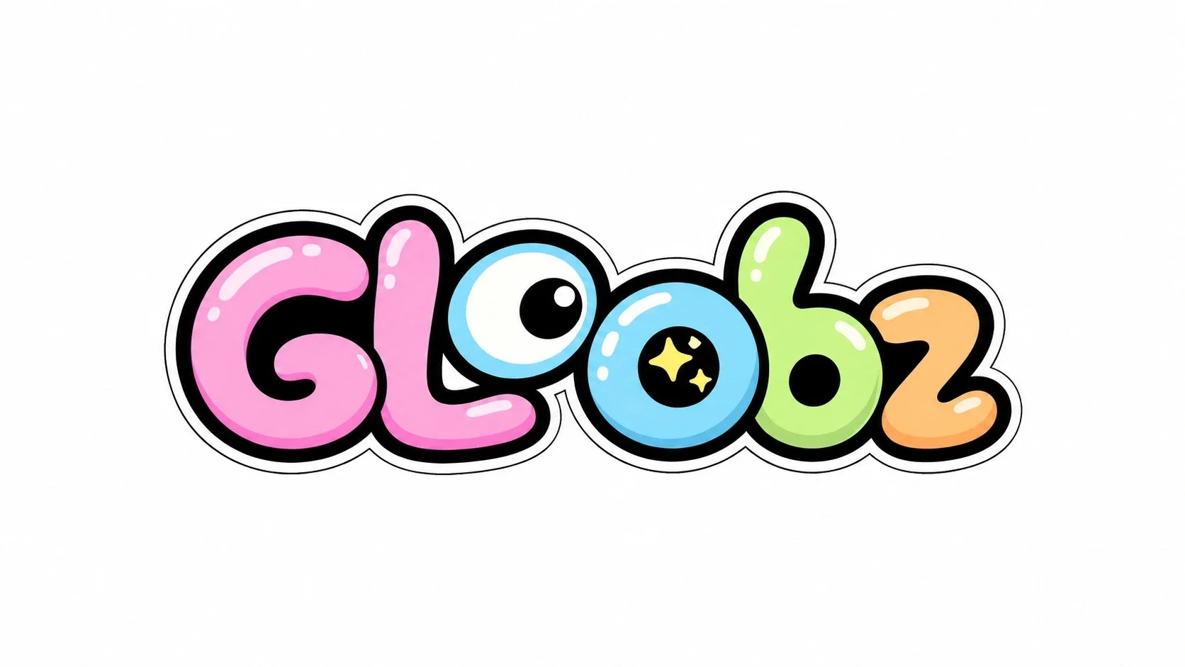
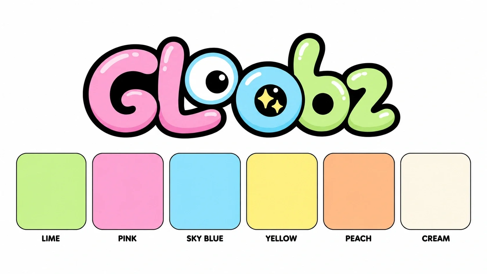
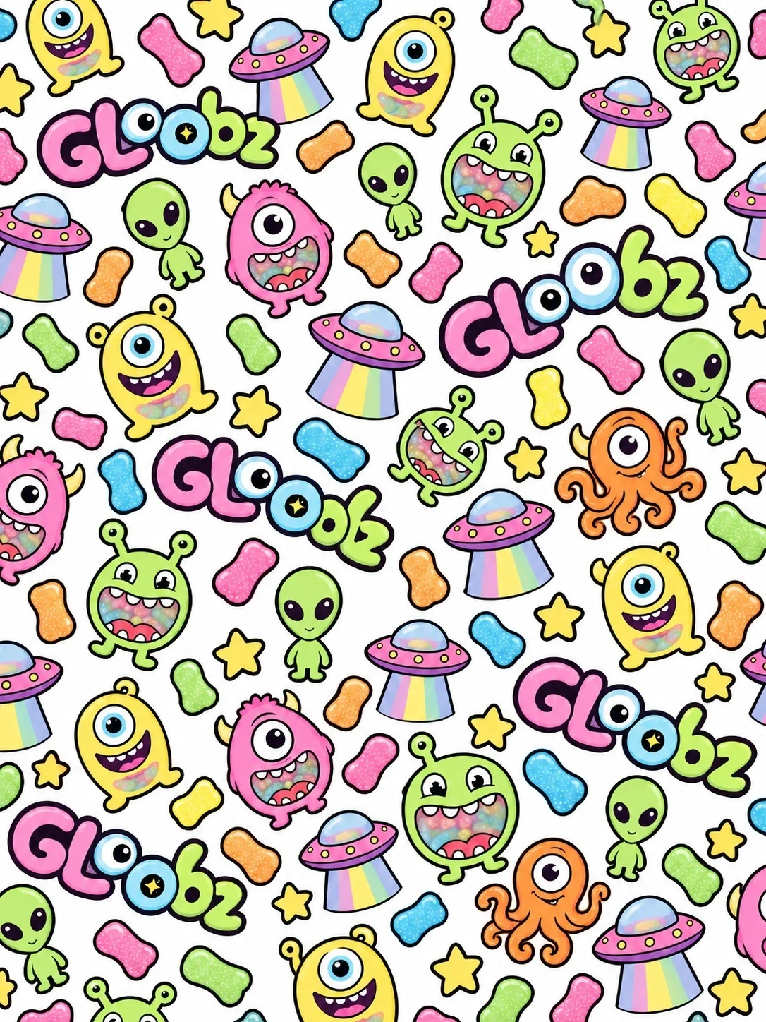
The rounded Gloobz letters turn the two O’s into eyes. Black outlines give the pink, blue, green and orange forms a clear edge, even beside energetic illustrations. The name becomes a character before the viewer reaches an individual pack.
Five characters, one family
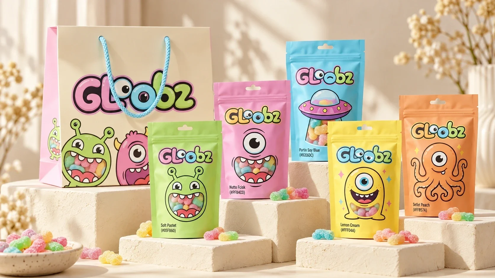
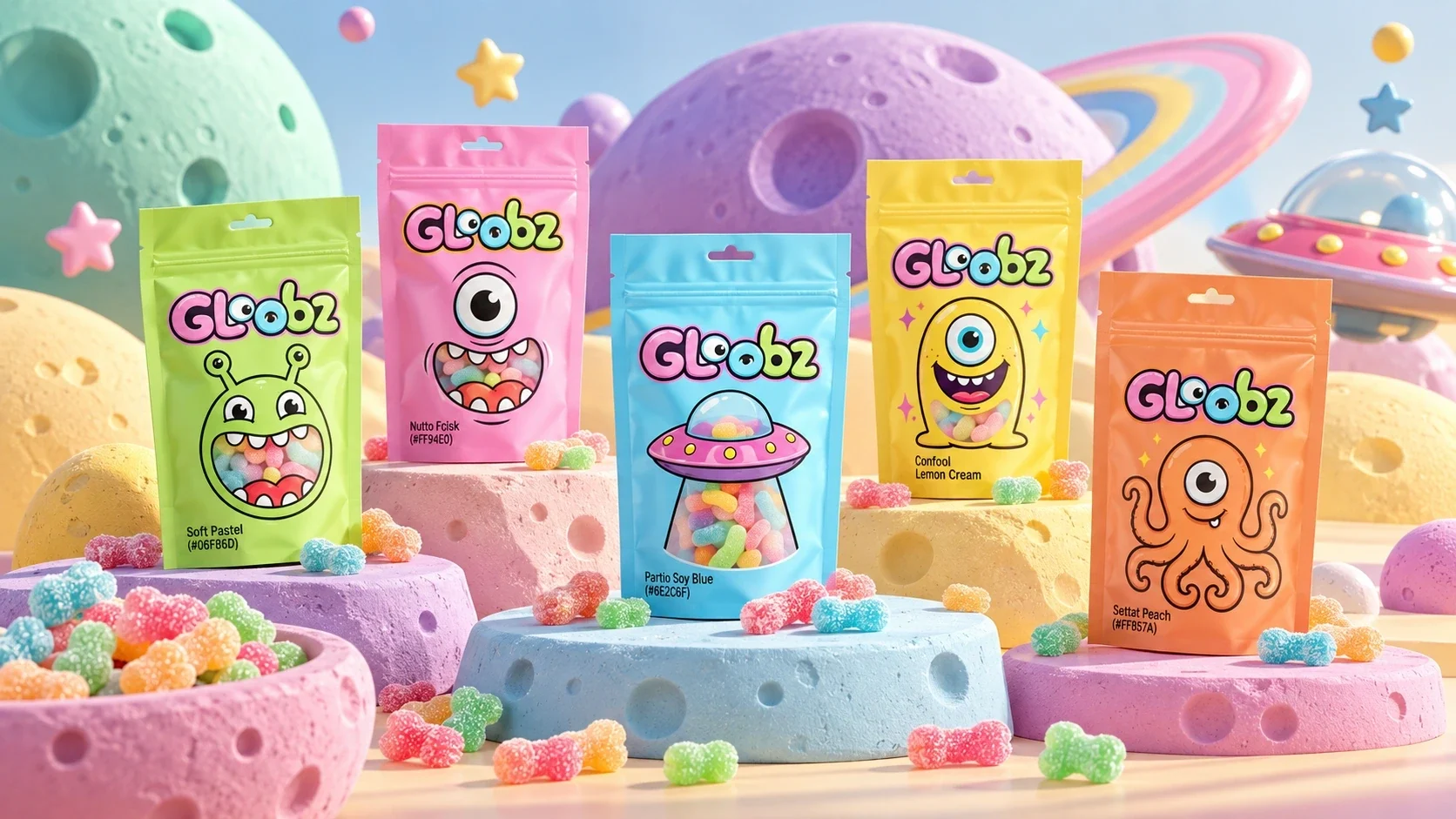
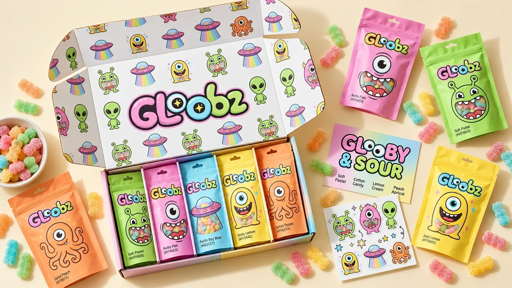
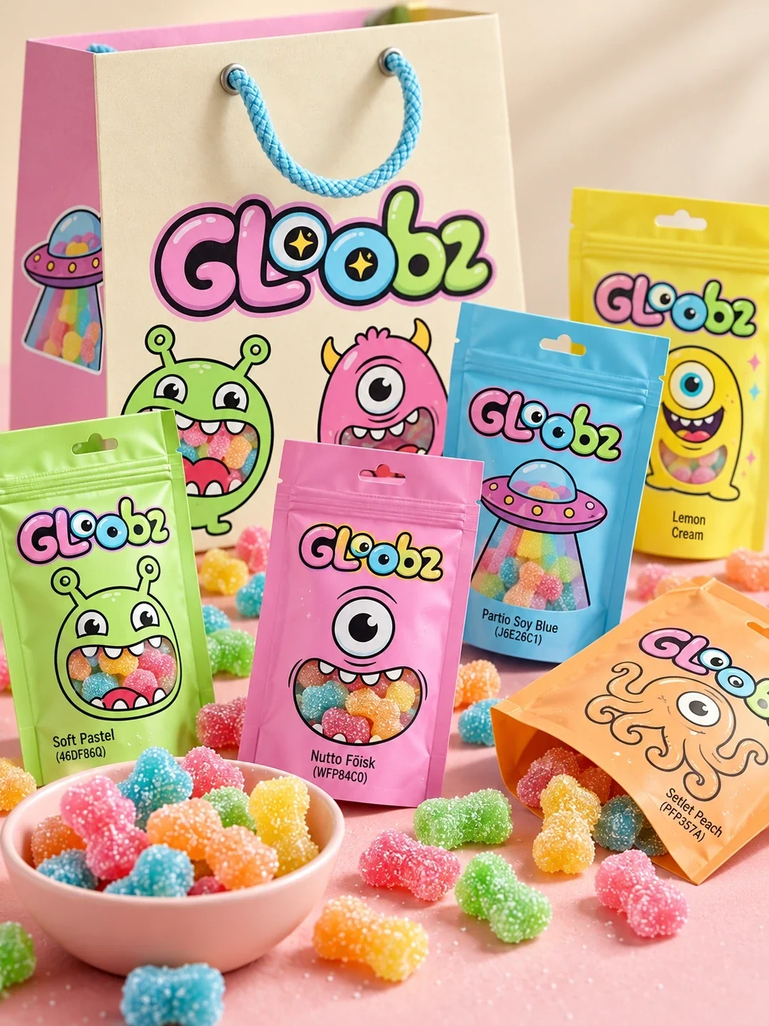
A green antennaed creature, a pink one-eyed monster, a blue UFO, a yellow smiling alien and an orange tentacled figure each anchor a pouch. Color and illustration change, while the wordmark, character scale and clear gummy window keep the range together.
The pack carries the story
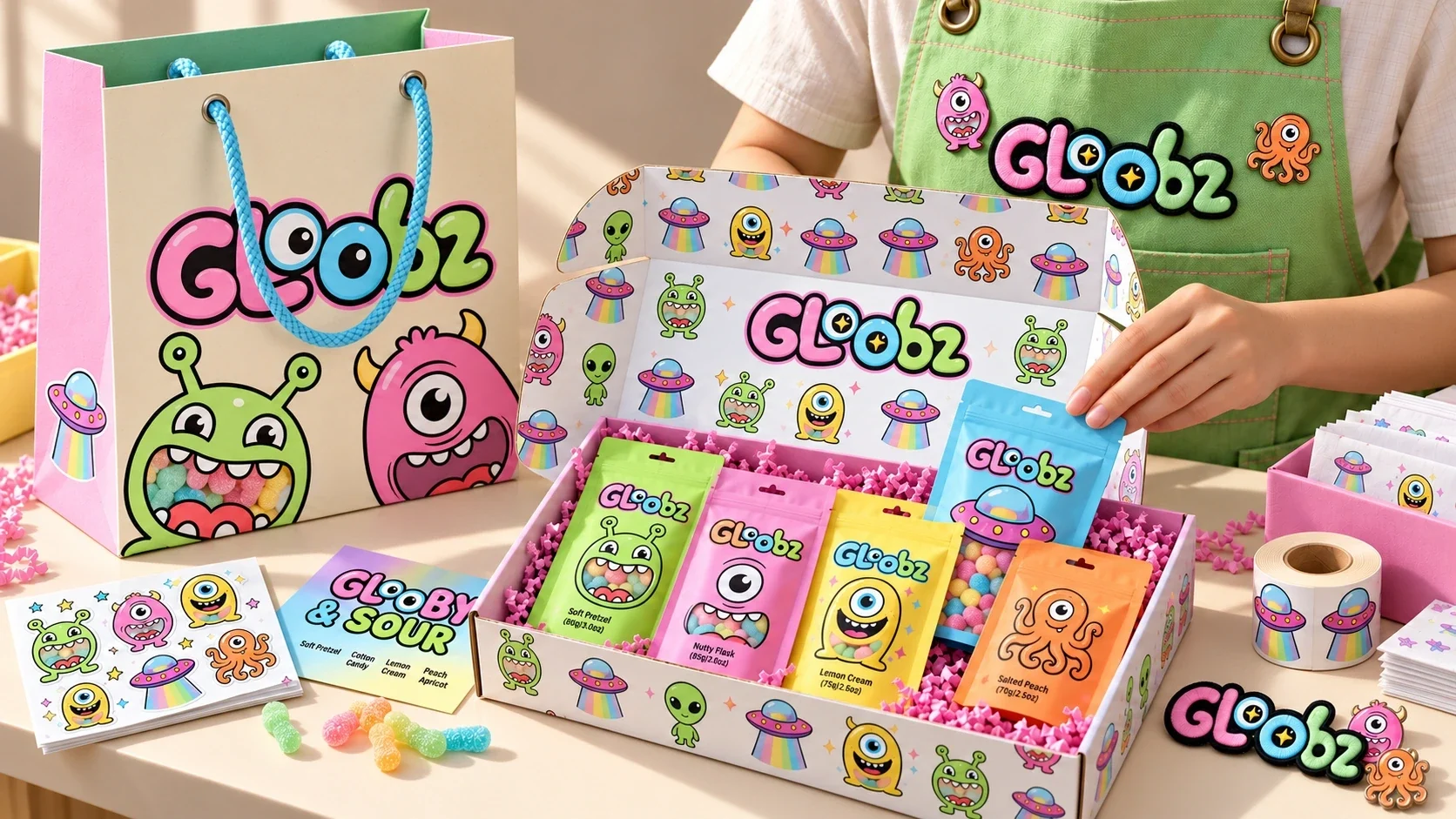
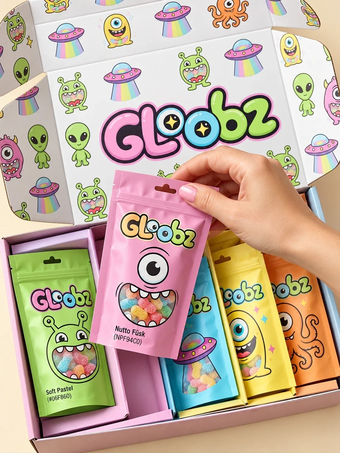
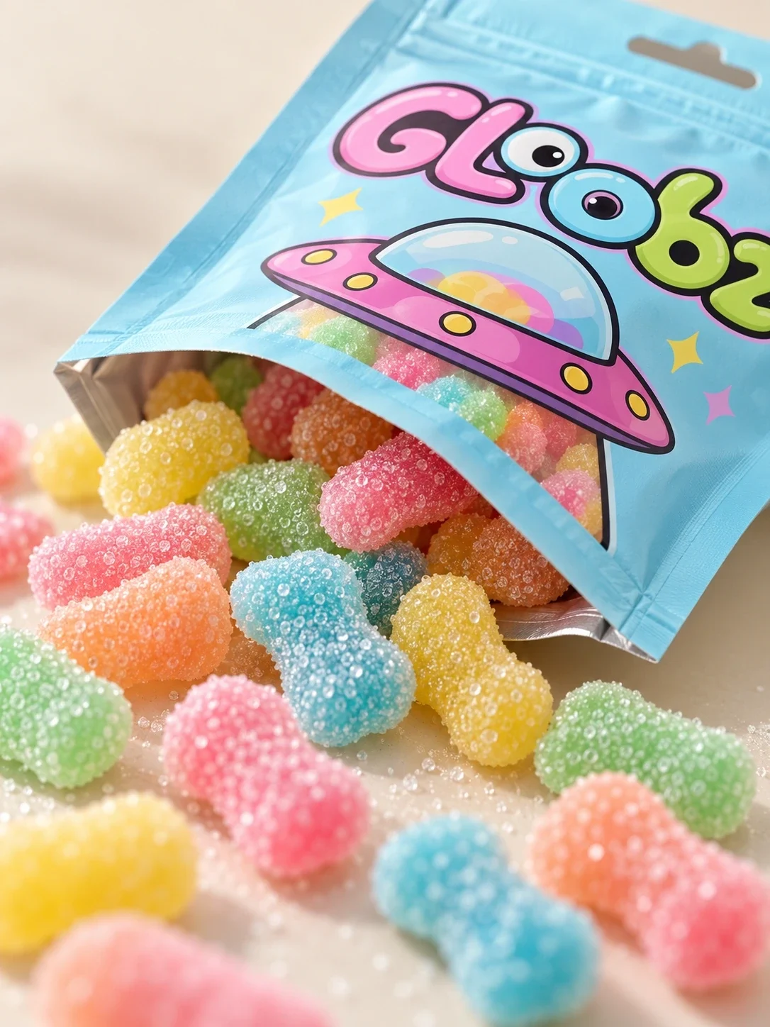
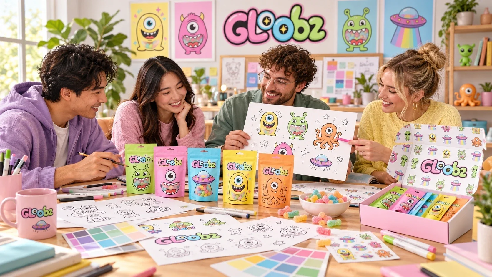
The pouches make the characters the main recognition cue and allow the sugar-coated gummies to remain visible. A patterned multipack gathers the five designs without flattening their differences. The product shots show this hierarchy at both single-pack and family scale.
Beyond the gummy pouch
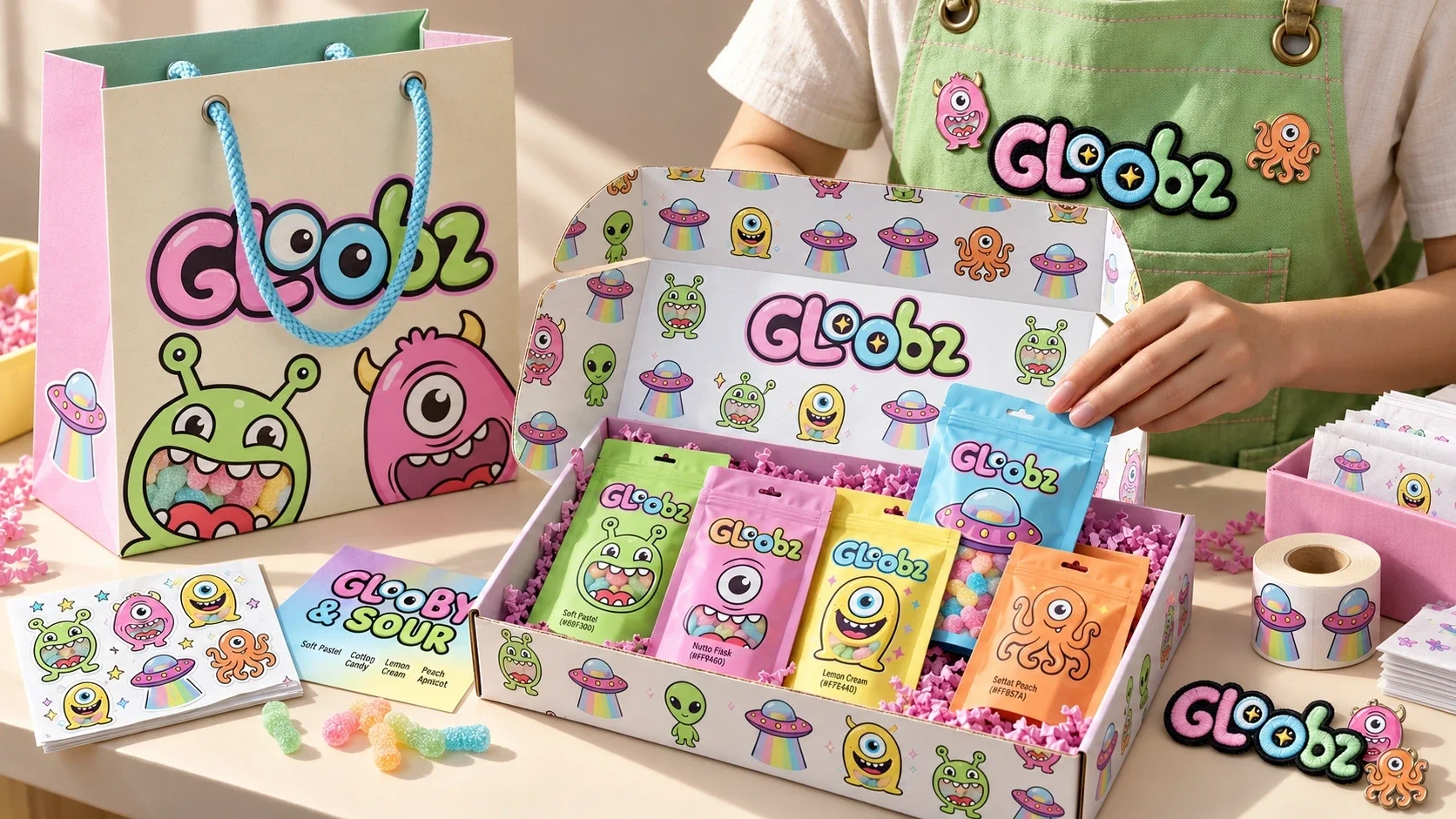
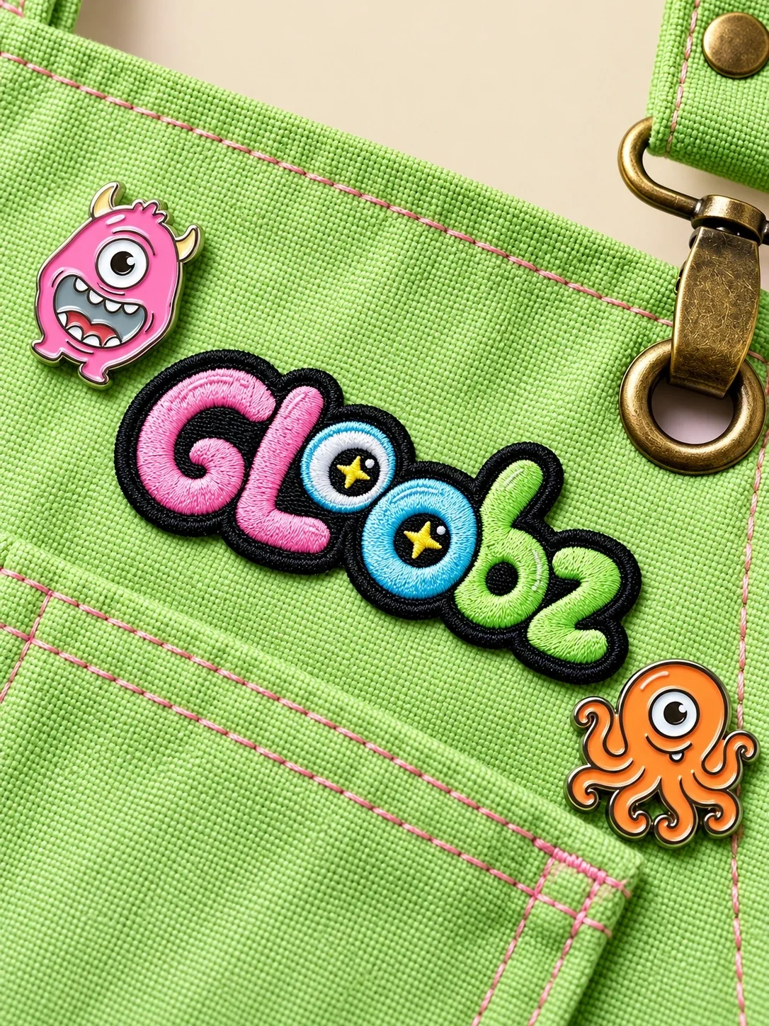
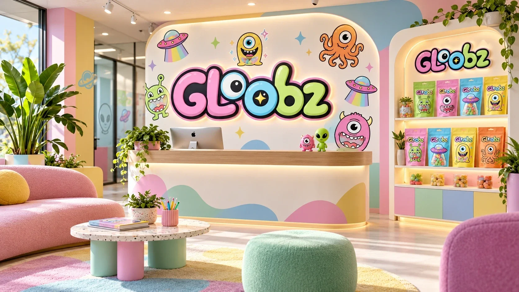
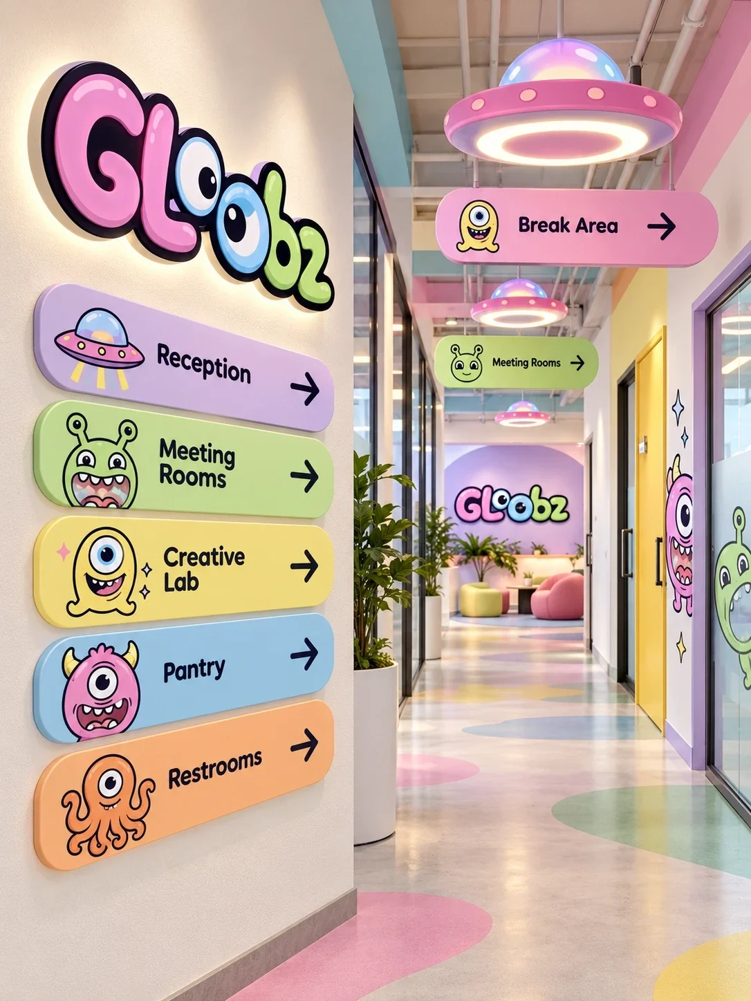
The characters and small space motifs move onto a shopping bag, embroidered apparel, retail graphics and wayfinding in the supplied presentation visuals. The same palette gives these applications a shared tone, while each surface uses a different amount of pattern and character detail.
A system ready to extend
The finished identity connects a five-part packaging family with a flexible set of brand applications. Its characters, colours and wordmark carry a shared visual language from the pouch to the wider brand.
- gummy packaging design
- candy brand identity
- character-led packaging
- food and beverage branding