Kashan Carpet Museum — A living thread
A visual identity for Kashan Carpet Museum that carries the language of woven threads from the galleries to every visitor touchpoint.
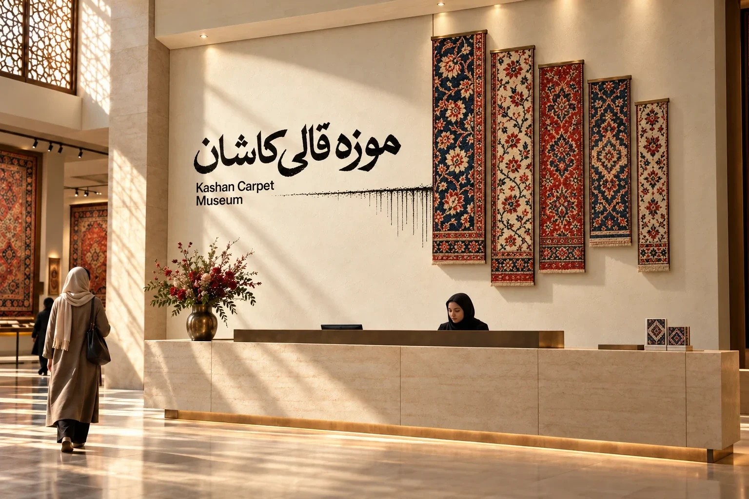
Kashan Carpet Museum presents the craft and visual heritage of carpet weaving in Kashan. The identity was commissioned by the Cultural Heritage Organization in 2026.
The museum needed a clear identity that could honor the detail of Kashan carpets while working across signs, object labels, visitor materials and the museum shop.
Art direction and design by Ali Komeili.
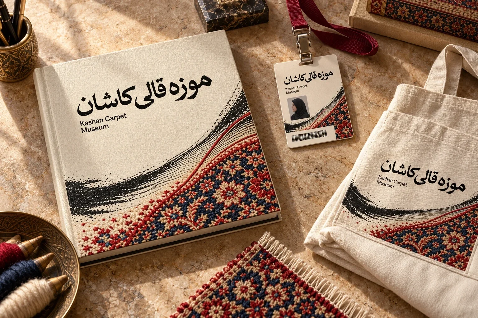
Visual identity, logotype, colour and typography system, gallery signage, wayfinding, admission ticket, map, provenance labels, staff applications and museum merchandise packaging.
A coherent visual system connects the museum entrance, exhibitions, visitor information and take-home objects through one recognizable thread-and-carpet graphic.
Commissioned by the Cultural Heritage Organization. Art direction and design: Ali Komeili.
A museum identity drawn from the carpet
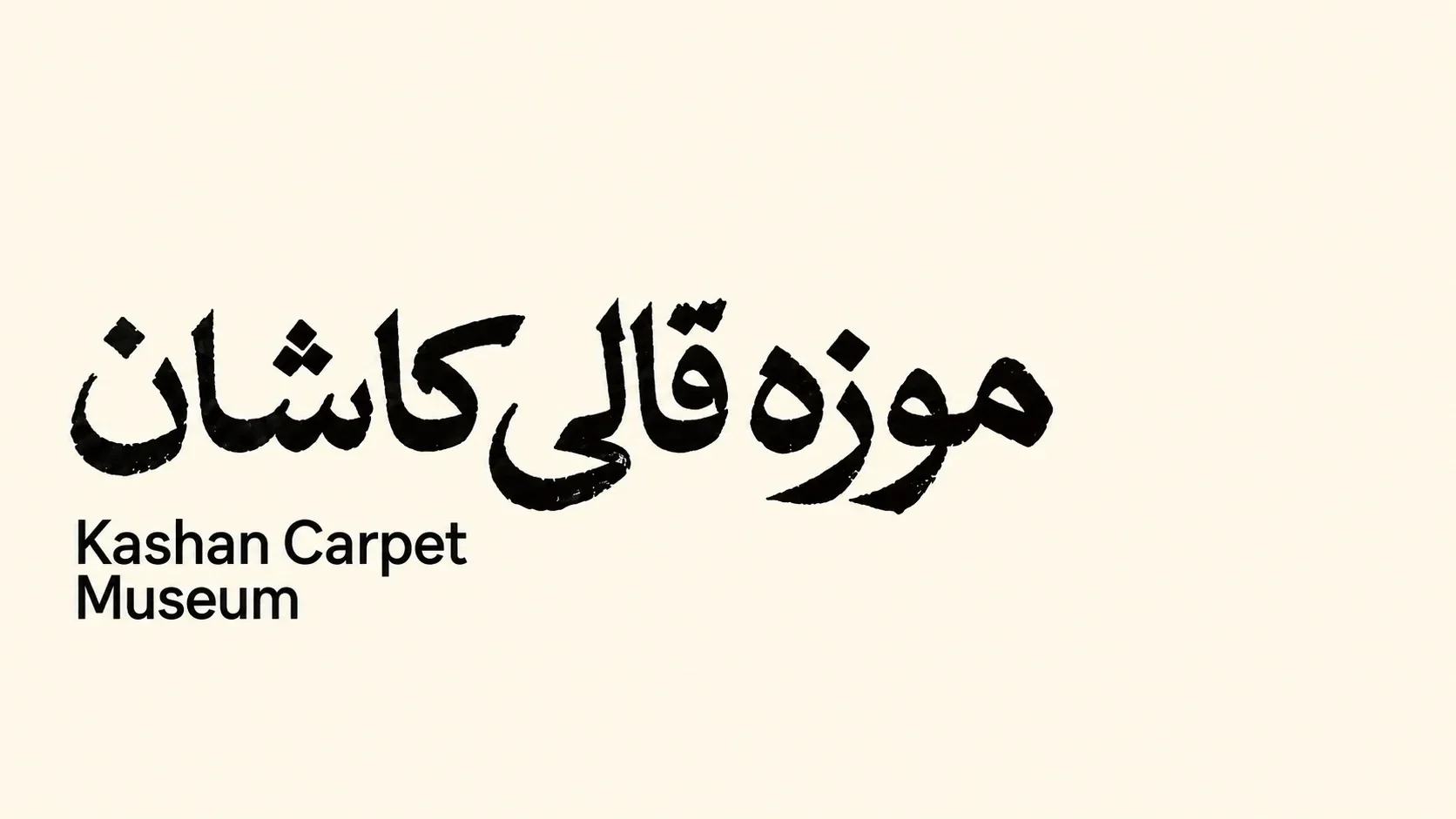
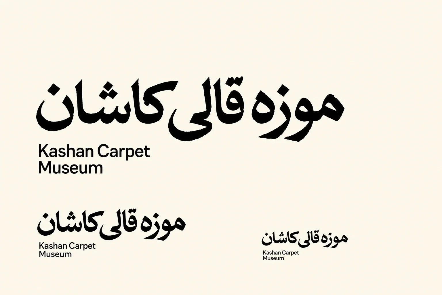
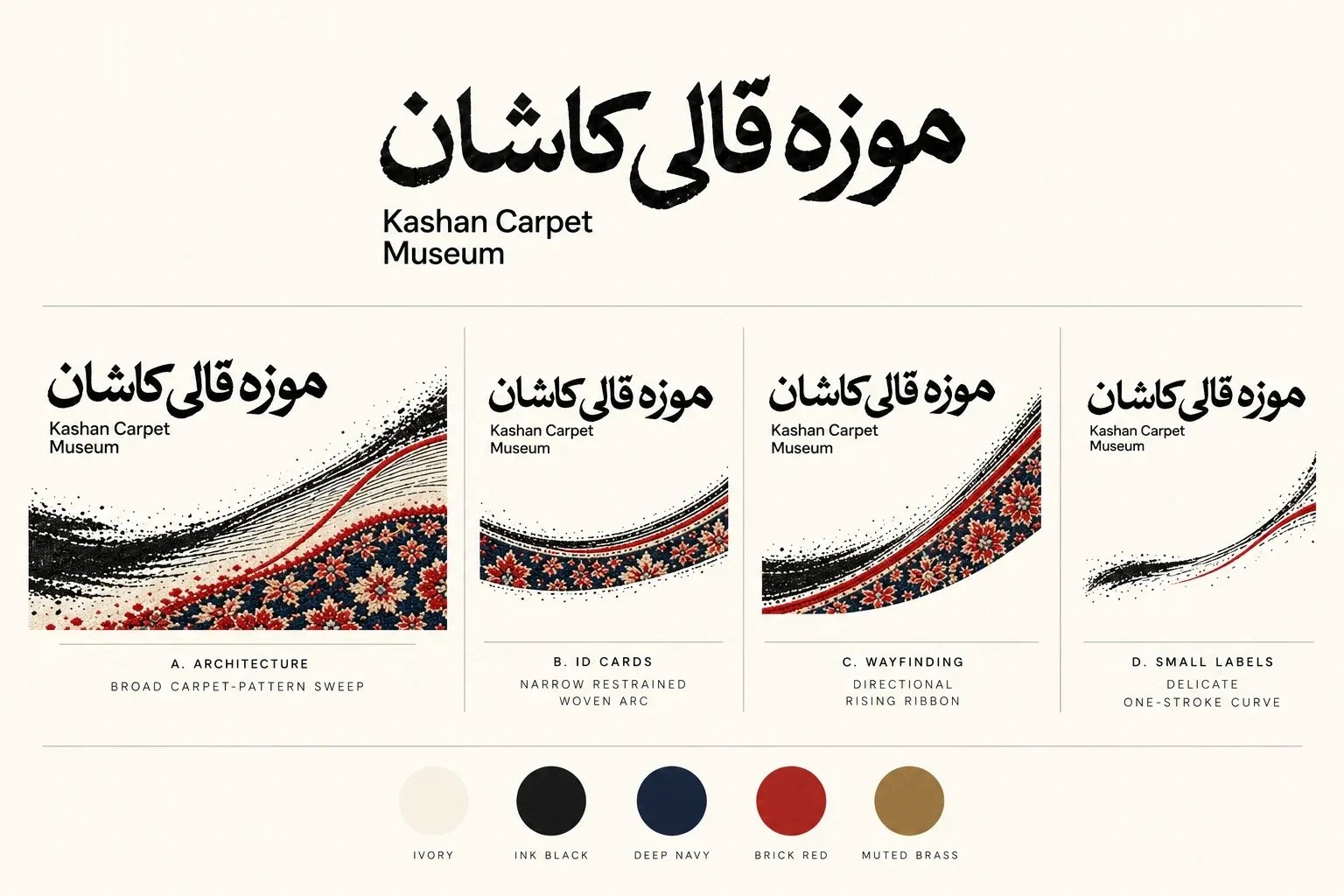
Commissioned by the Cultural Heritage Organization, the 2026 identity puts the carpet itself at the centre of Kashan Carpet Museum. The task was to give a diverse collection one visual voice without competing with the work on display. A restrained wordmark and a sweeping field of threads make the museum recognizable across spaces and printed objects.
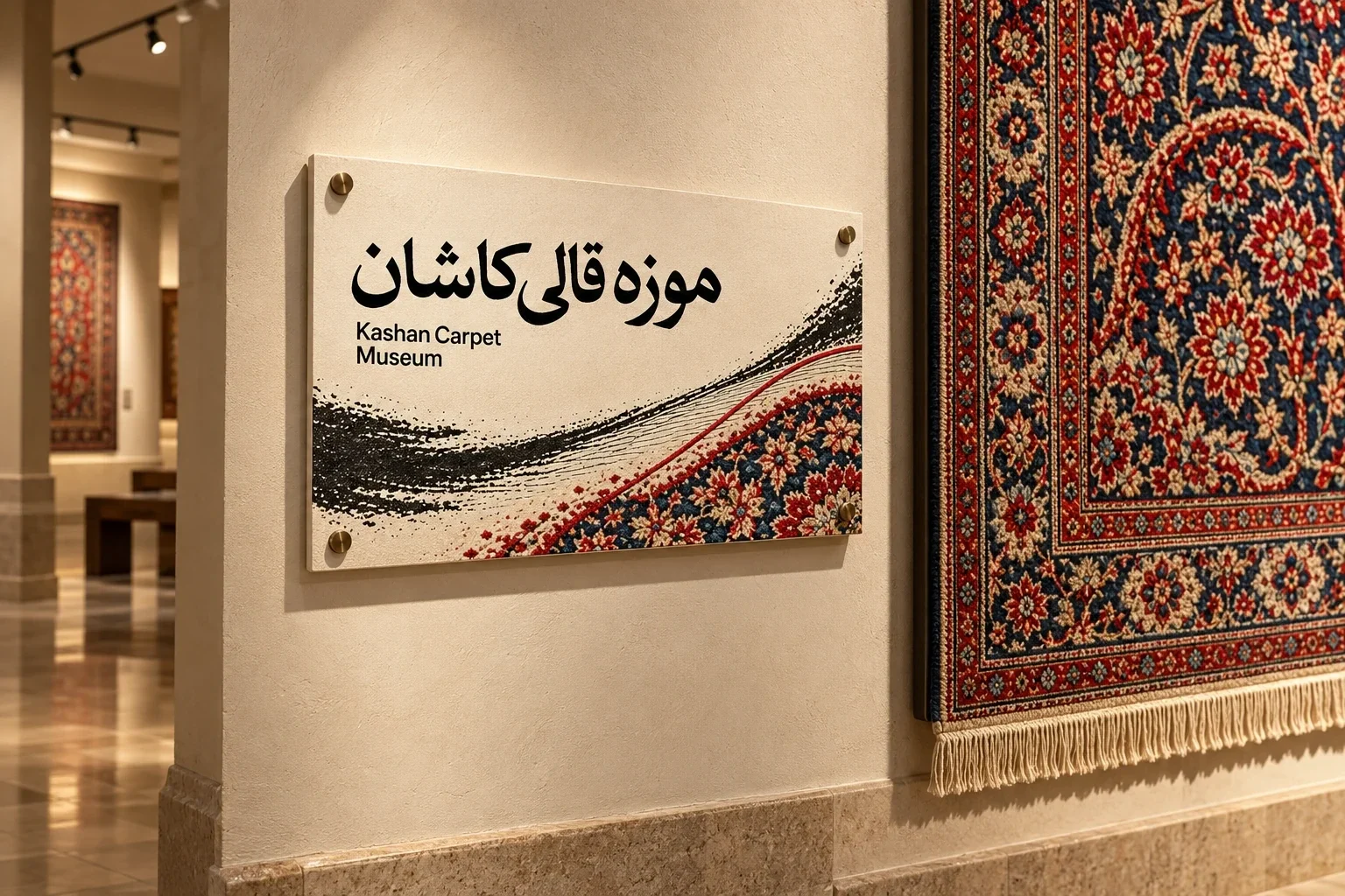
From loose thread to woven pattern
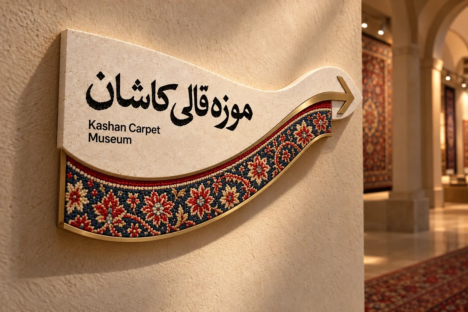
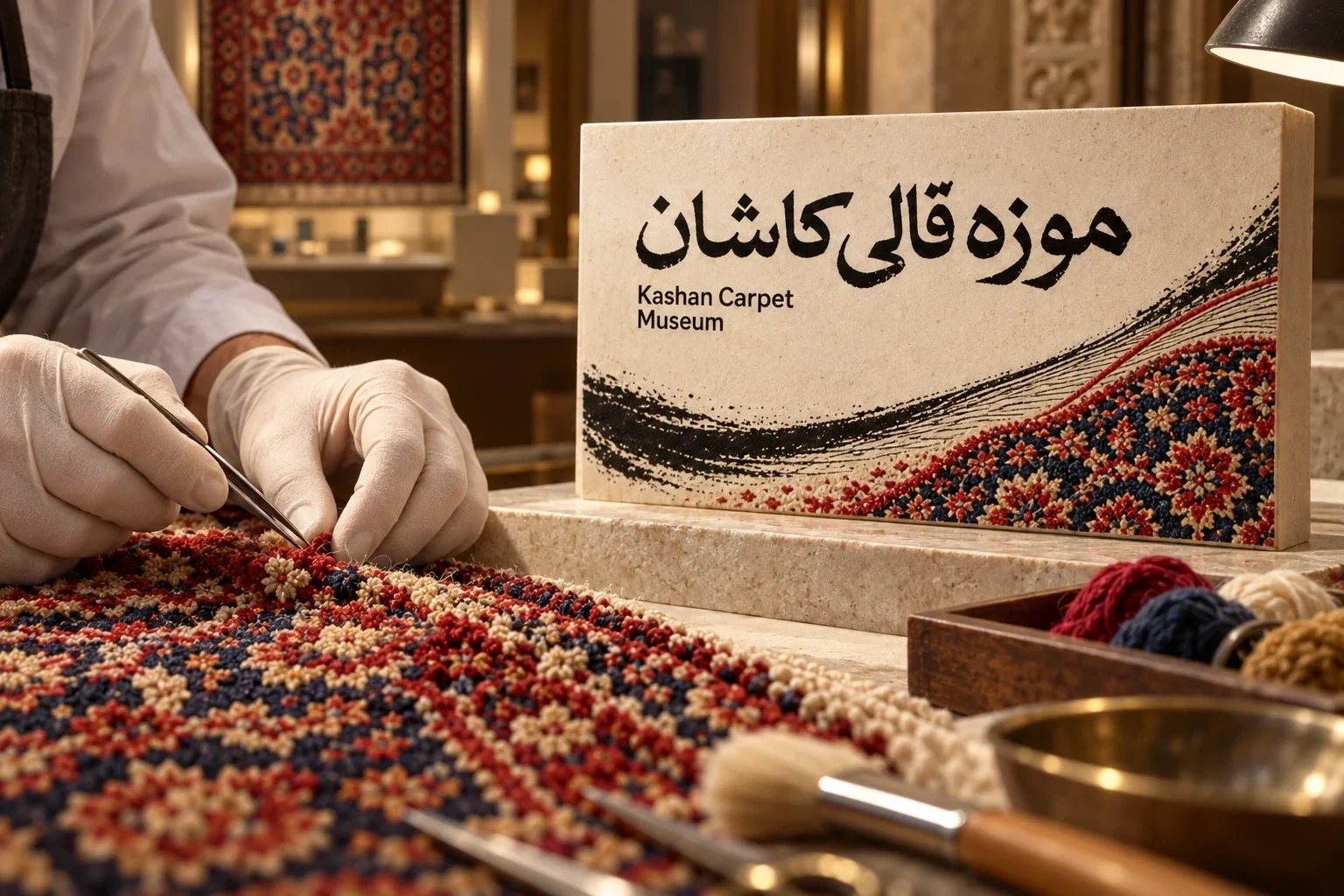
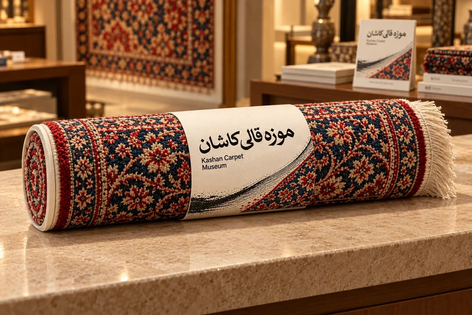
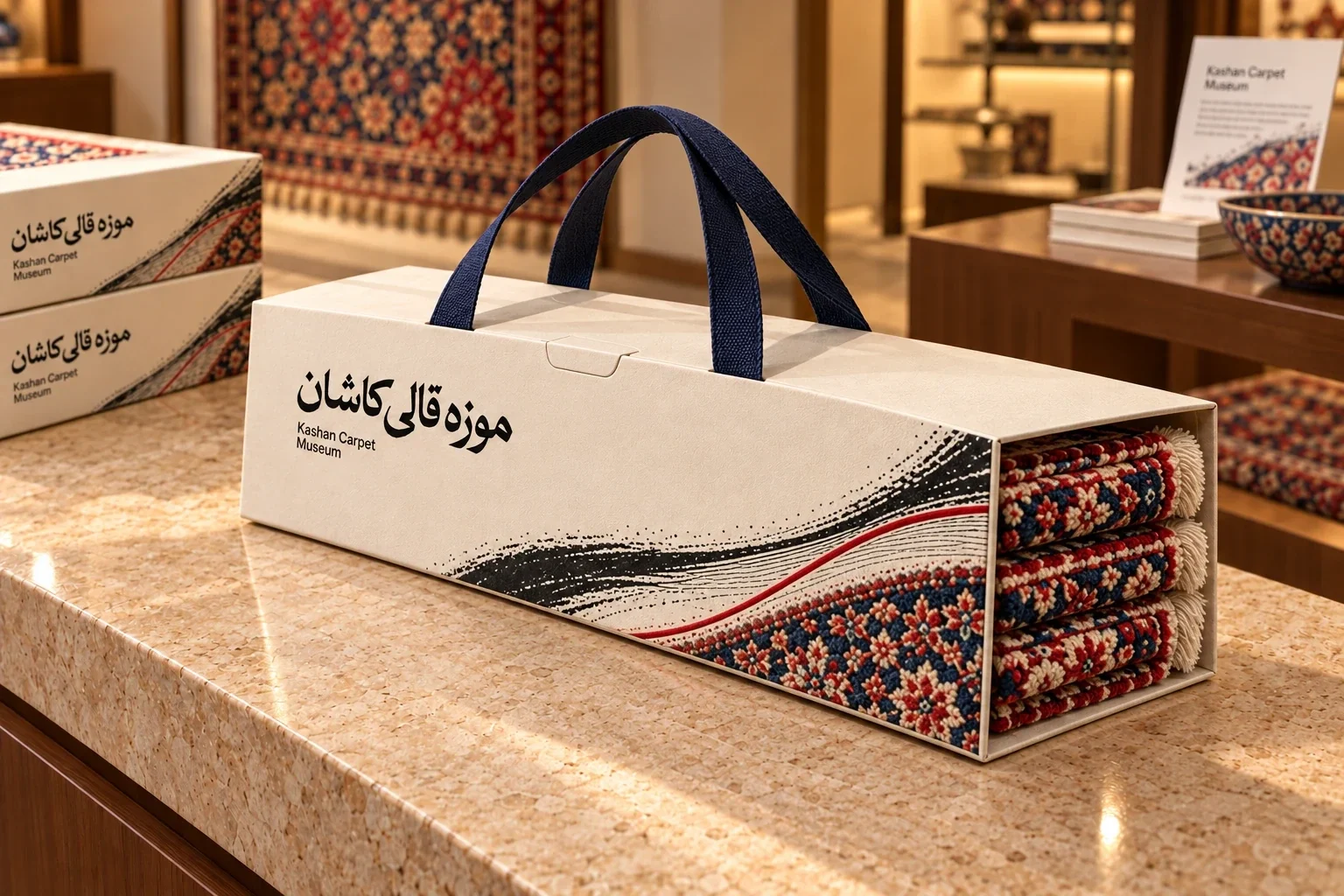
The main graphic begins as spare black strokes, then gathers into the red and navy pattern of a carpet border. That change of density lets the identity refer to making as well as the finished object. It can run along a wall sign, frame a label or fold around a package without losing its origin.
A clear path through the collection
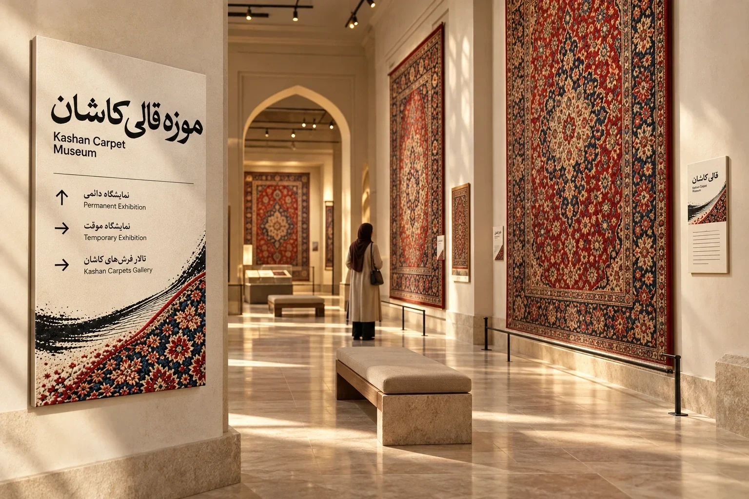
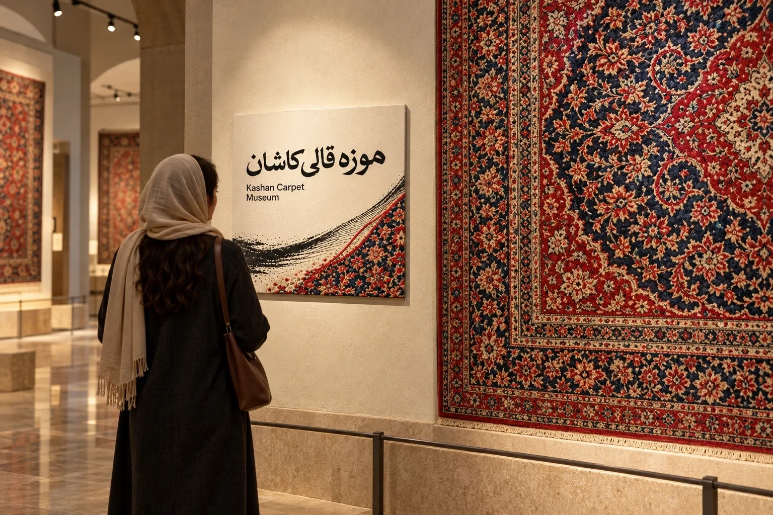
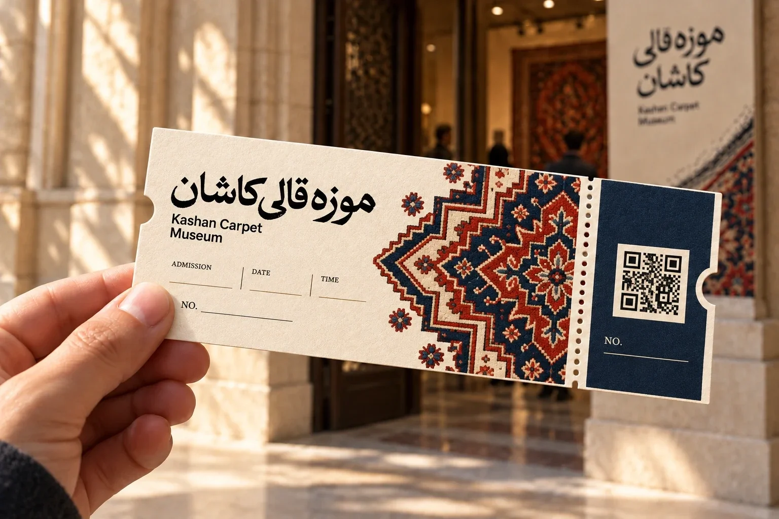
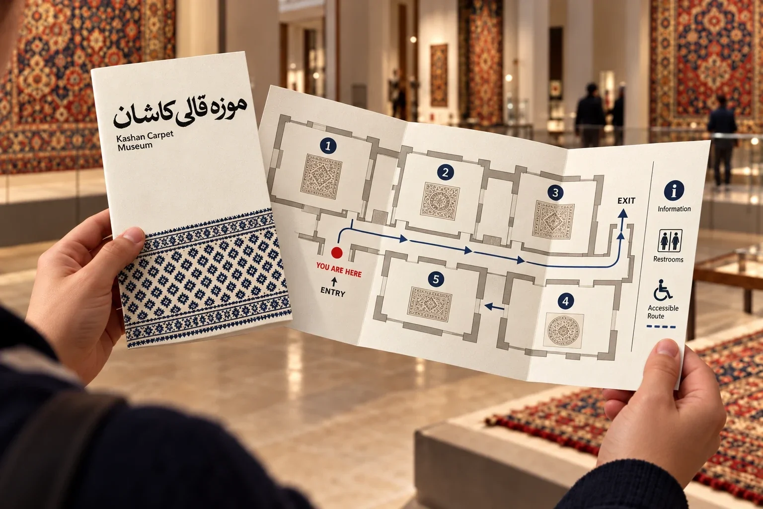
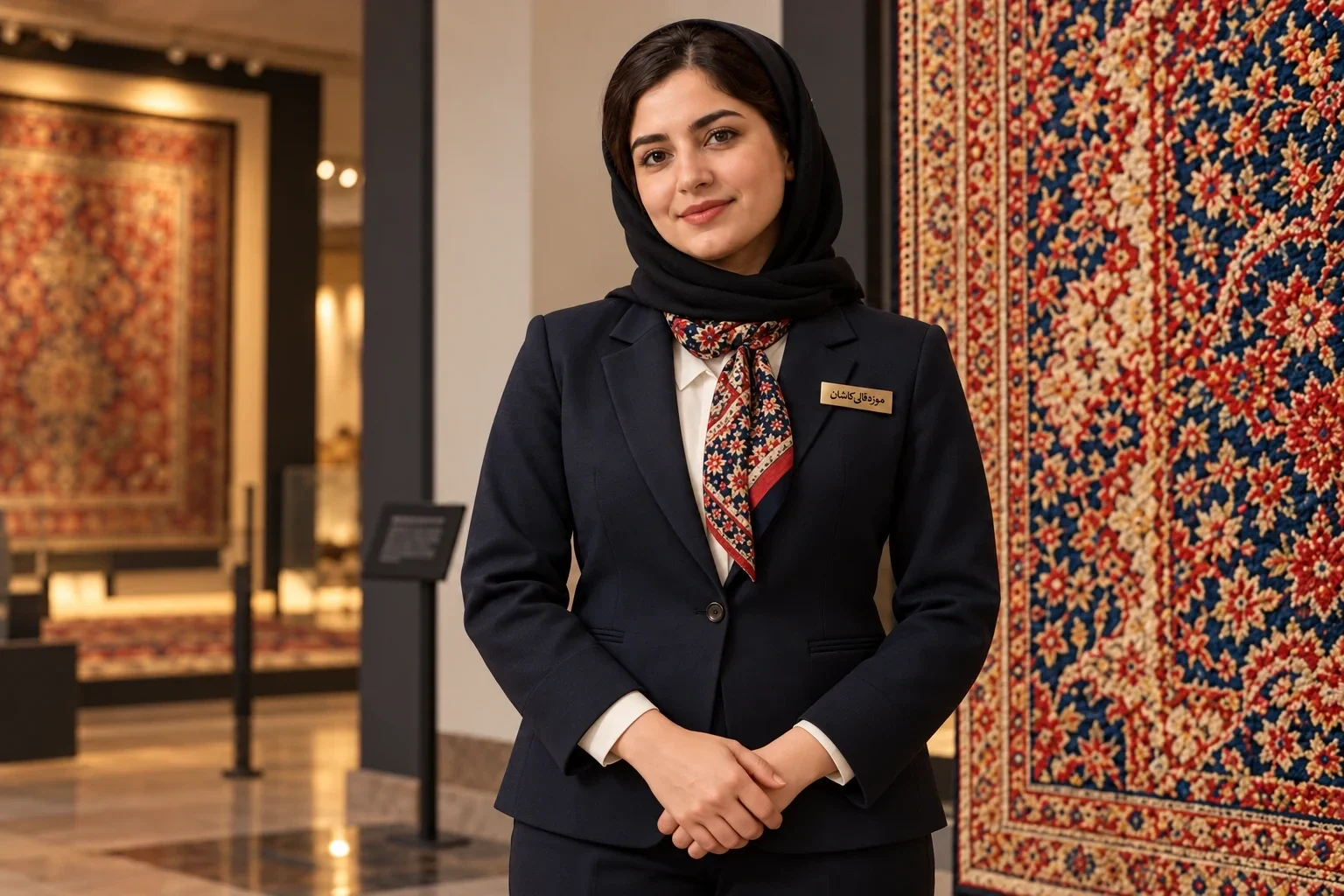
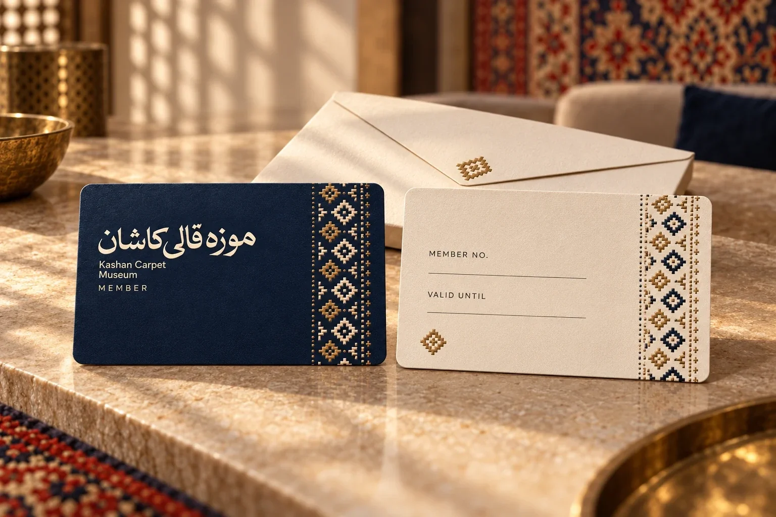
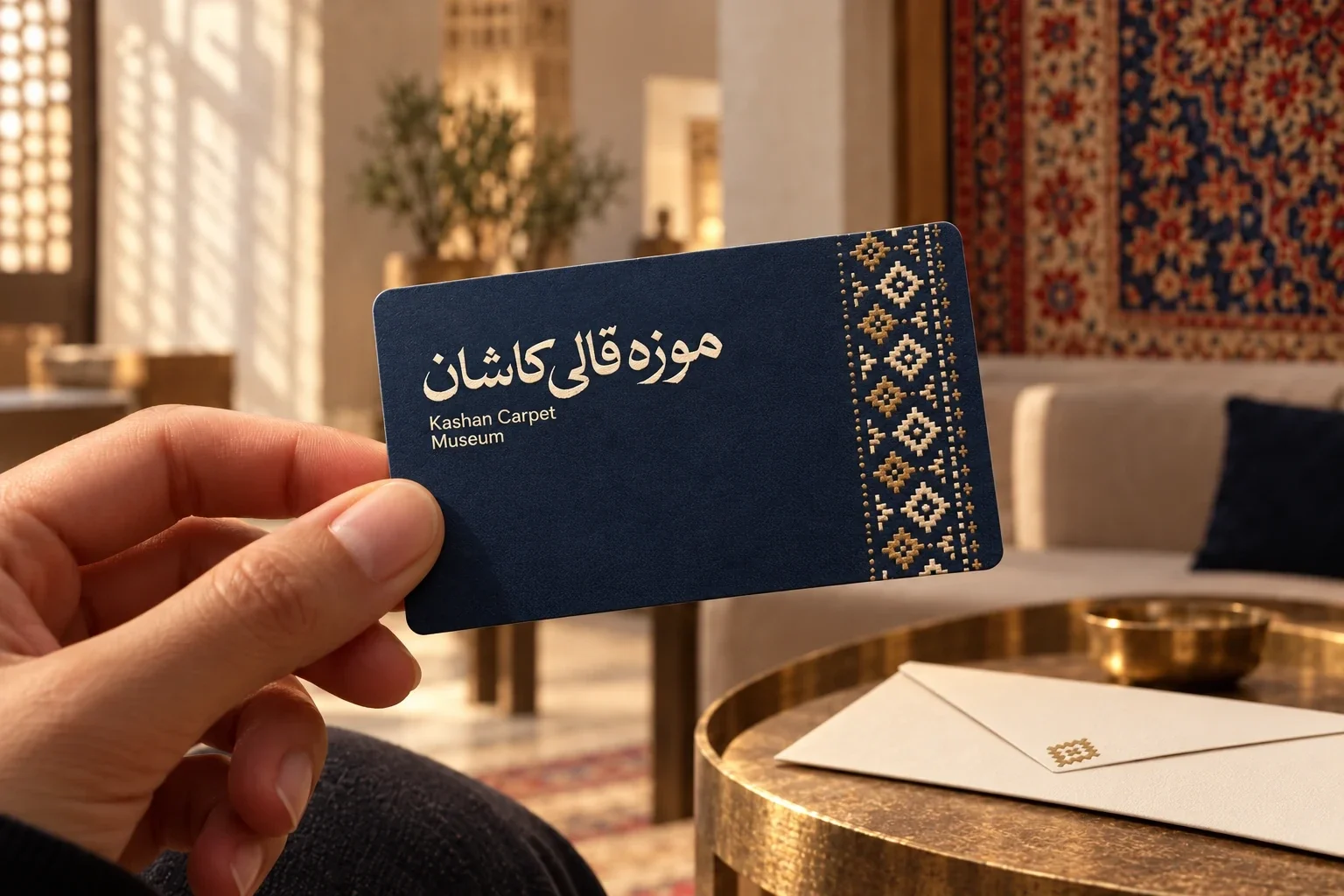
At the reception, the mark has room to breathe beside suspended carpets. In the galleries, it appears on wall panels and directional signs, while tickets and a fold-out map carry the same visual cues into the visitor’s hands. The hierarchy stays practical: museum name first, then the information needed in each moment.
Identity at the scale of the object
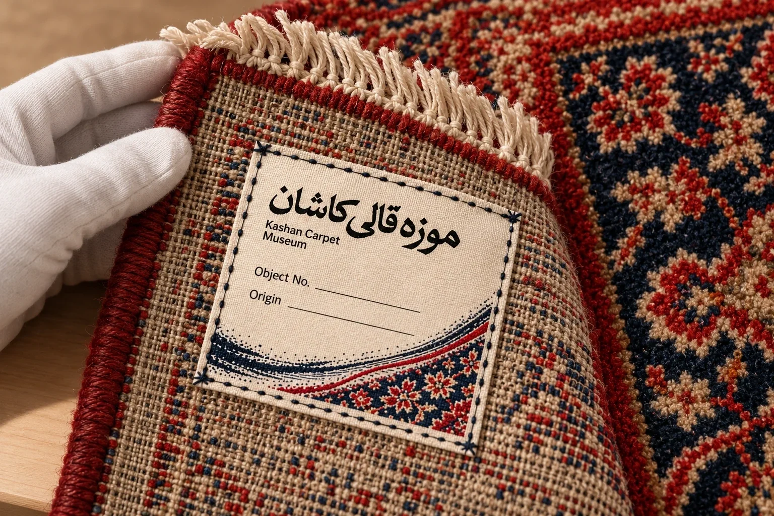
Provenance labels use the graphic close to the weave, where detail matters most. The same language also reaches the conservation workspace, staff clothing and working materials. These applications keep the museum identity connected to the people who care for and interpret the collection, not only to its walls.
A visual language visitors can take home
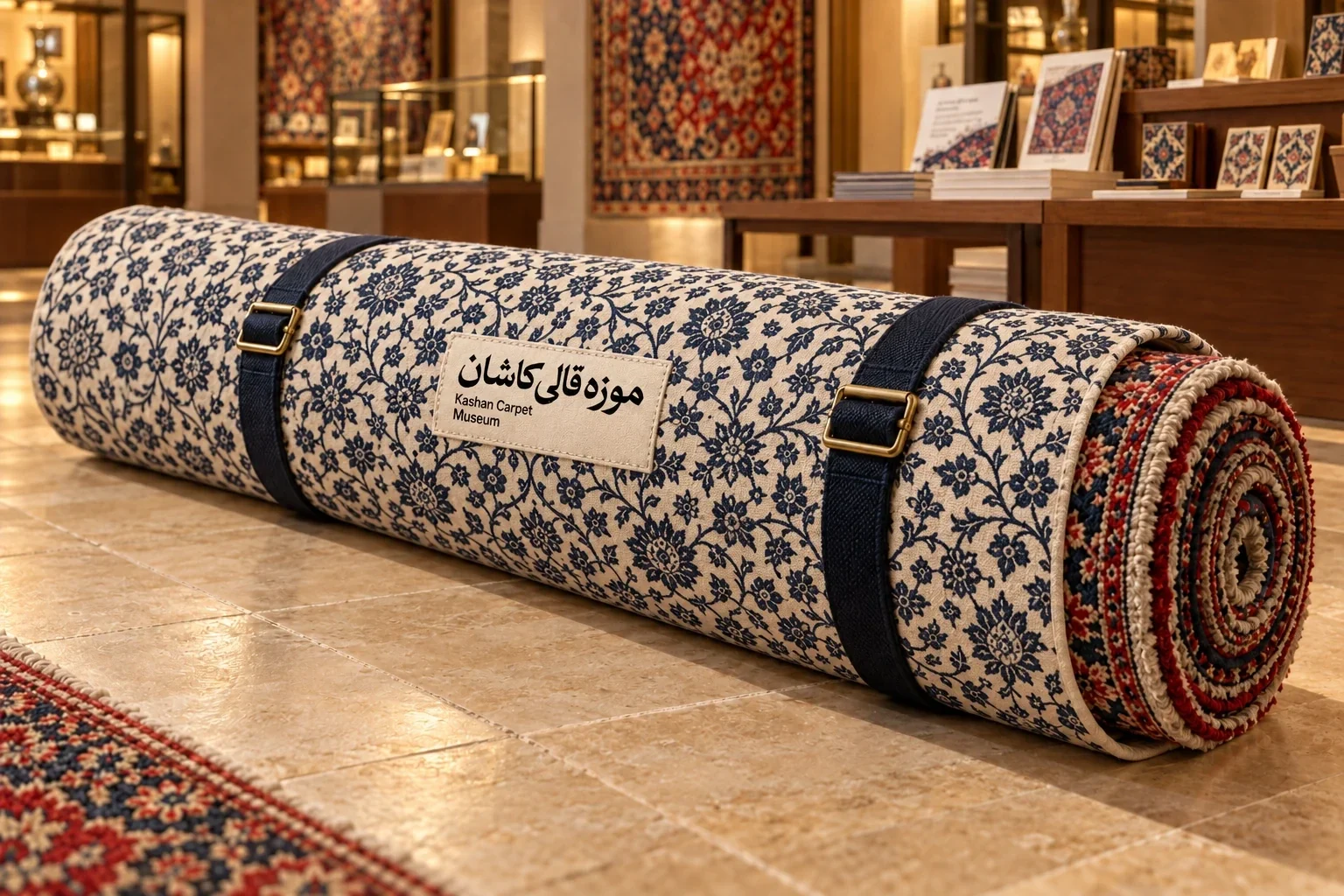
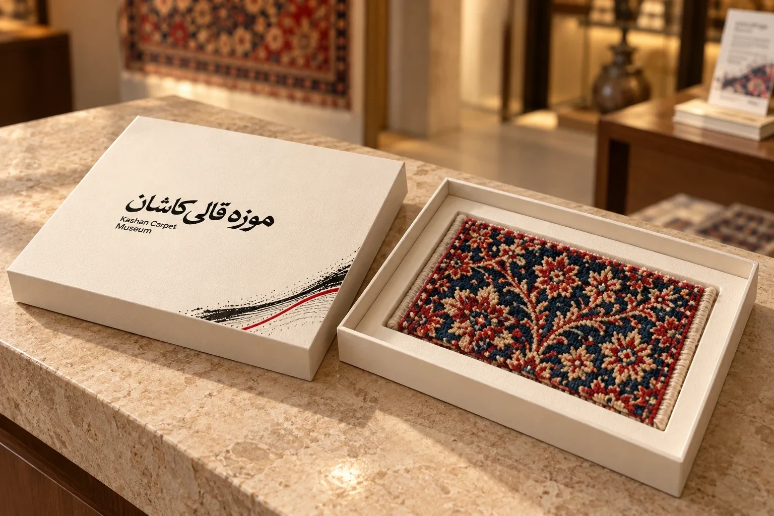
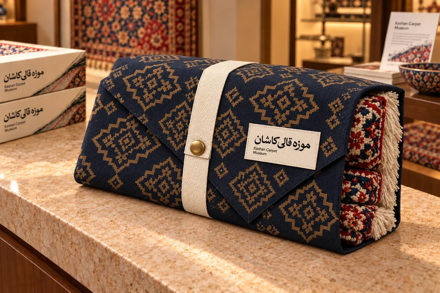
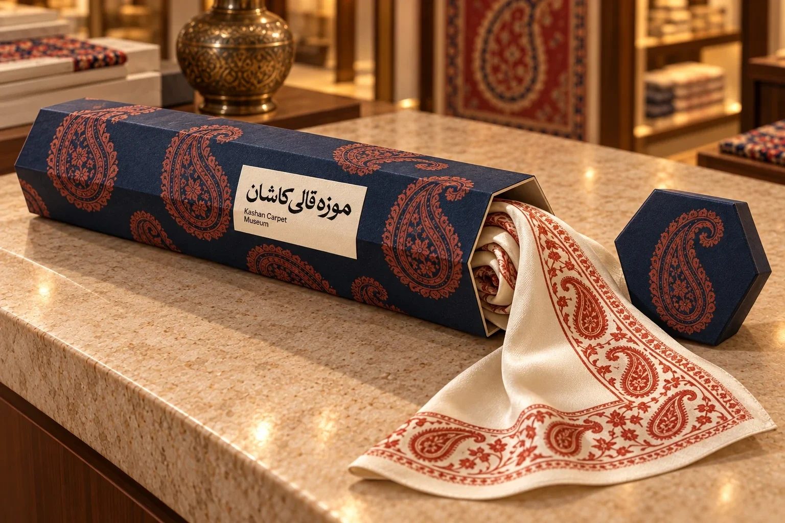
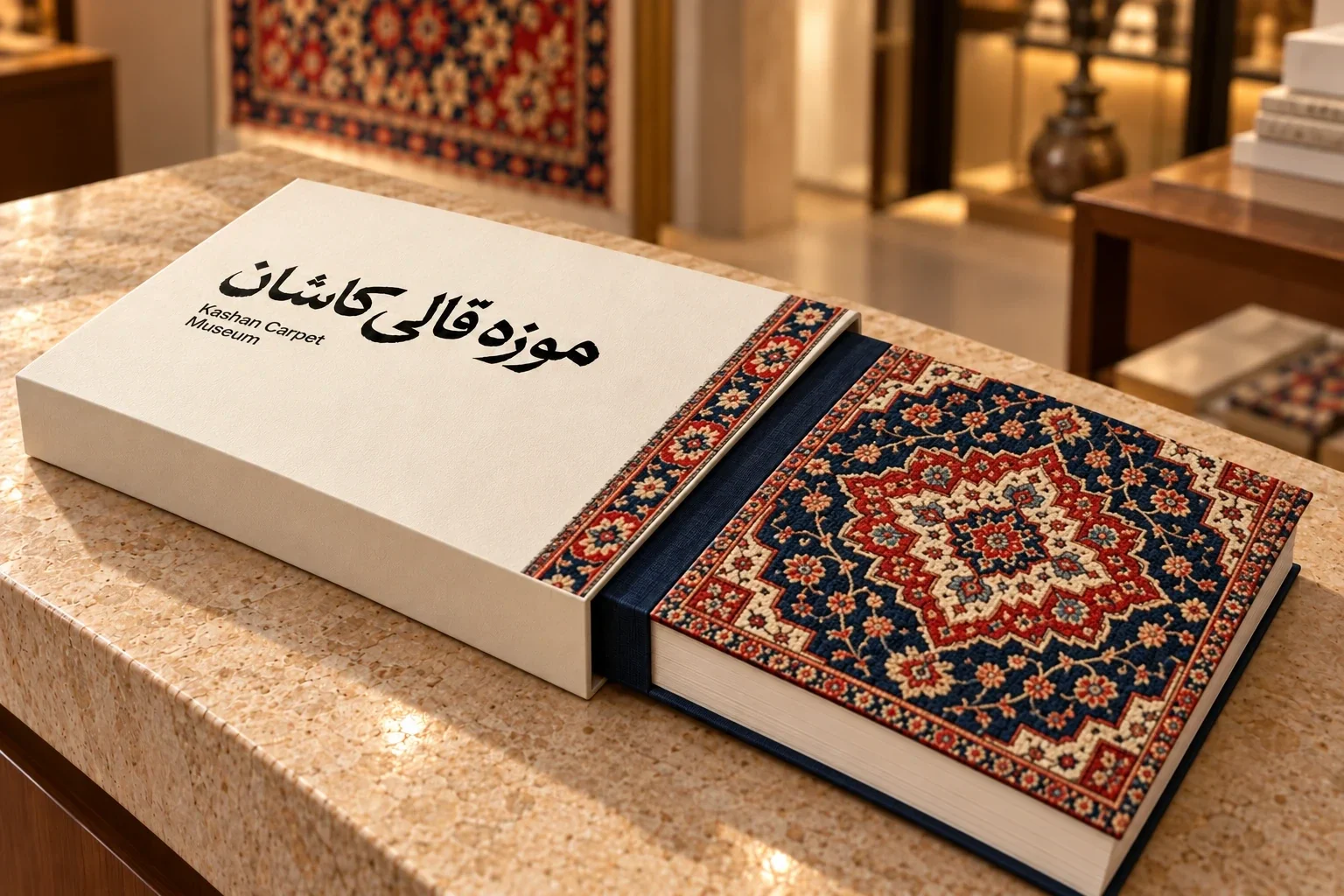
The museum’s retail pieces extend the system into boxes, sleeves, wraps and small keepsakes. The red and navy pattern gives each format a shared rhythm, while the quiet cream ground leaves room for the object and its name. The result is a family of applications with a consistent relationship to the gallery identity.
- Museum identity
- Environmental graphics
- Carpet heritage
- Kashan
- Wayfinding