Noctara — Follow the Unknown
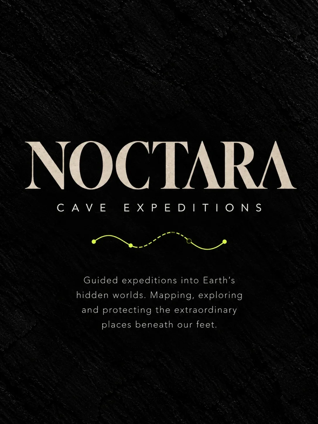
An identity for an international cave expedition brand, turning the thrill of discovery into a visible path through the underground world.
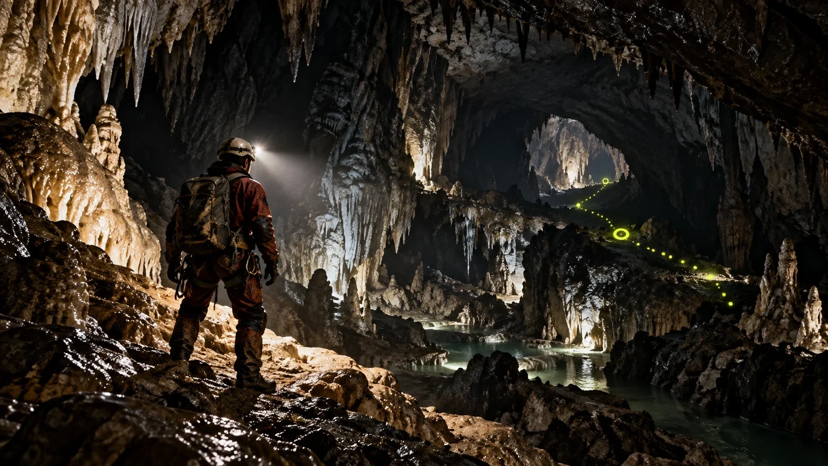
Noctara is an international brand organizing cave tours and exploratory experiences shaped by wonder and discovery.
The identity needed to hold two feelings together: the mystery of entering a cave and the clarity visitors need when following a guided route.
Brand identity design and art direction by Ali Komeili.
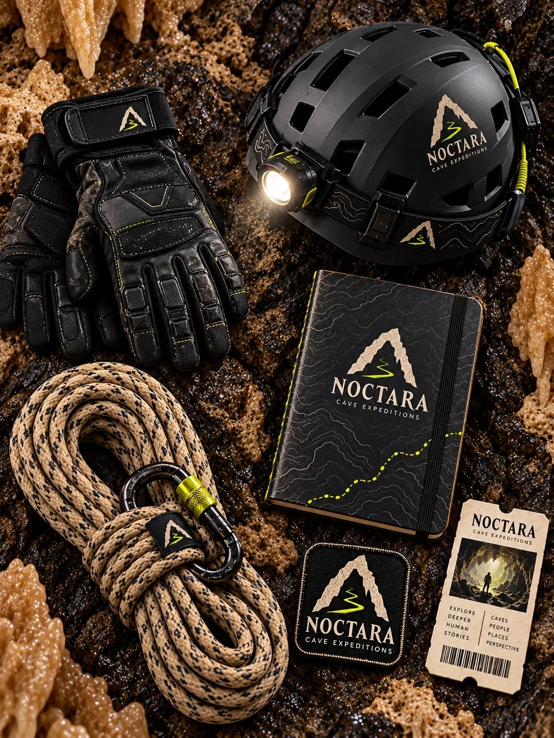
Logo, typography and color system, route graphics, equipment branding, entrance, guide station, uniforms and cave wayfinding.
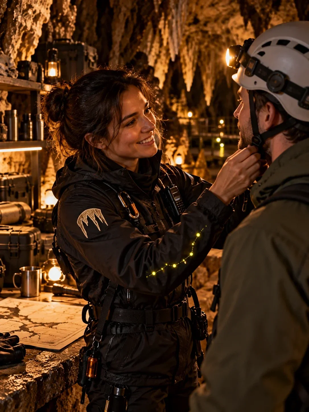
A connected identity now runs from the first entrance marker to guides, equipment and the route itself, making Noctara recognizable throughout the expedition.
Ali Komeili — designer and art director.
An invitation below the surface
Noctara organizes cave tours for people drawn to discovery and the wonder of the underground. The 2023 identity begins with a simple promise: follow a guided route into a world that feels unfamiliar, vivid and worth exploring. The brand had to make that invitation visible before the journey began.
The cave becomes a symbol
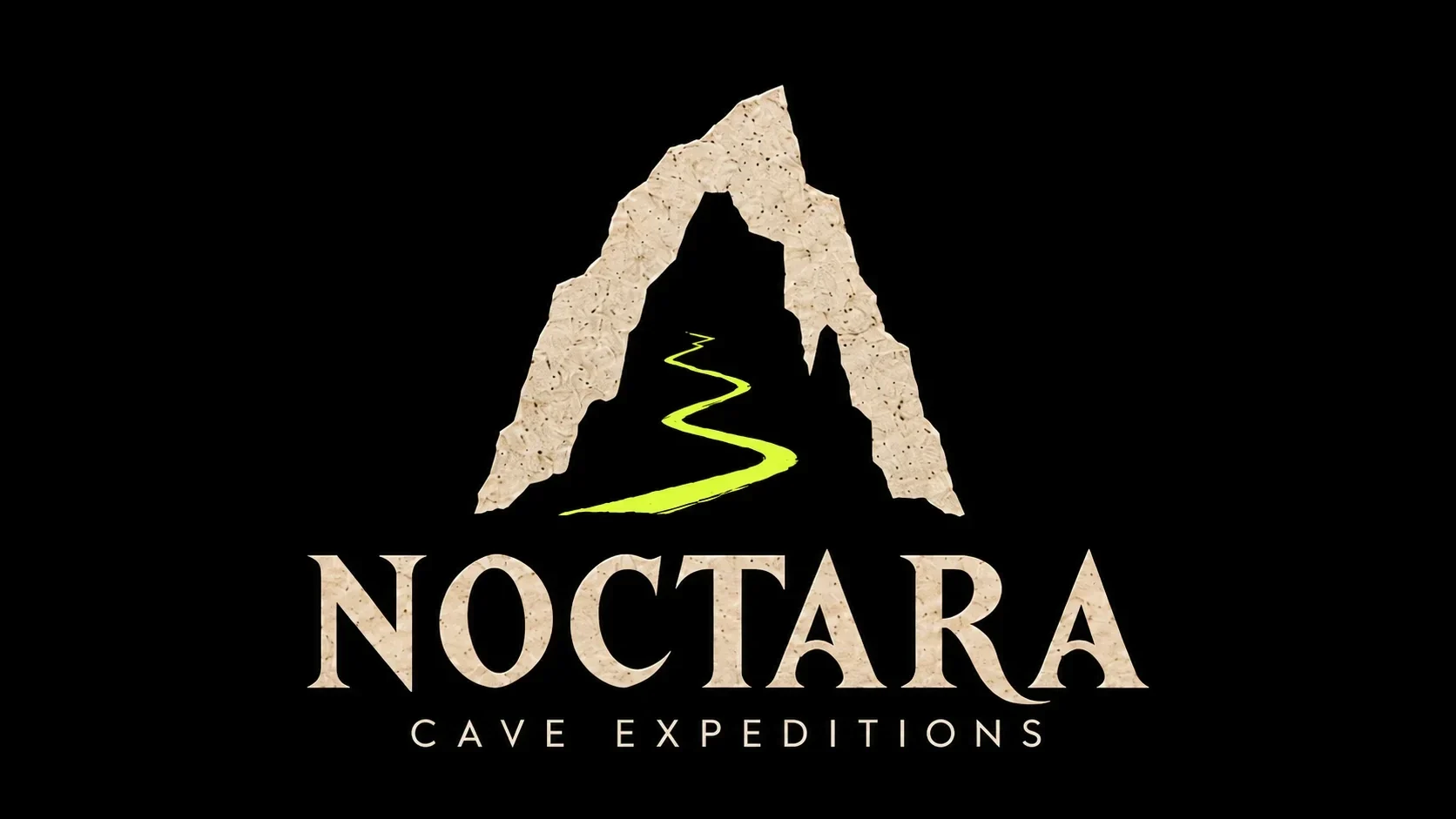
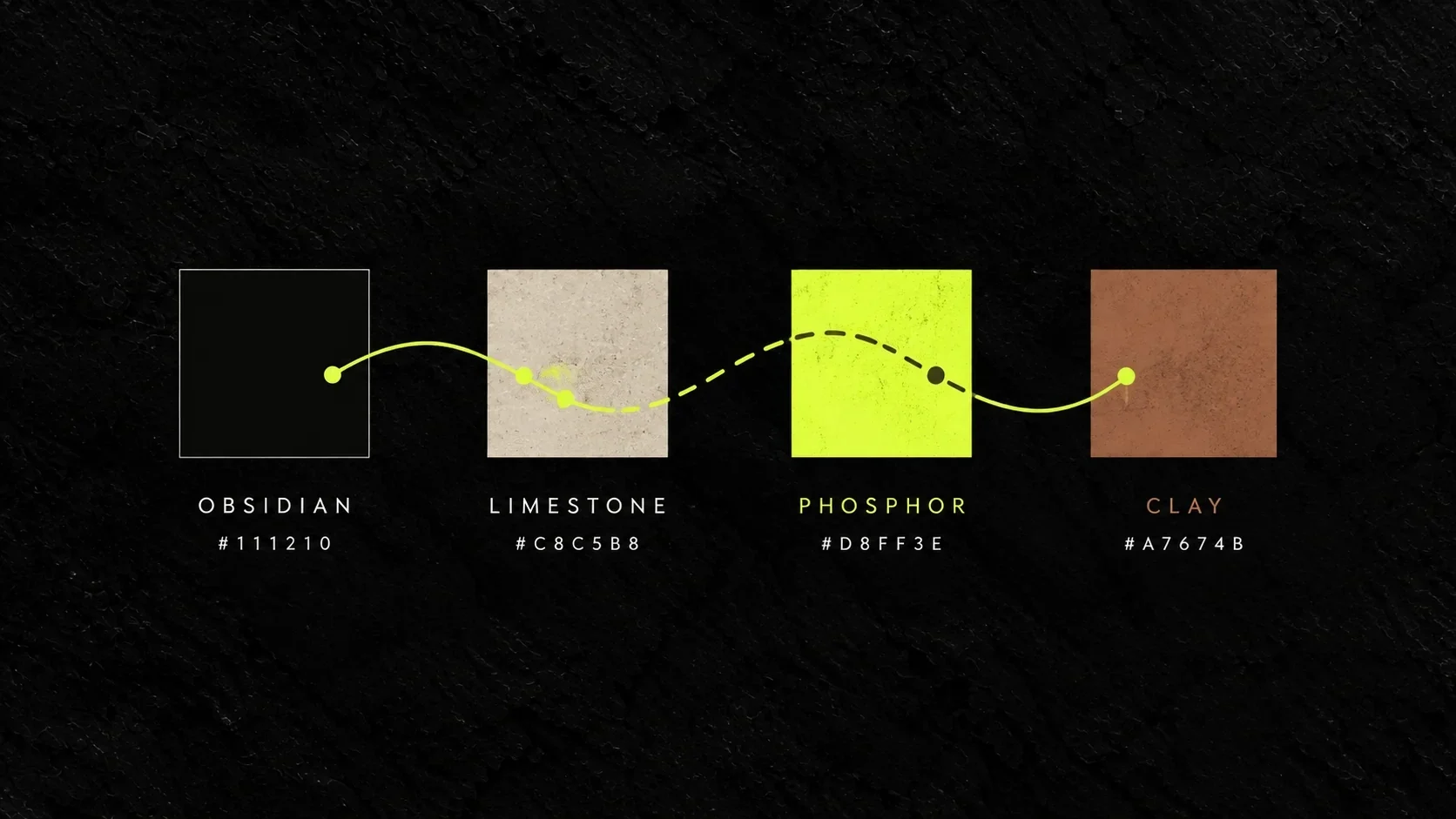
The mark frames a winding path inside the shape of a cave opening. Stone-toned lettering gives the name weight, while a bright phosphor line moves through the darkness. Together they hold the brand’s two essential qualities: the age of the landscape and the energy of stepping into it.
A line to follow
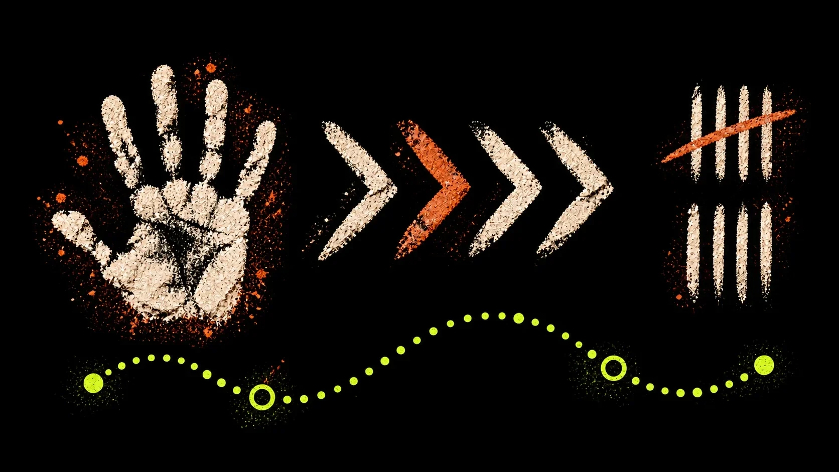
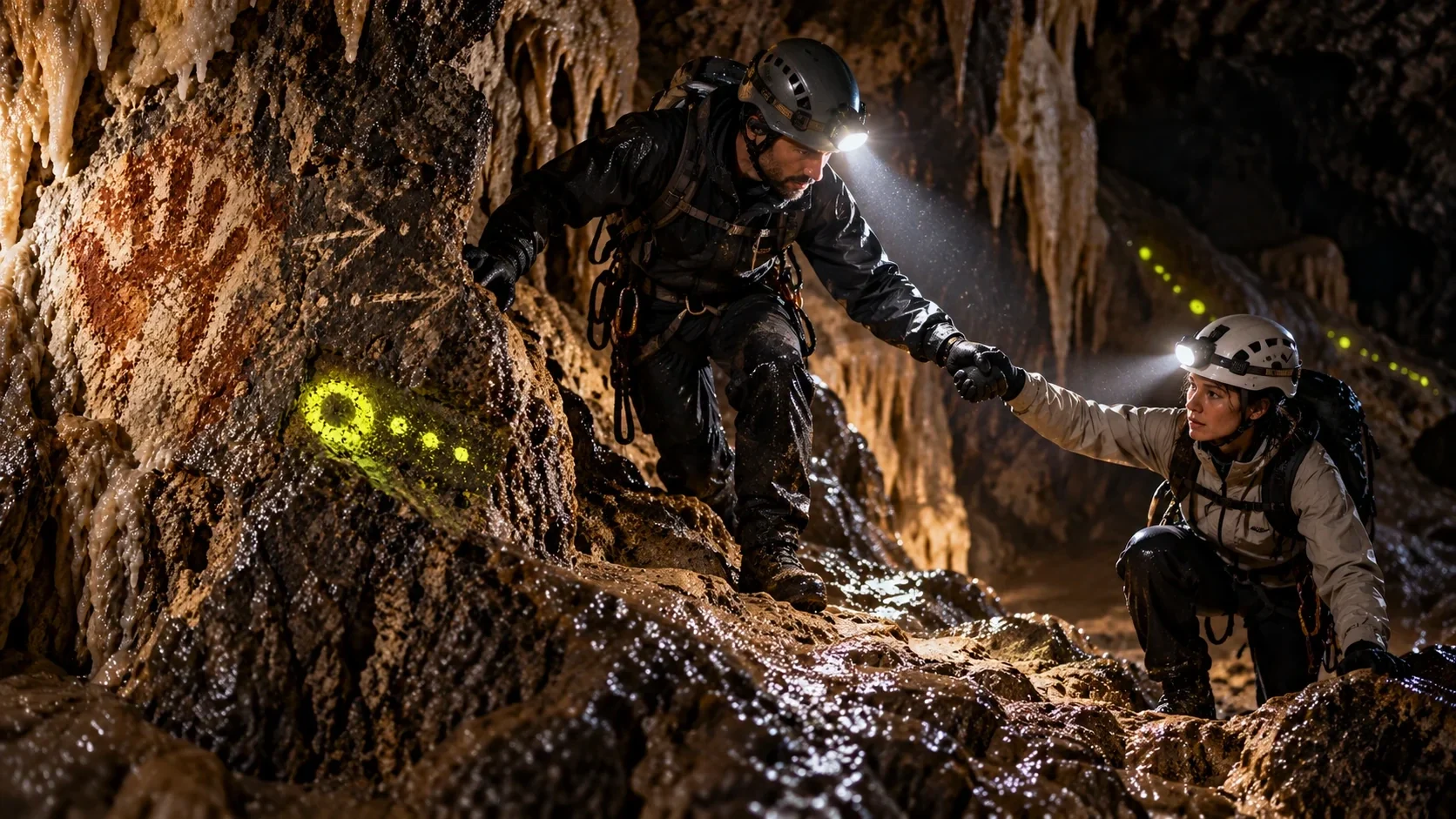
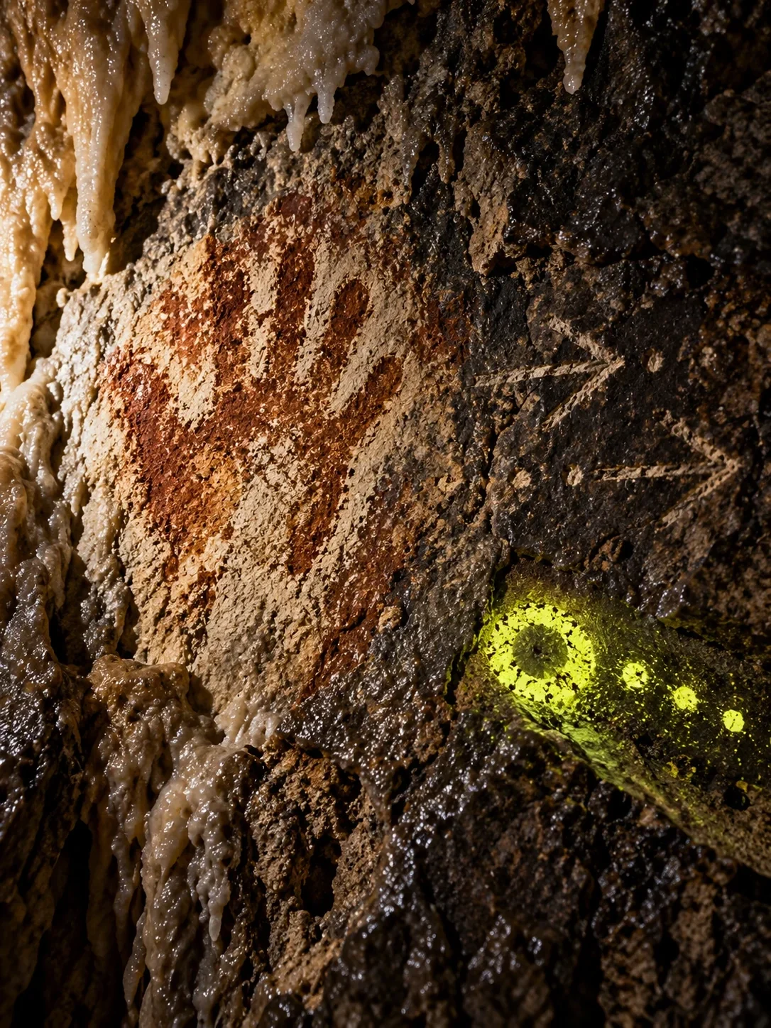
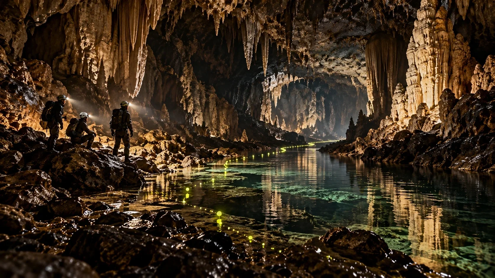
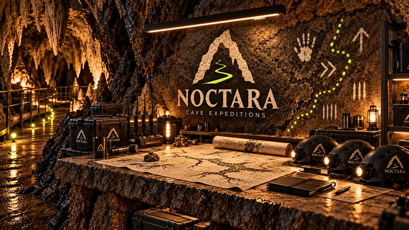
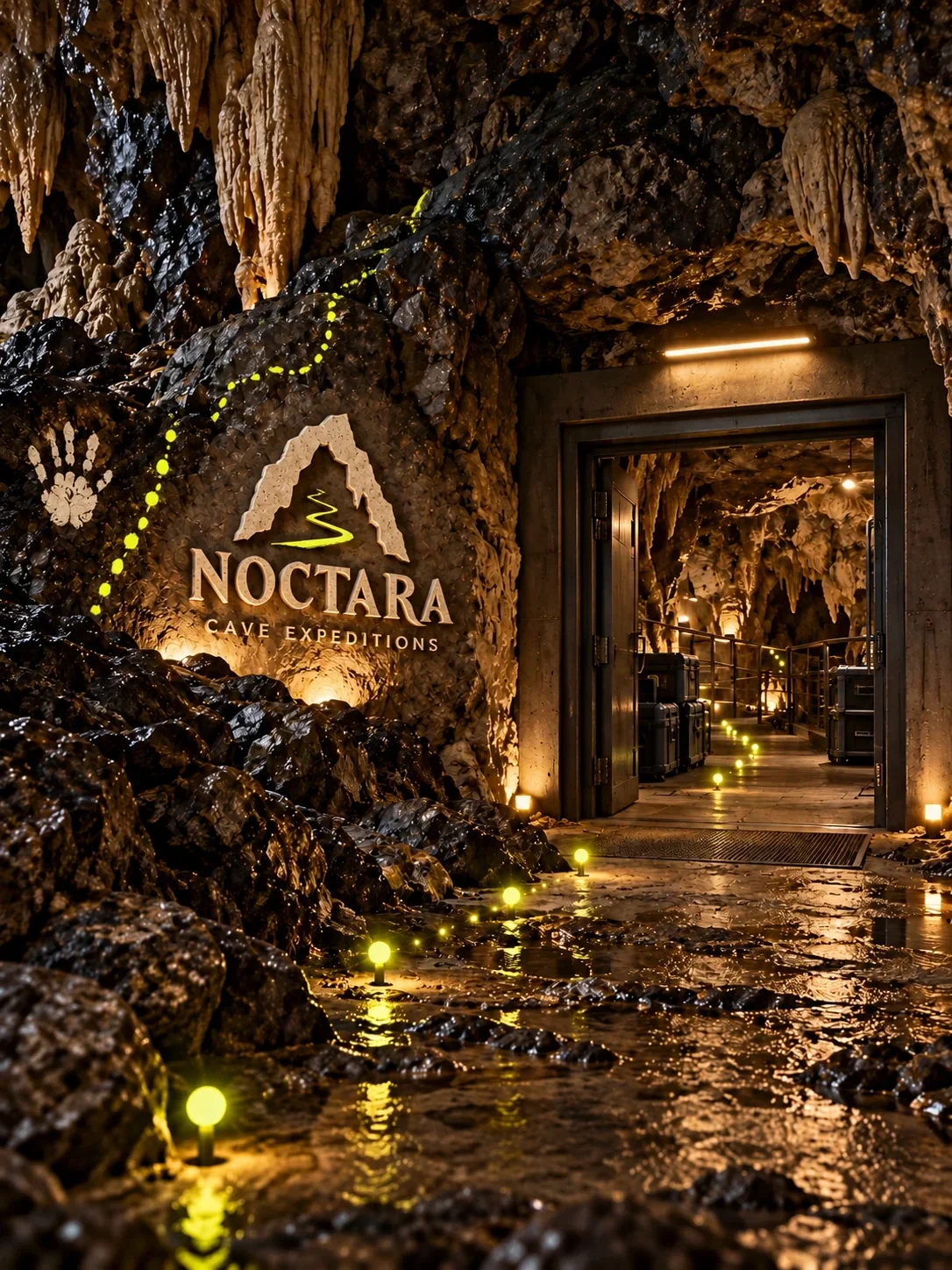
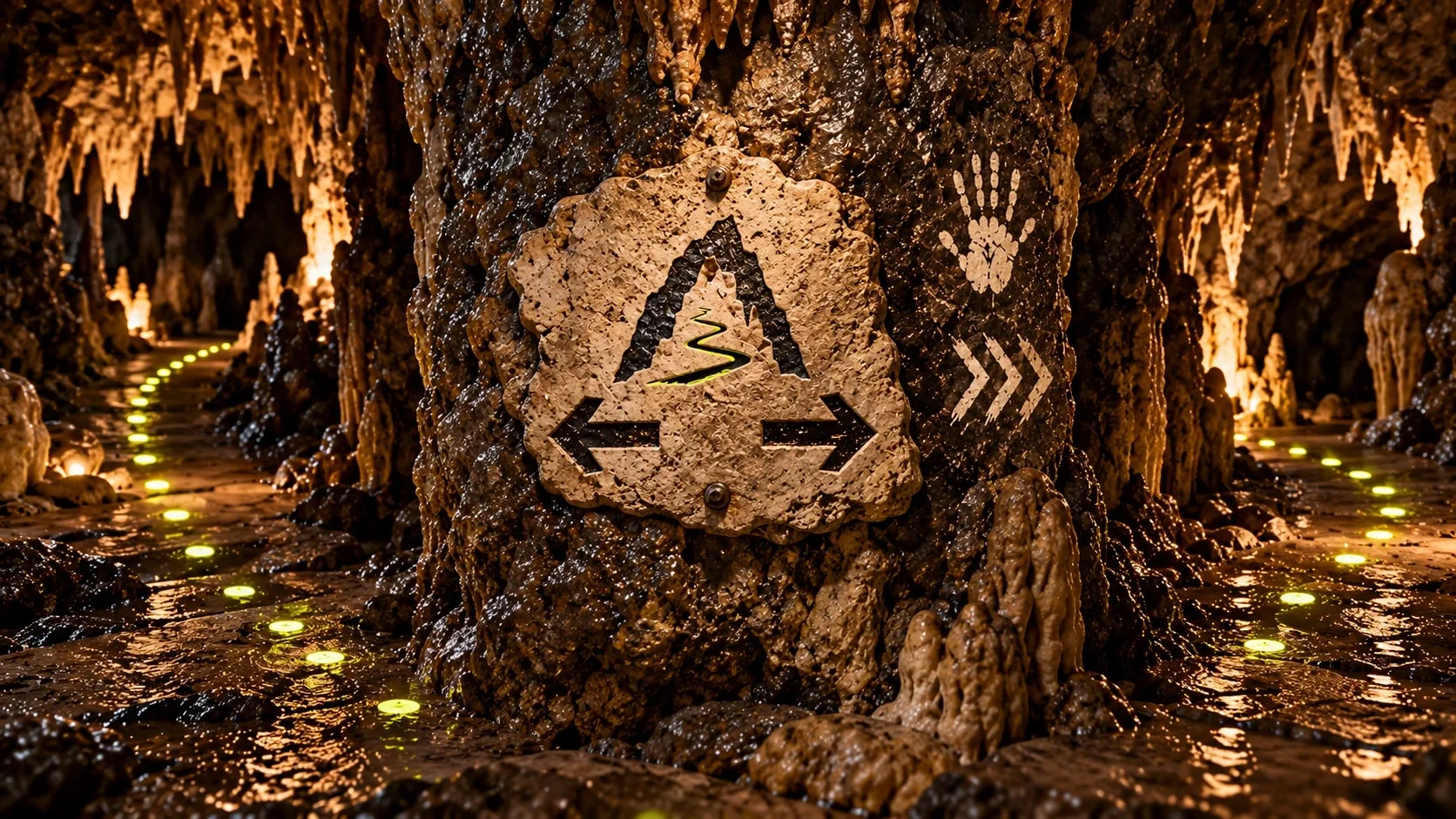
The dotted phosphor trail acts like a thread across the expedition. It moves from the graphic system into cave imagery, passing ancient handprints and directing attention toward the next opening. Arrows and textured marks bring a human trace into the visual language without competing with the landscape.
The identity joins the expedition
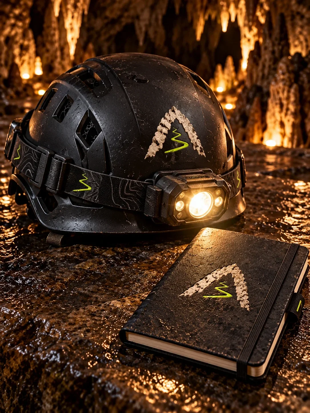
At the entrance and guide station, the cave mark gives visitors a clear point of arrival. The same signs carry through helmets, ropes, notebooks and uniforms; inside the cave, arrows and the glowing trail become the most direct expressions of the brand. Each touchpoint feels part of the same guided experience.
A world with one trail
The completed system connects the logo, visual language and on-site applications through a single route motif. From the first threshold to the equipment in a guide’s hands, Noctara presents exploration as an organized journey with room for mystery.
- cave expedition branding
- adventure travel identity
- cave wayfinding
- experiential brand design