ORVEN — Spaces for a brighter tomorrow
A real estate identity for Turkey, shaped by a faceted monogram, spacious serif type and a coastal palette.
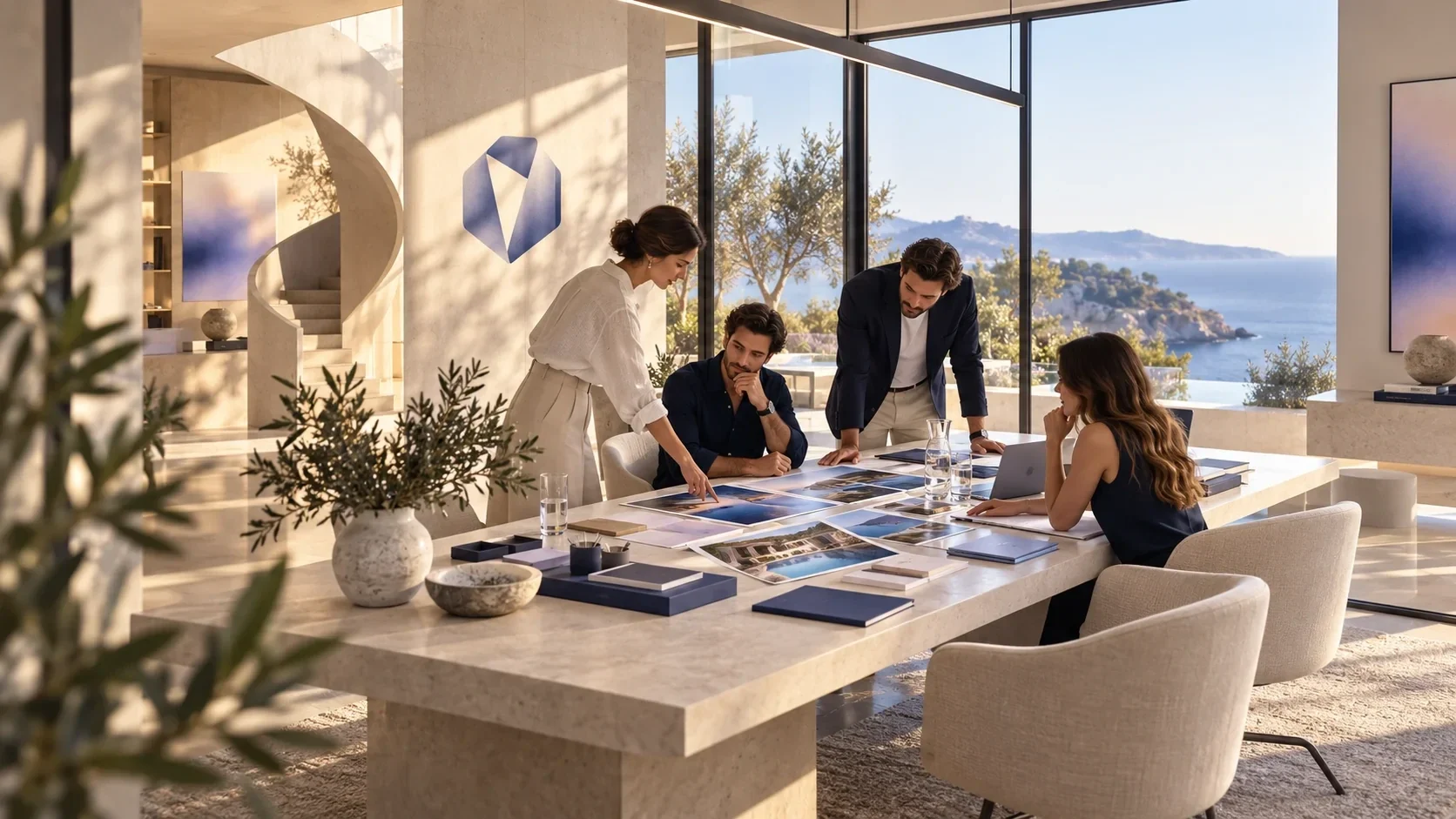
ORVEN is a real estate brand in Turkey, presented through residential properties, private viewings and client-facing spaces.
ORVEN needed an identity that could frame distinctive properties and a personal client experience without reducing the brand to a familiar house icon.
Visual identity design and art direction by Ali Komeili.
Logo and wordmark, color and typography system, graphic language, property presentation, signage, apparel and stationery.
The identity connects property imagery, presentation materials and client-facing spaces through the same geometric mark, serif wordmark and navy-to-lavender palette.
Ali Komeili — designer and art director.
A place begins with a point of view
ORVEN is a real estate brand in Turkey. The identity frames property as a relationship between people, places and possibility, echoing the language visible in its brand materials. Coastal residences and interiors give the system its setting, while the mark and typography keep the brand present without overwhelming the spaces.
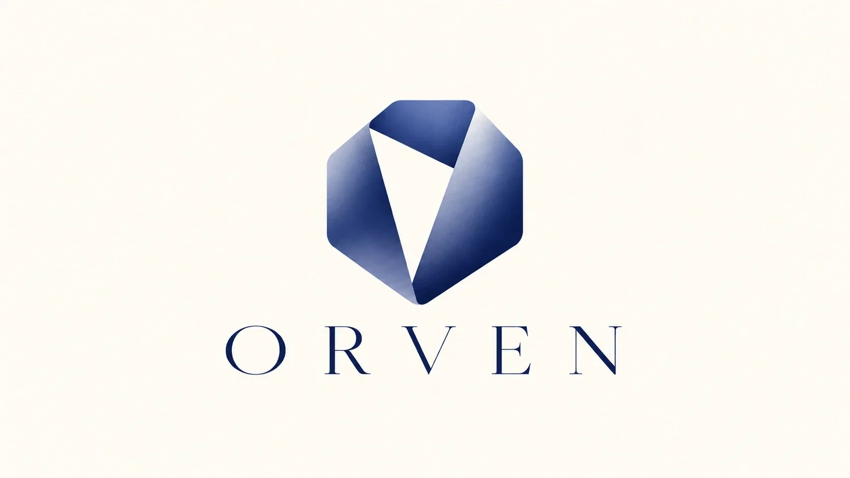
A mark with room inside
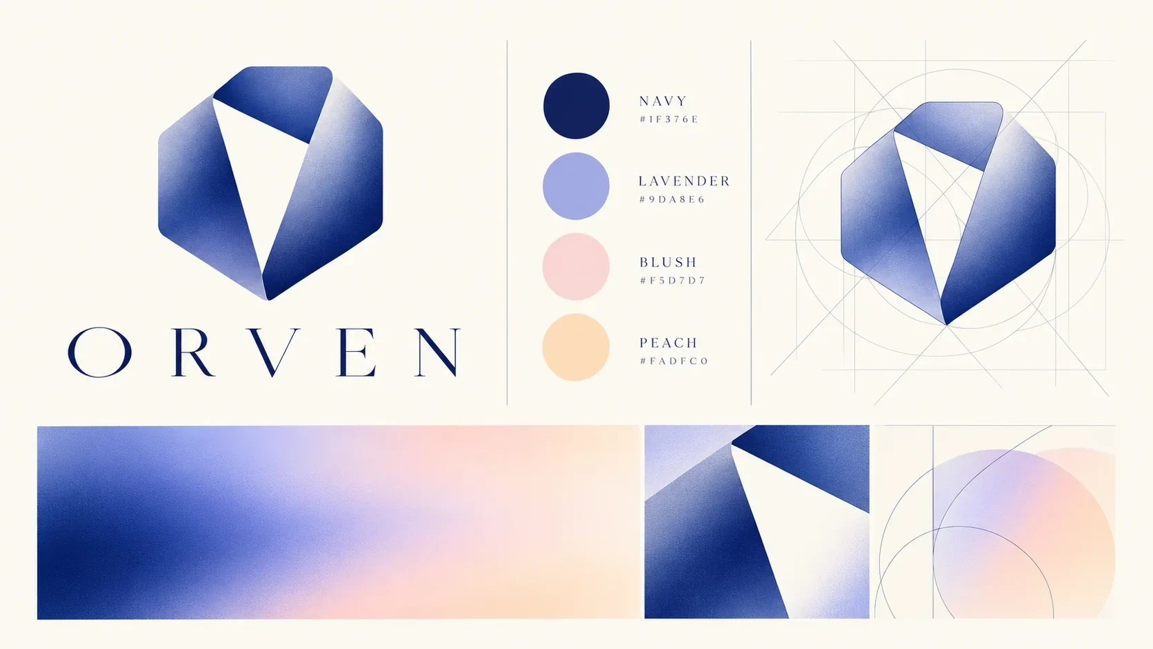
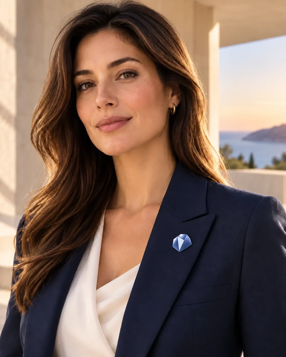
A faceted blue form holds a sharp white opening at its centre. It can be read as a V, a doorway or a view through architecture. That ambiguity gives ORVEN a symbol that feels spatial while staying compact enough for a wall sign, lapel pin or document cover.
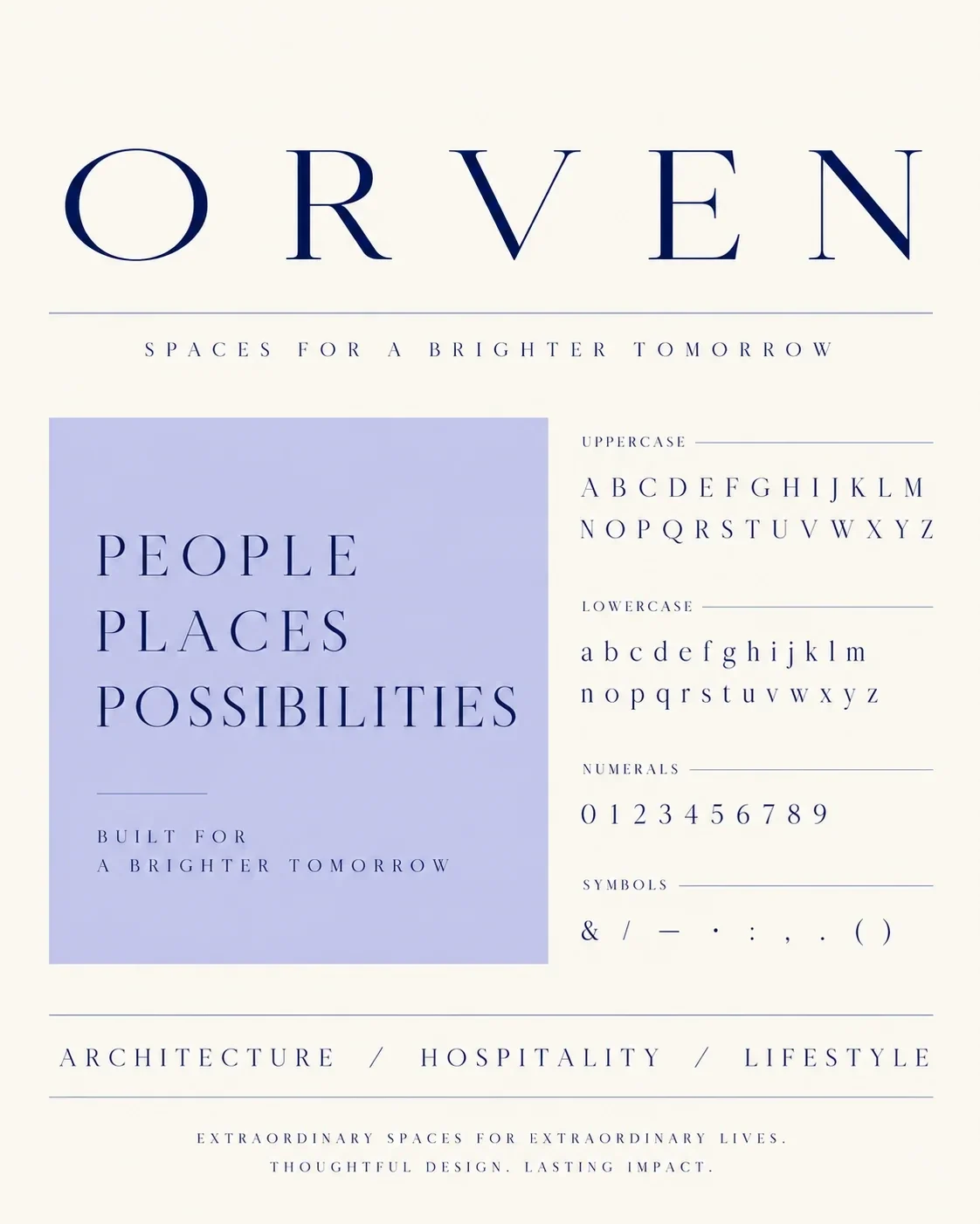
Typography with an architectural pace
Wide-spaced serif letters give the ORVEN name a measured rhythm. The restrained line of “Spaces for a brighter tomorrow” sits beneath it, while “People. Places. Possibilities.” offers a more expressive editorial voice. This hierarchy gives property information and photographs room to lead.
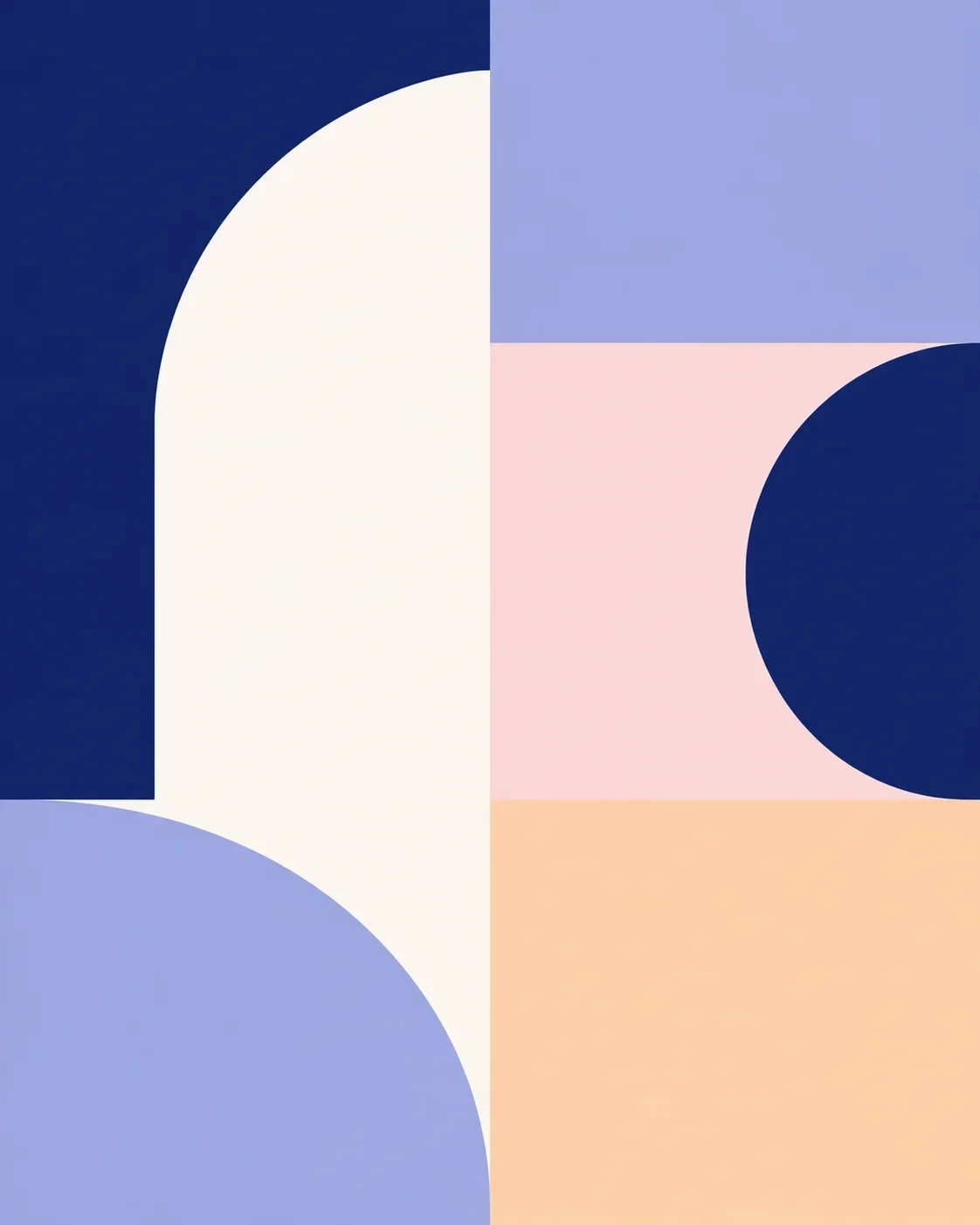
Color that follows the light
Deep navy anchors the identity; lavender, blush and peach soften it. Gradients move between those colors as light changes across the coastal imagery. The palette gives ORVEN a recognizable visual temperature across quiet stationery, large graphic panels and interior applications.
Geometry beyond the logo
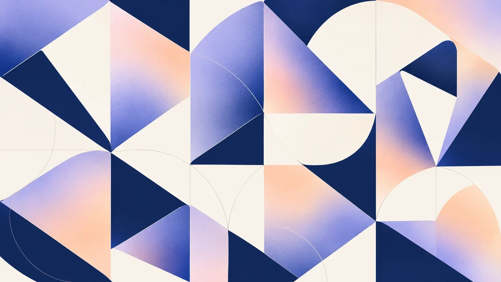
The monogram’s curved edges, angled cuts and open centre are unfolded into a graphic language. Repeated circles and triangular facets make patterns that can fill a wall or crop into a small card. The system stays related to the logo without simply repeating it at every scale.
Property imagery with space to breathe
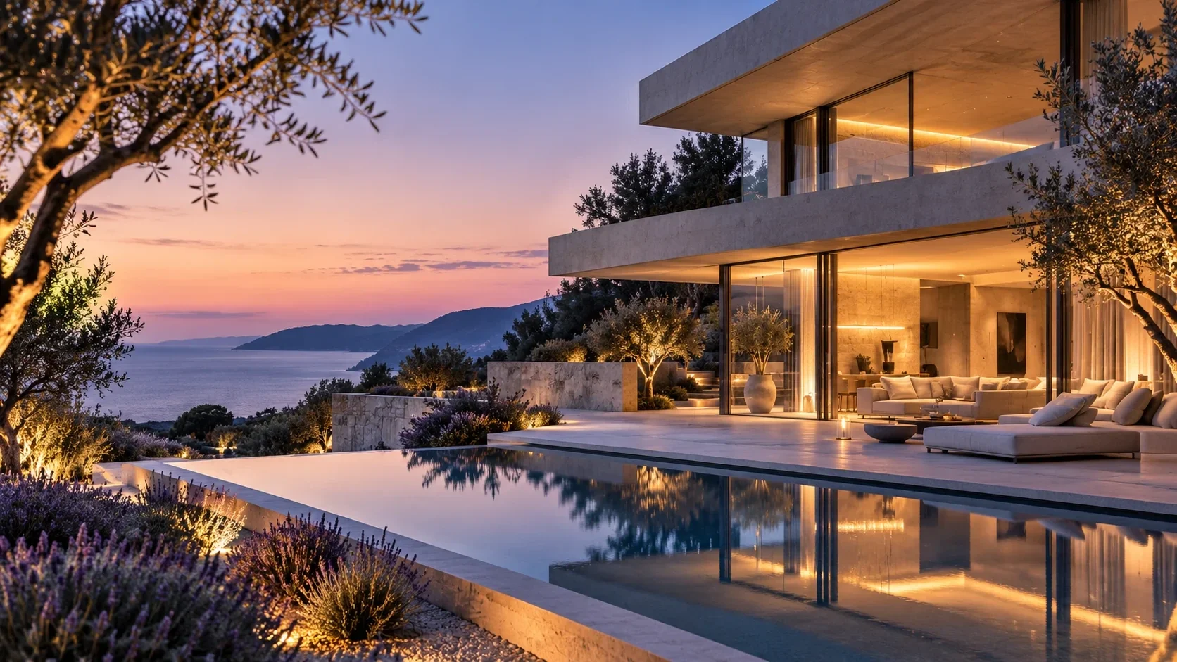
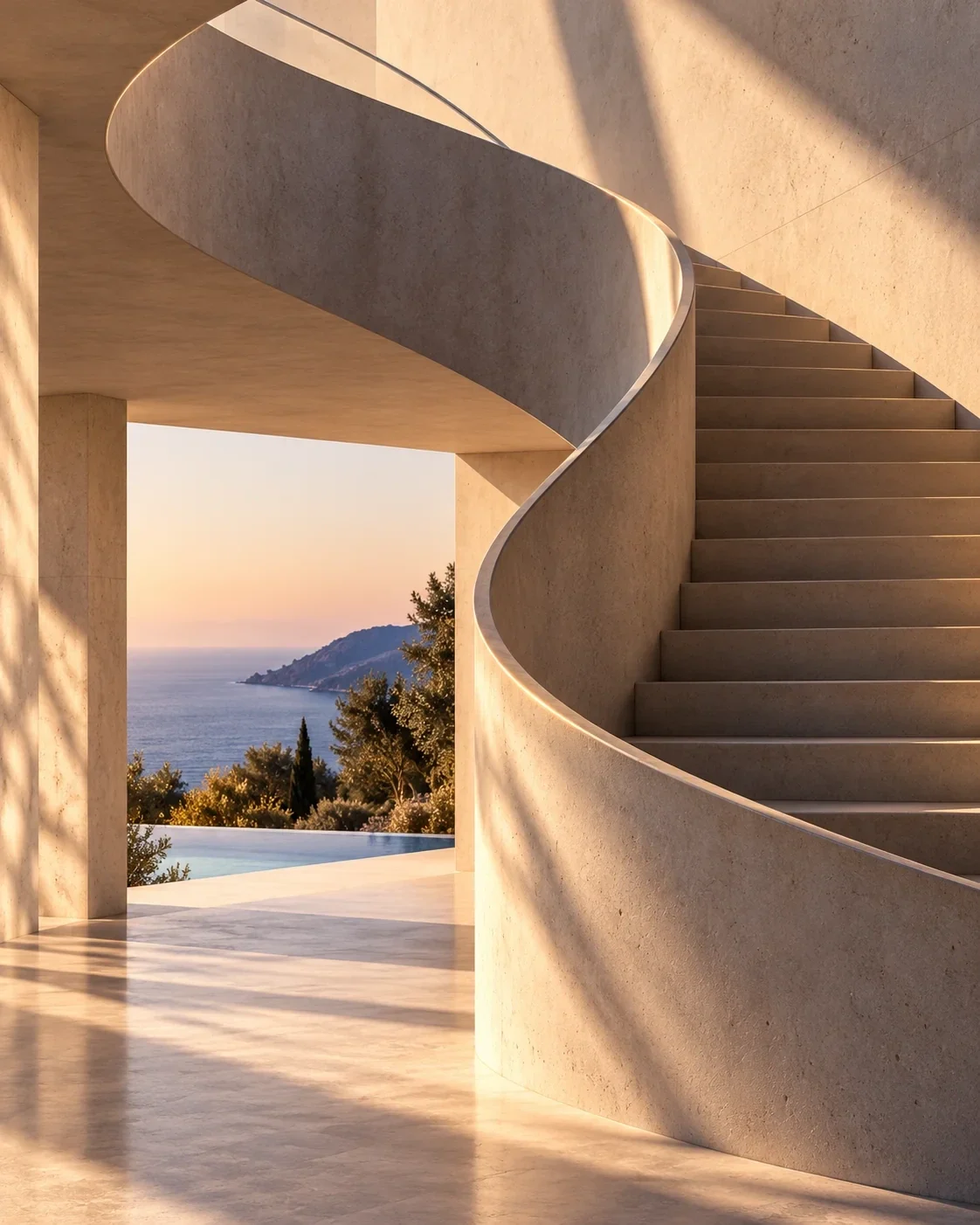
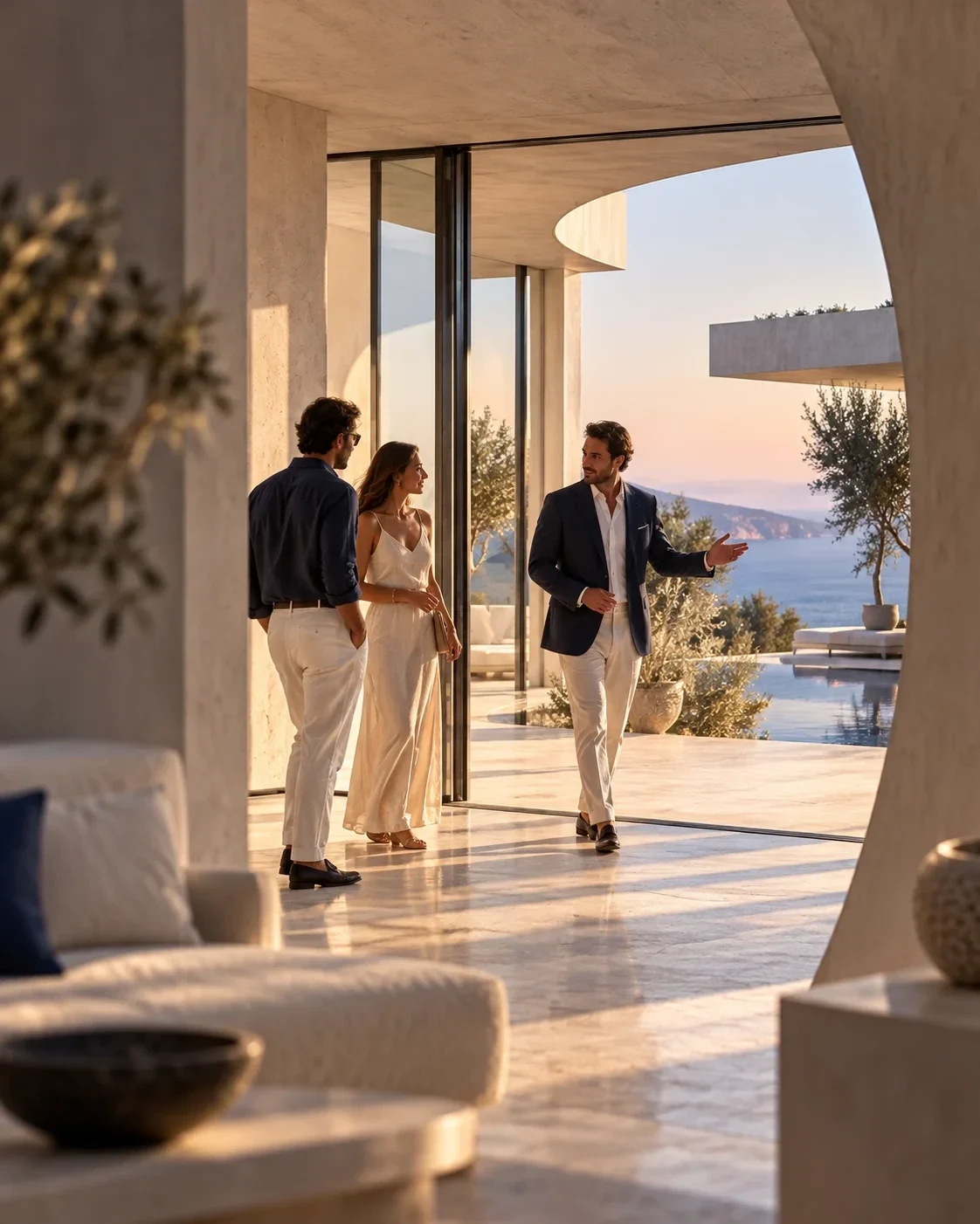
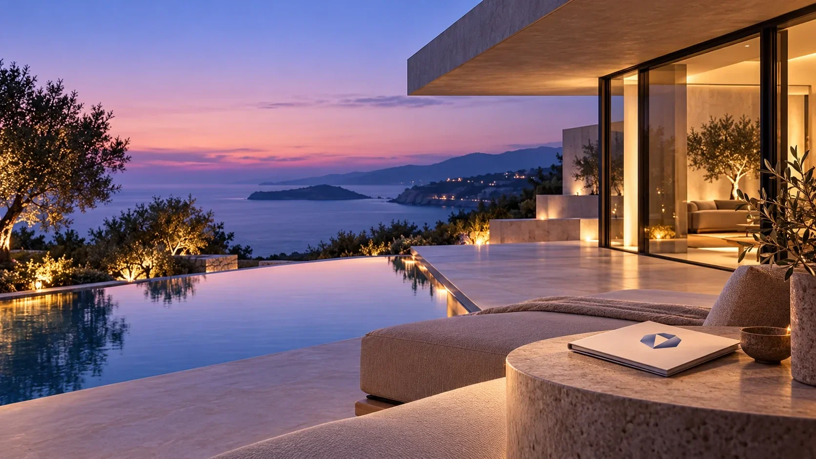
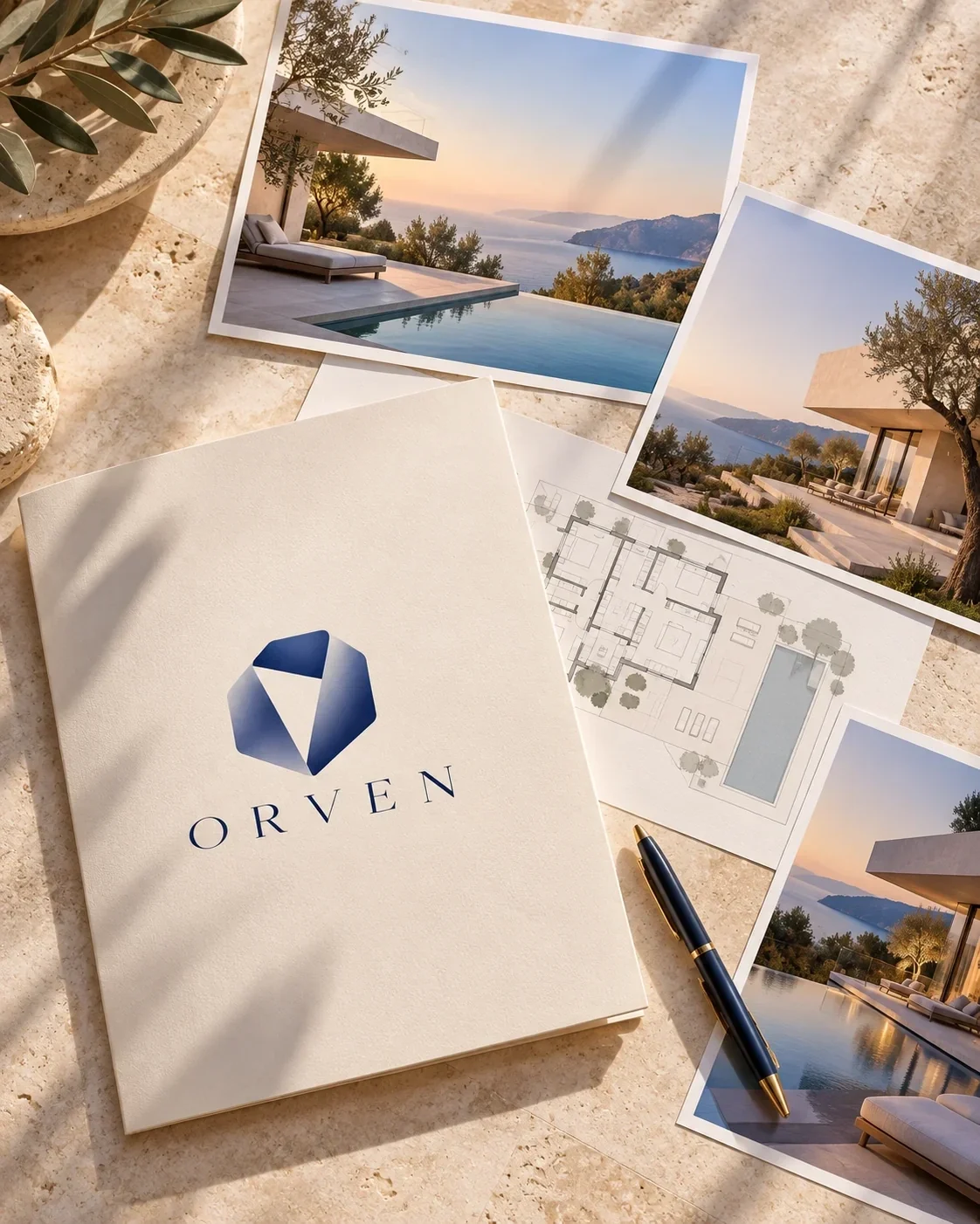
Property photographs move from a wide coastal residence to an interior stair and a closer viewing scene. Selection sheets and architectural imagery give the brand a way to present different spaces in one visual voice. The identity supports the imagery instead of placing a heavy frame around it.
A coherent client experience
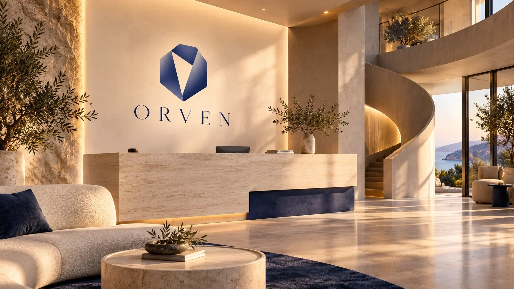
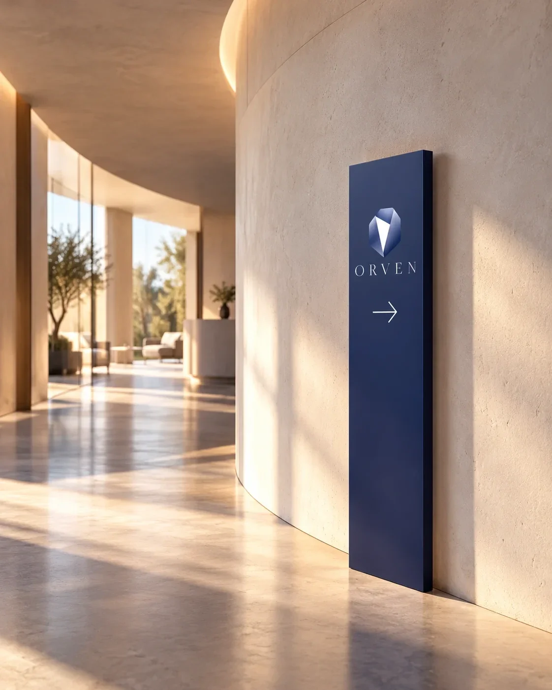
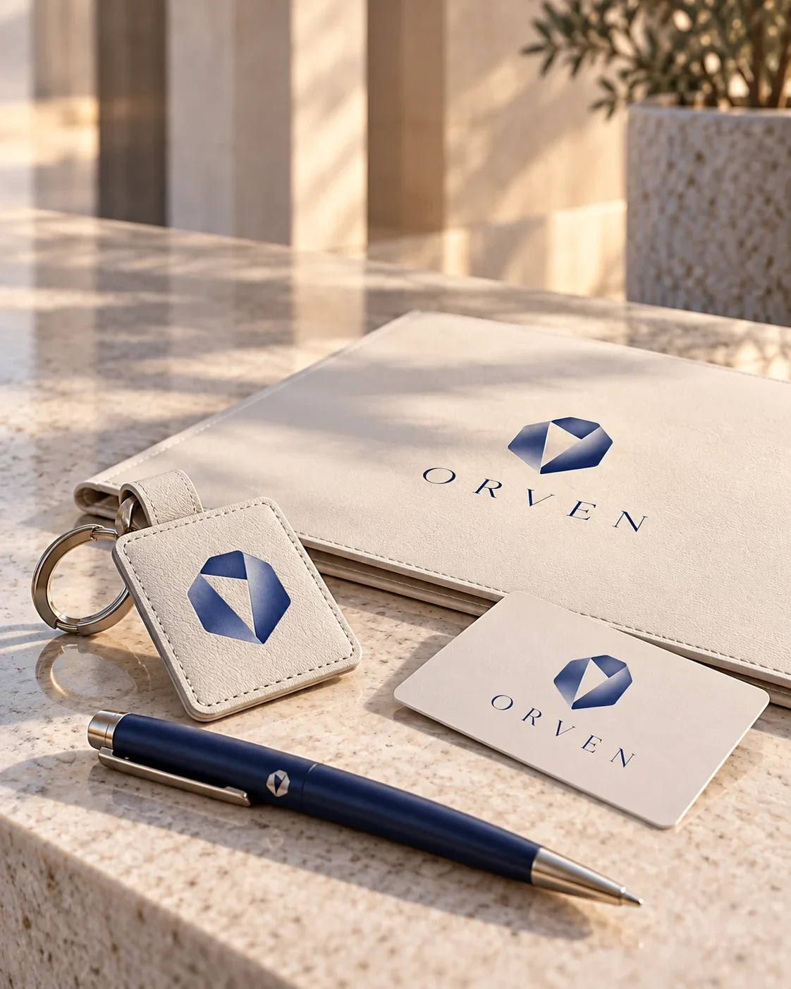
The same language reaches reception, workspace, wayfinding, clothing and desk essentials. A navy sign, a small lapel emblem and printed cards all carry the mark at different scales. Together they make the property presentation and the face-to-face setting feel like parts of the same brand.
- real estate brand identity
- property branding
- visual identity Turkey
- architectural branding