TerraRoots
A warm, grounded identity for TerraRoots soil sensors and bio-fertilization, helping local growers understand their soil and care for plants with confidence.
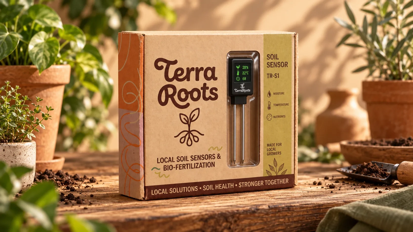
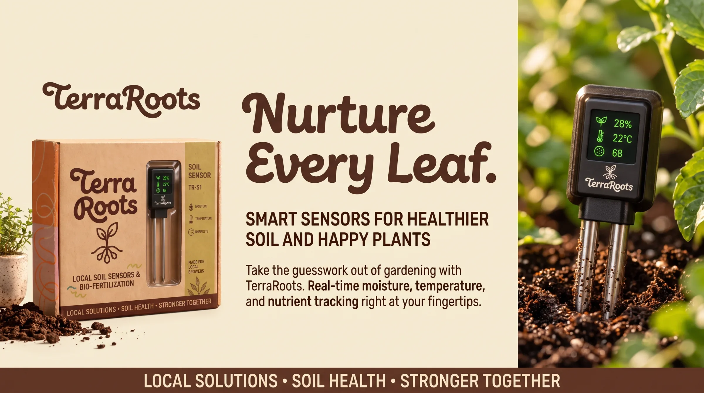
TerraRoots brings local soil monitoring and biological plant nutrition to home gardeners, urban growers and small local producers. Its TR-S1 sensor measures moisture, temperature and nutrients.
Make soil-sensing technology understandable and approachable, and connect a small gardening device to a wider identity built around care, soil health and local growth.
Visual identity, packaging and brand application design
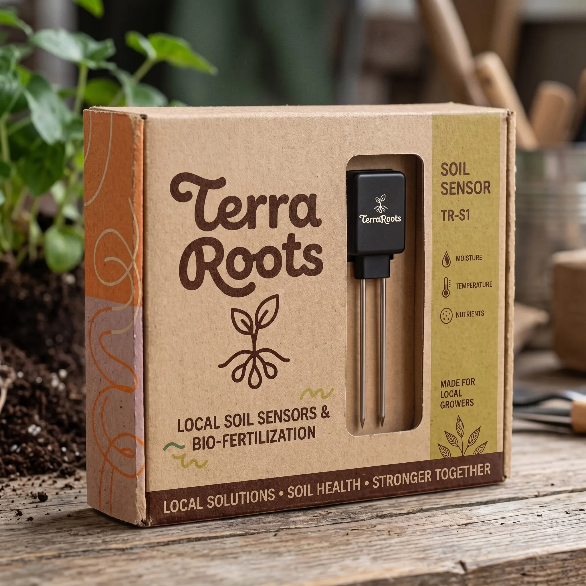
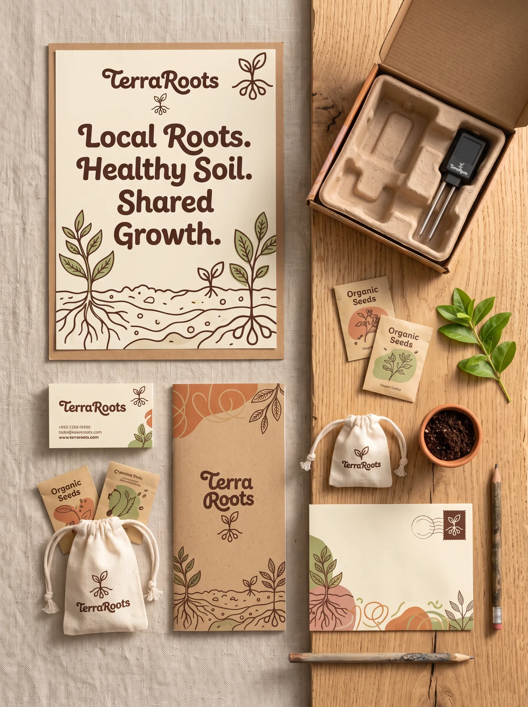
Wordmark and root symbol, typography direction, colour palette, botanical graphics, TR-S1 sensor packaging, team materials and workplace applications.
A consistent visual identity connecting practical soil technology to the warm, hands-on world of local gardening. The system carries one recognisable voice from the product package to team materials and shared spaces.
Visual identity and brand presentation by Ali Komeili. Product and brand context supplied by the project owner.
Know the soil. Help it grow.
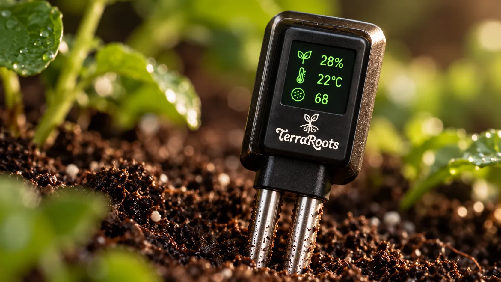
TerraRoots helps local growers understand what their plants need. The TR-S1 soil sensor measures moisture, temperature and nutrients, supporting clearer decisions about watering and soil care. The brand brings soil monitoring and biological plant nutrition into a familiar gardening world, with an identity that feels warm, practical and close to the ground.
A friendly face for practical technology
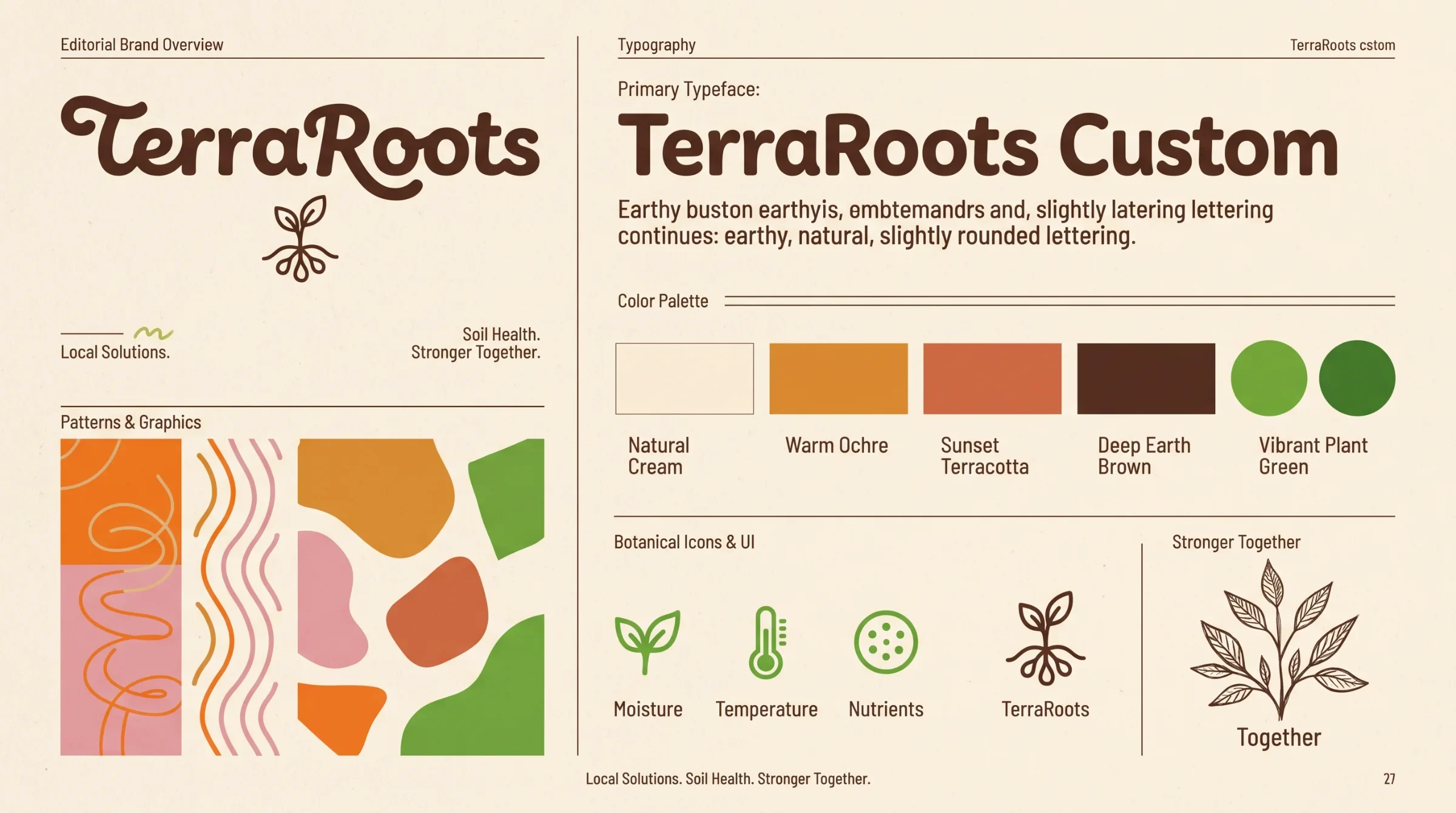
Home gardeners, urban growers and small local producers share a simple need: more confidence in caring for their plants. Rounded lettering and the small root symbol give the technology an approachable face. The digital display supplies the precise counterpoint, keeping warmth and competence together in the same product.
A language that starts below the surface
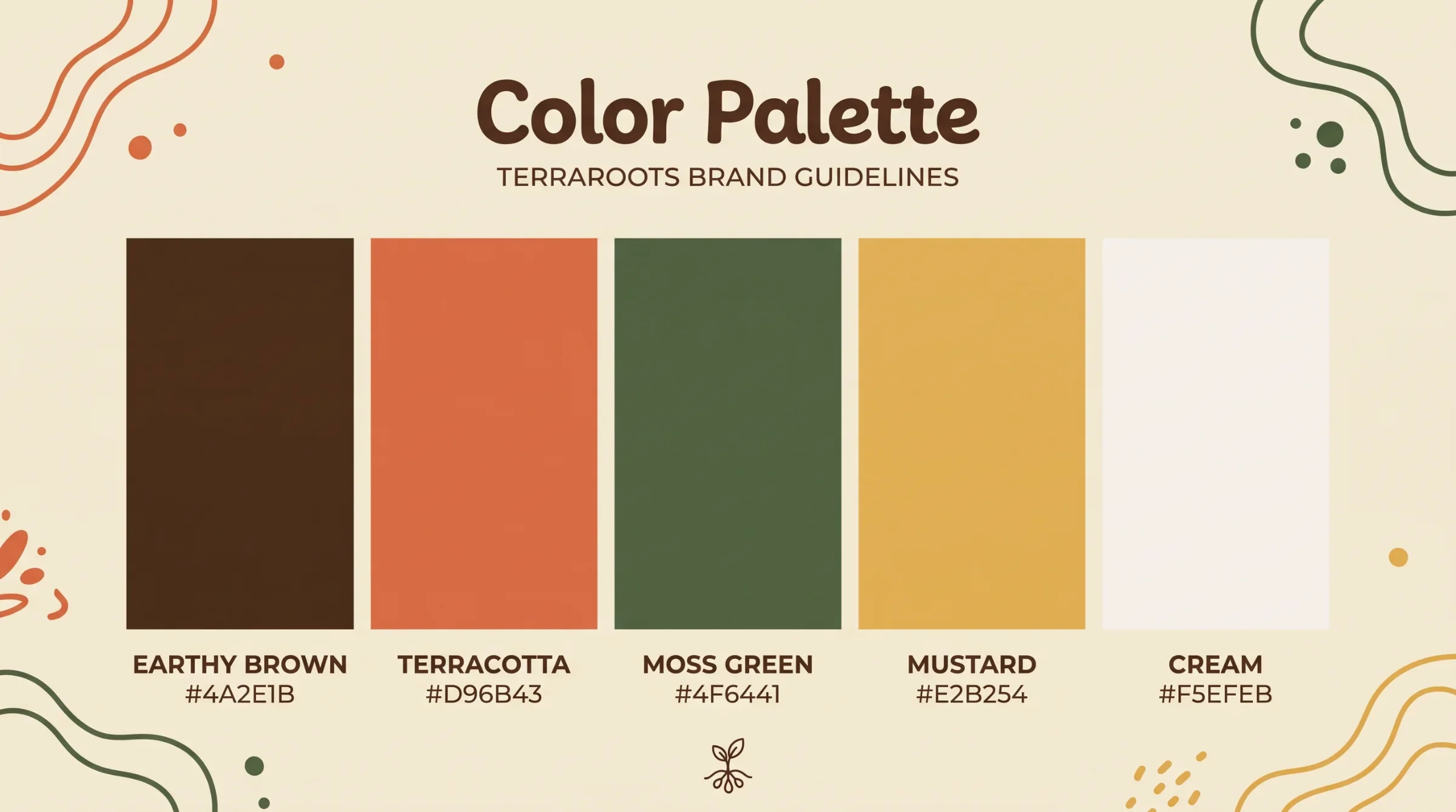
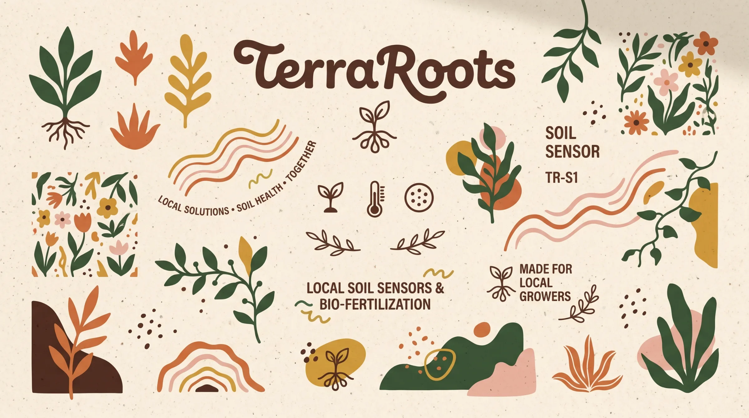
Brown, terracotta, moss green and cream connect the brand to soil, foliage and everyday gardening materials. Root lines, leaves and flowers carry that setting beyond the logo. Expressive headlines lead the message, while smaller supporting text and sensor icons give practical information a quieter, more consistent place.
Growth has a shared language
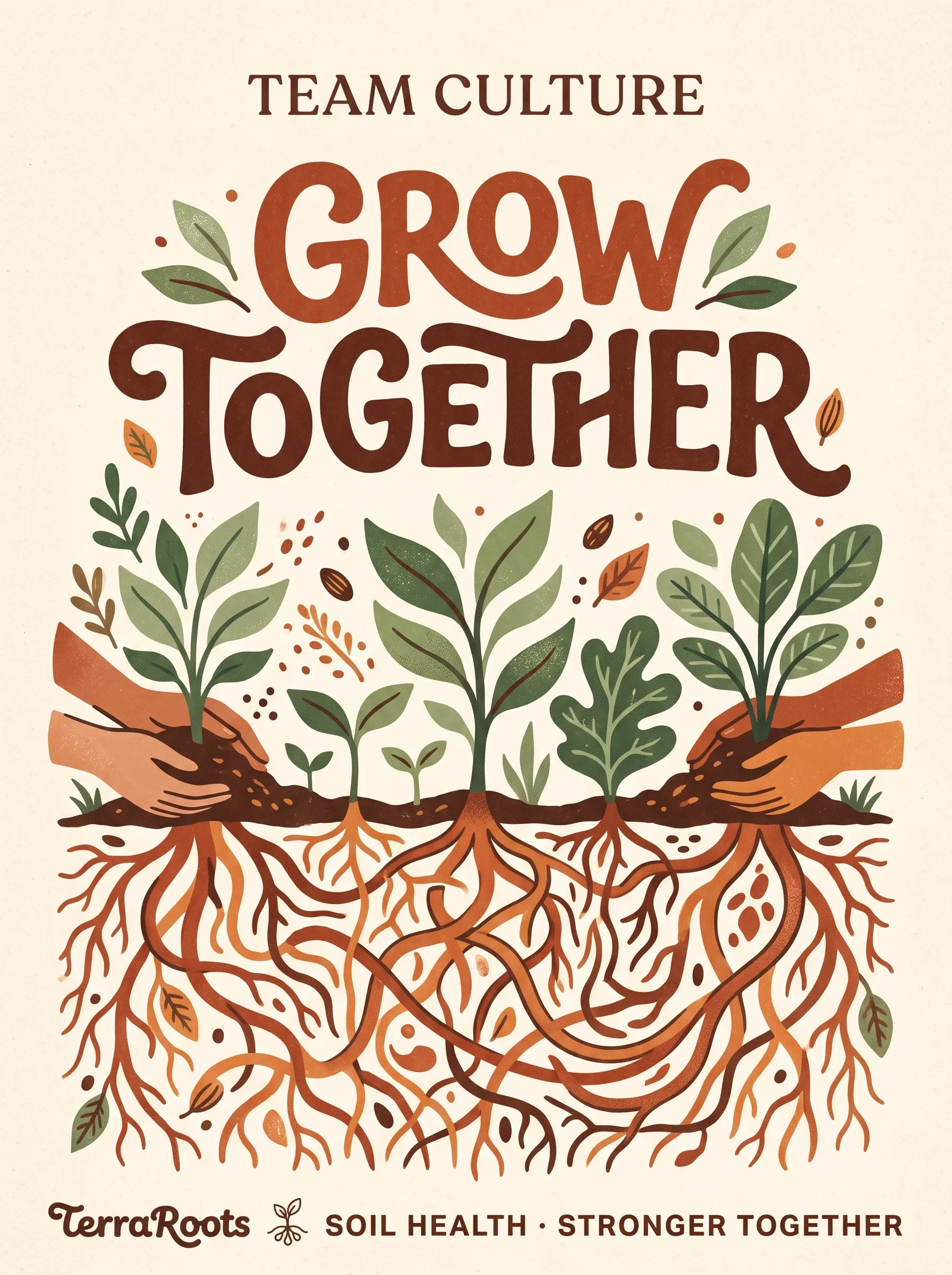
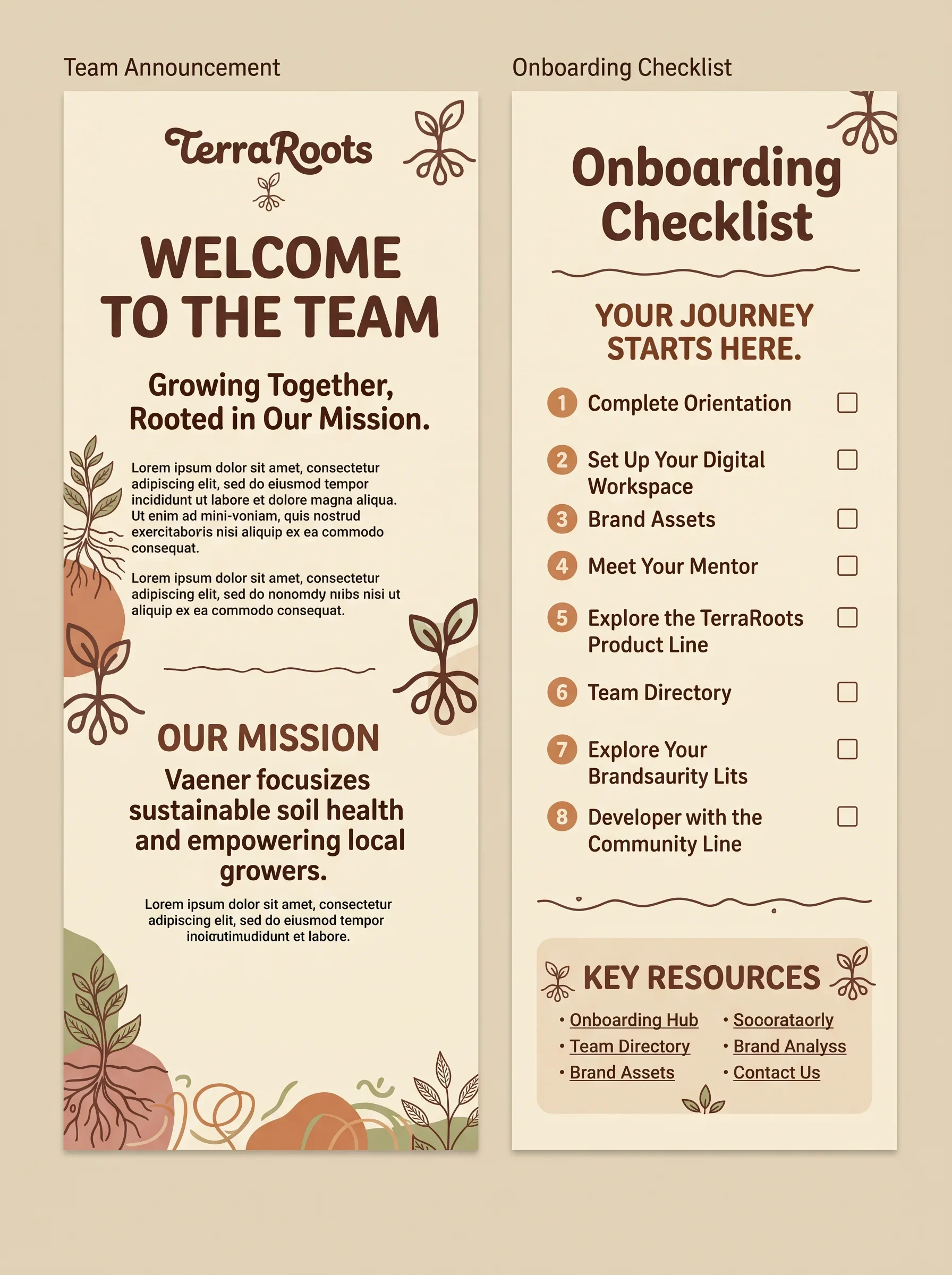
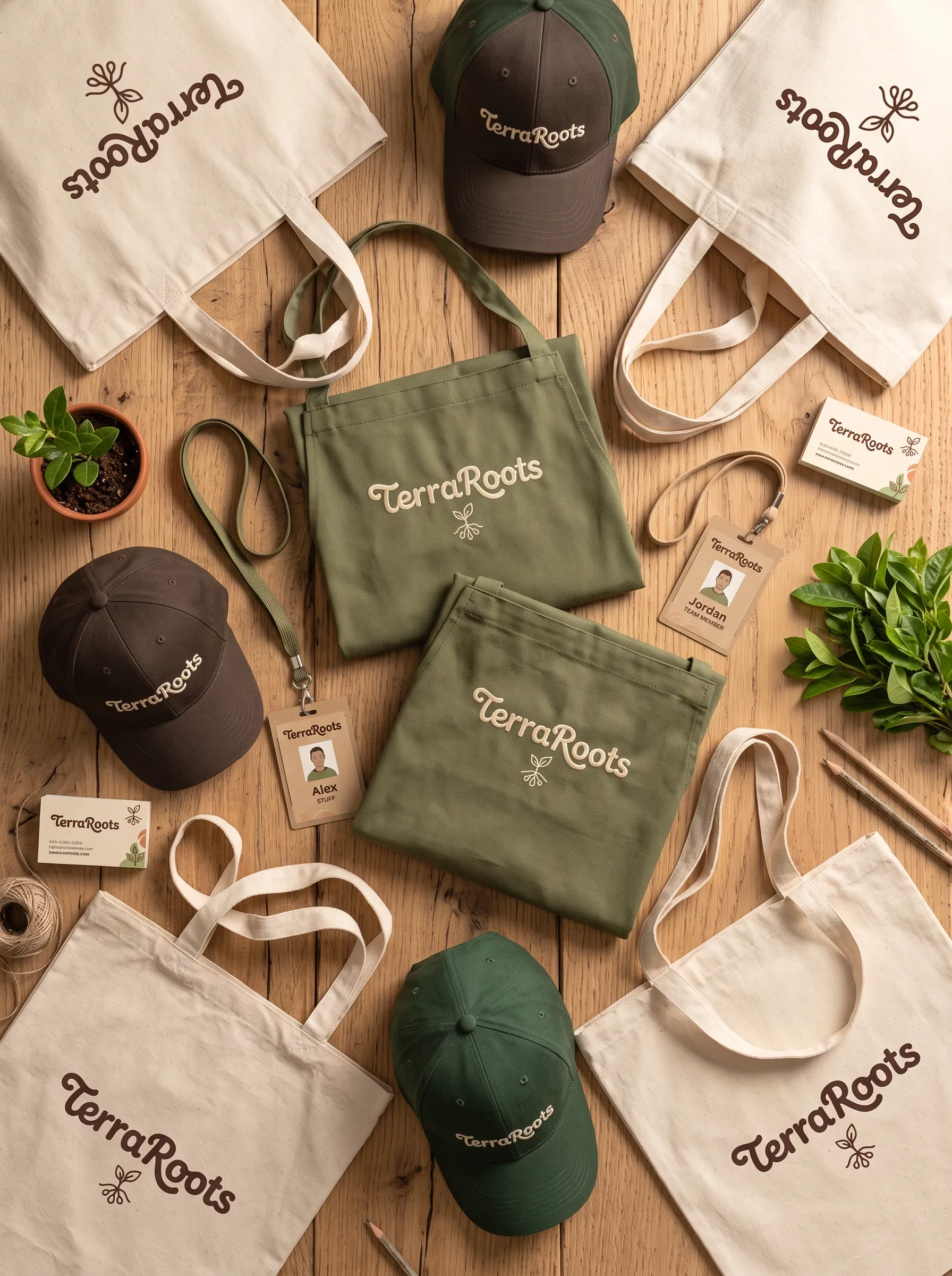
Local Roots. Healthy Soil. Shared Growth. gives the identity a community focus. The Grow Together artwork makes that idea visible through intertwined roots and leafy forms. Printed team messages, bags, caps and an apron bring the same voice into daily use, with recognisable colour and lettering across the set.
From a small label to a shared workspace
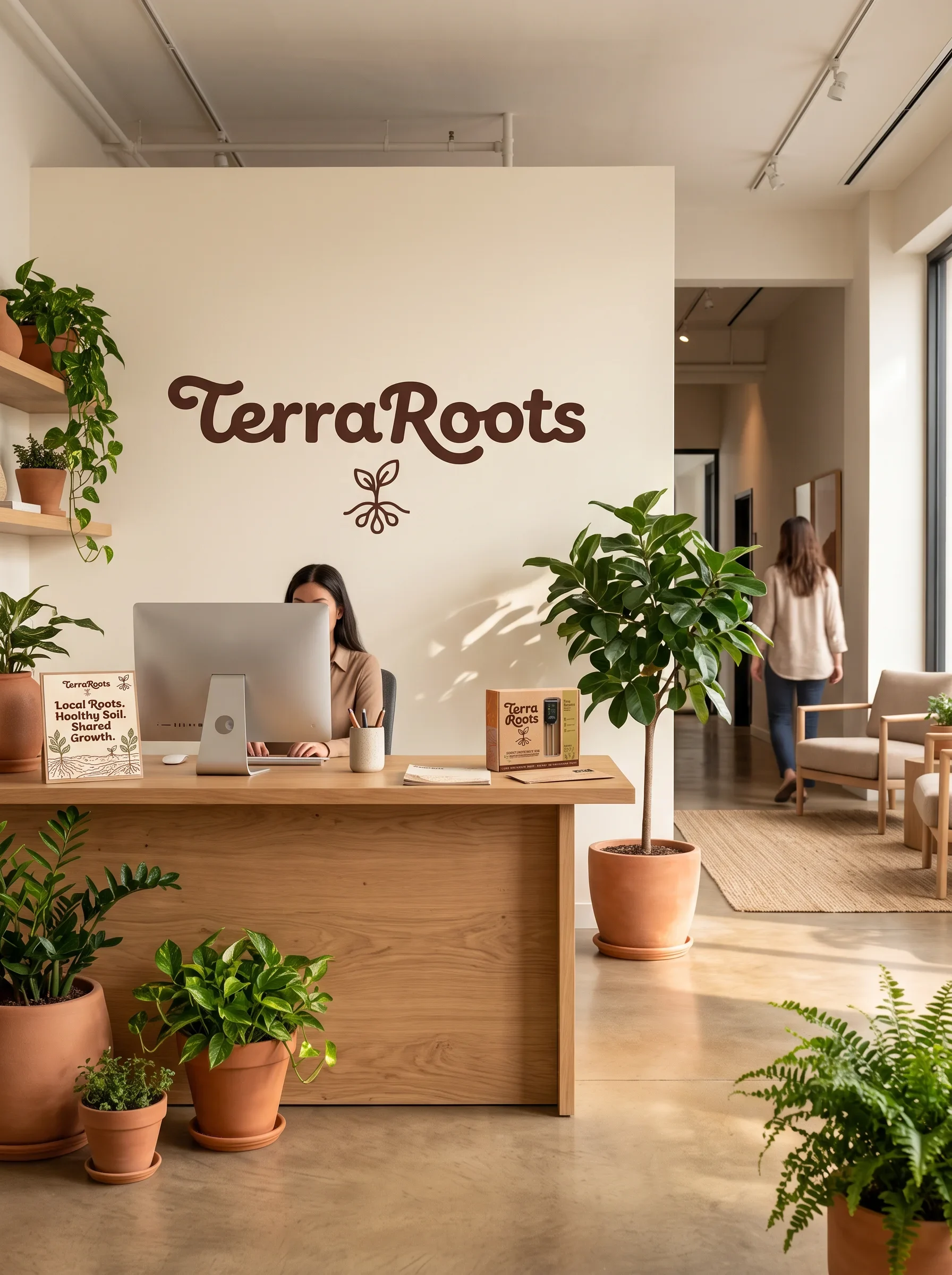
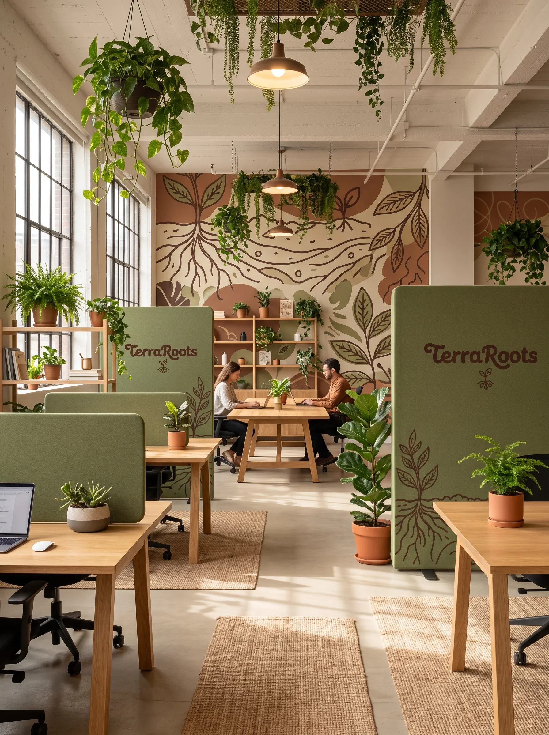
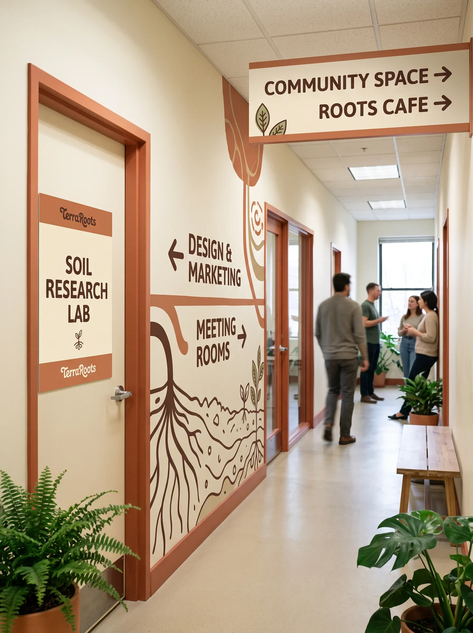
The identity keeps its character as the scale changes. A brown wordmark anchors the reception, moss-green surfaces organise the shared workspace, and botanical graphics guide people through the corridors. Wood, plants and cream backgrounds connect these larger applications to the tactile world already established by the sensor packaging.
Rooted in care, ready to grow
The finished identity connects soil-sensing technology with the people who use it. Lettering, colour, botanical graphics, packaging and workplace applications form a clear visual family. Its personality centres on sincerity, supported by competence: an experienced grower who explains things simply and takes pleasure in helping other plants thrive.