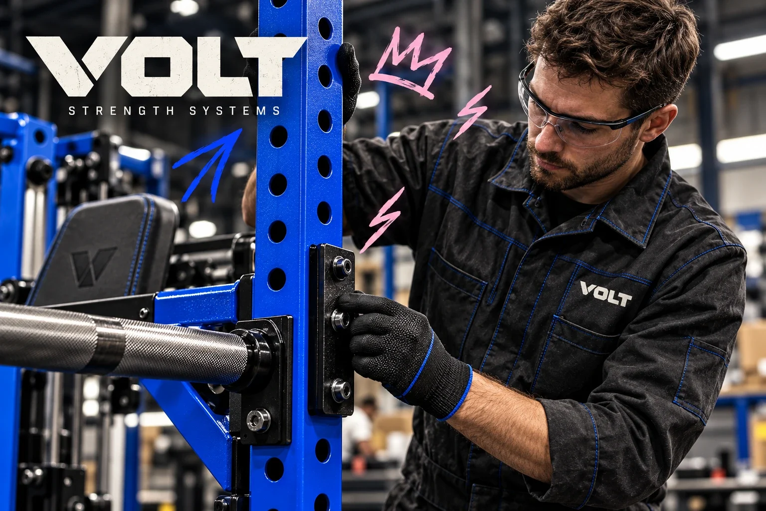
Volt — built to go heavy
A visual identity for a durable fitness equipment manufacturer, connecting the weight of its machines with an energetic graphic language.
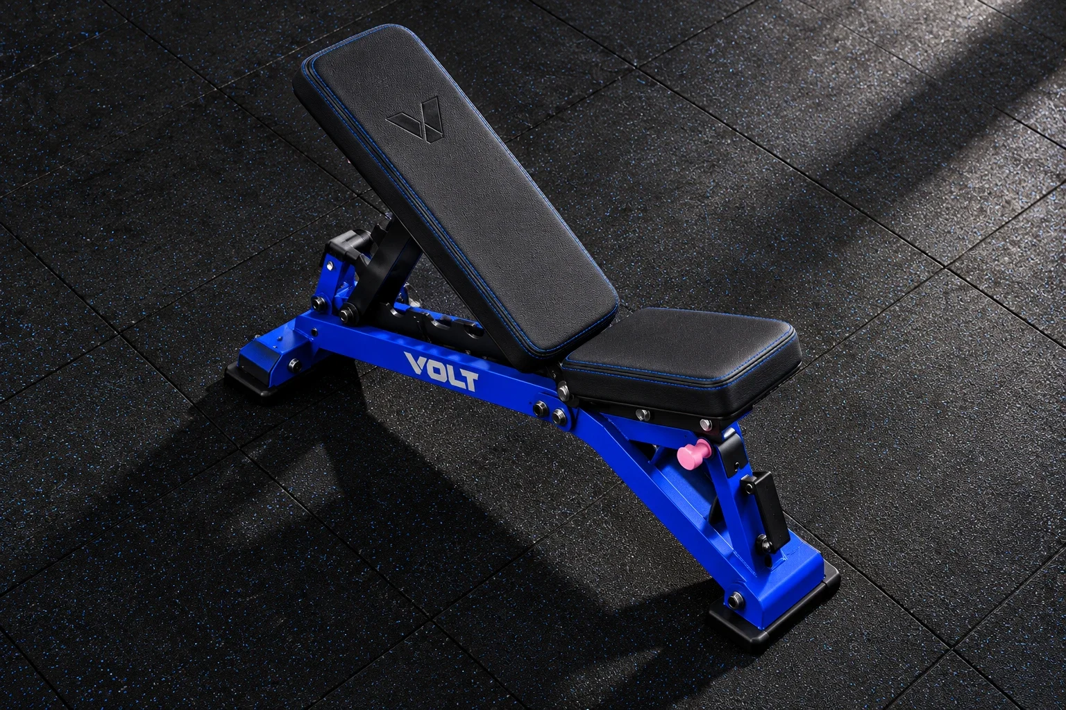
Volt manufactures strong, durable fitness equipment for strength training. The identity addresses the equipment itself and the spaces, materials and communication around it.
Express the durability of heavy training equipment while giving Volt a recognisable identity across machine surfaces, gym spaces and compact brand materials.
Visual identity and brand applications
Wordmark, colour palette, typography direction, graphic language and equipment, environmental and communication applications.
The presented identity connects equipment, signage and communication through a consistent wordmark, electric blue and forceful typography. Applications are visualisations; manufacturing validation and commercial results are outside this case study.
Ali Komeili / Desartly — visual identity and brand presentation
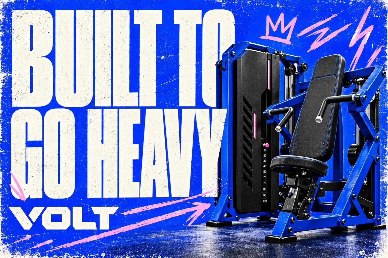
Strength that carries through
Volt makes equipment built for repeated, demanding use. The design challenge was to carry that sense of durability beyond the machine: into a mark, a wall graphic and a small equipment detail. Ruggedness leads the identity, supported by the precision of its equipment-focused applications.
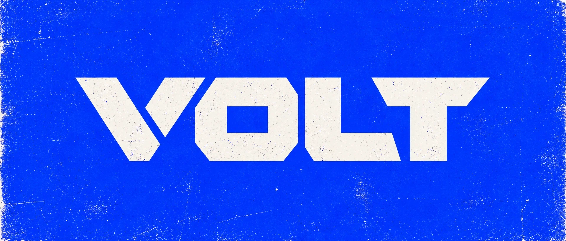
Weight in the letterforms
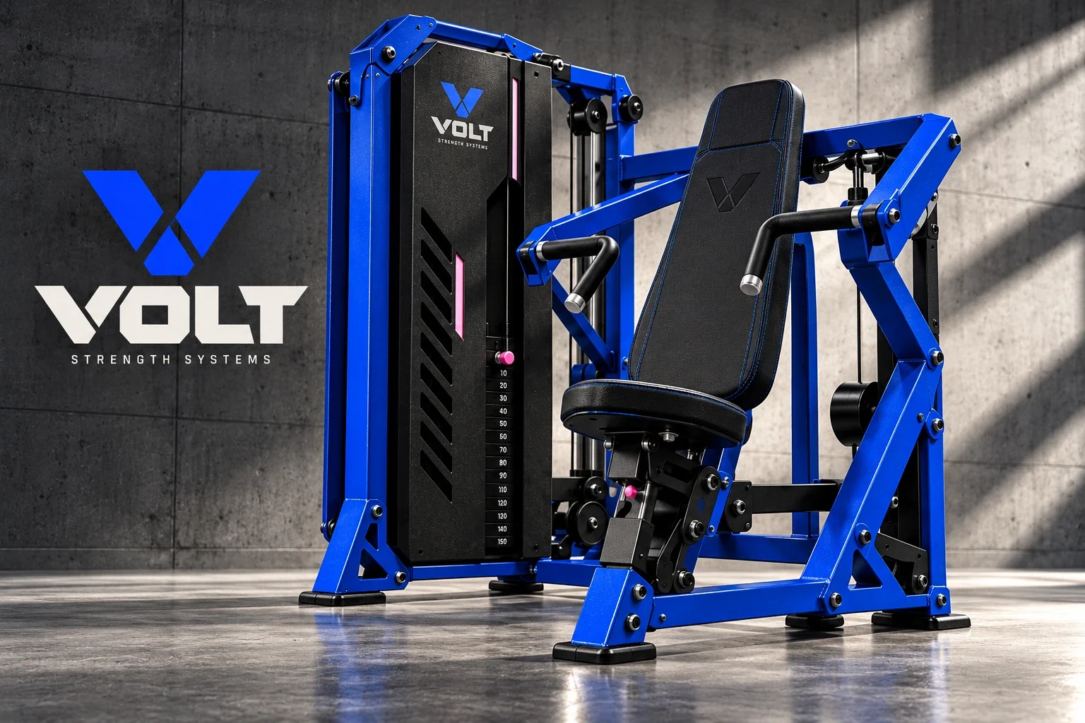
The wordmark uses broad, angular letters and tight spacing to create a compact silhouette. Its slanted cuts introduce forward movement without making the mark feel light. In white against electric blue, that construction stays prominent beside the dense frames and black pads of the equipment.
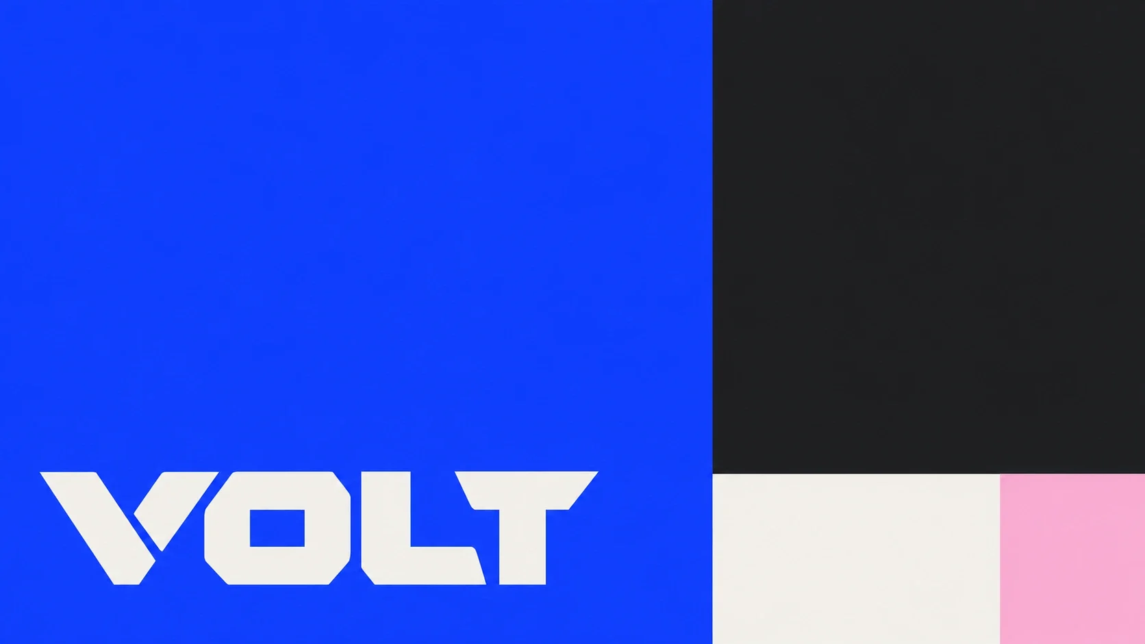
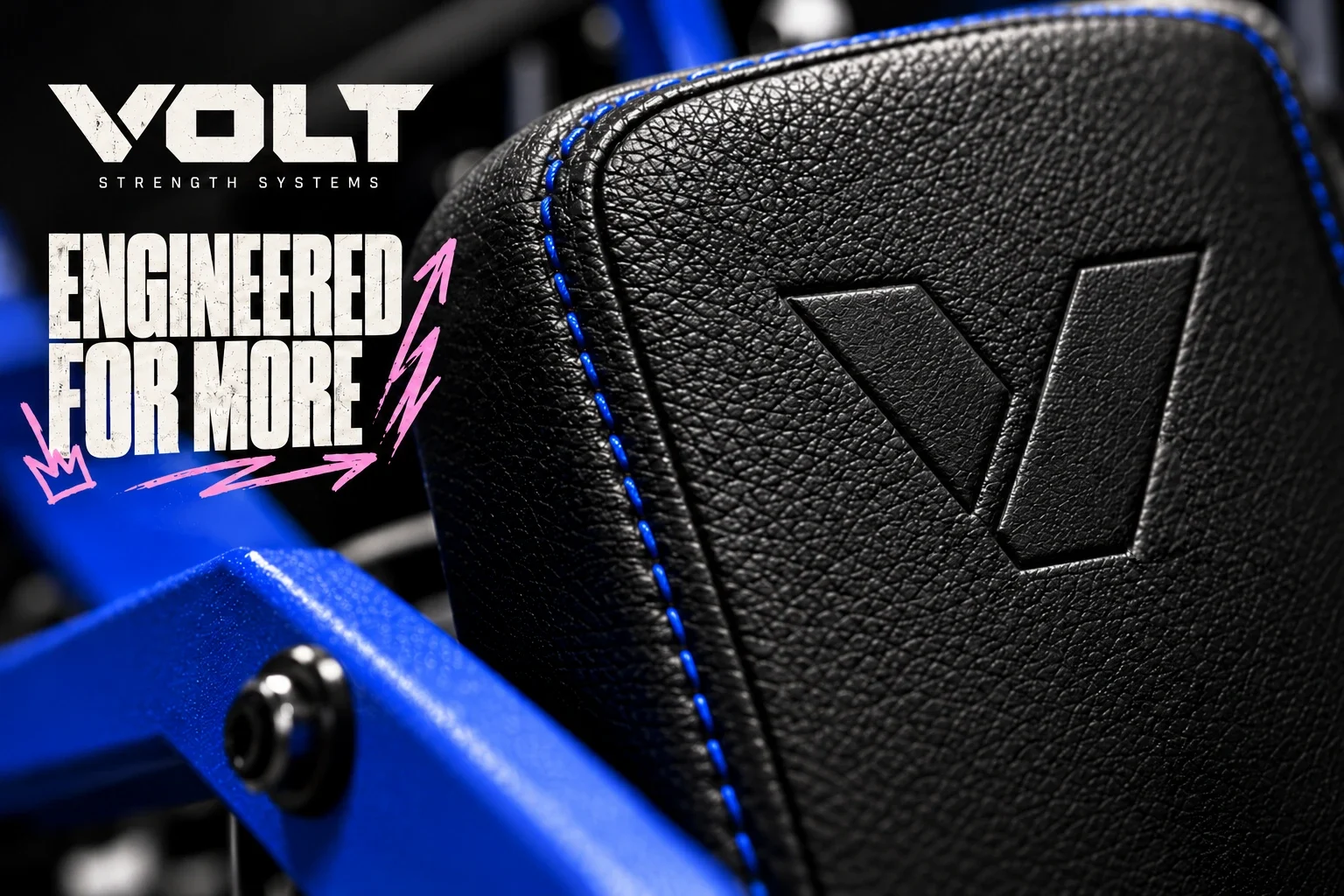
A louder supporting language
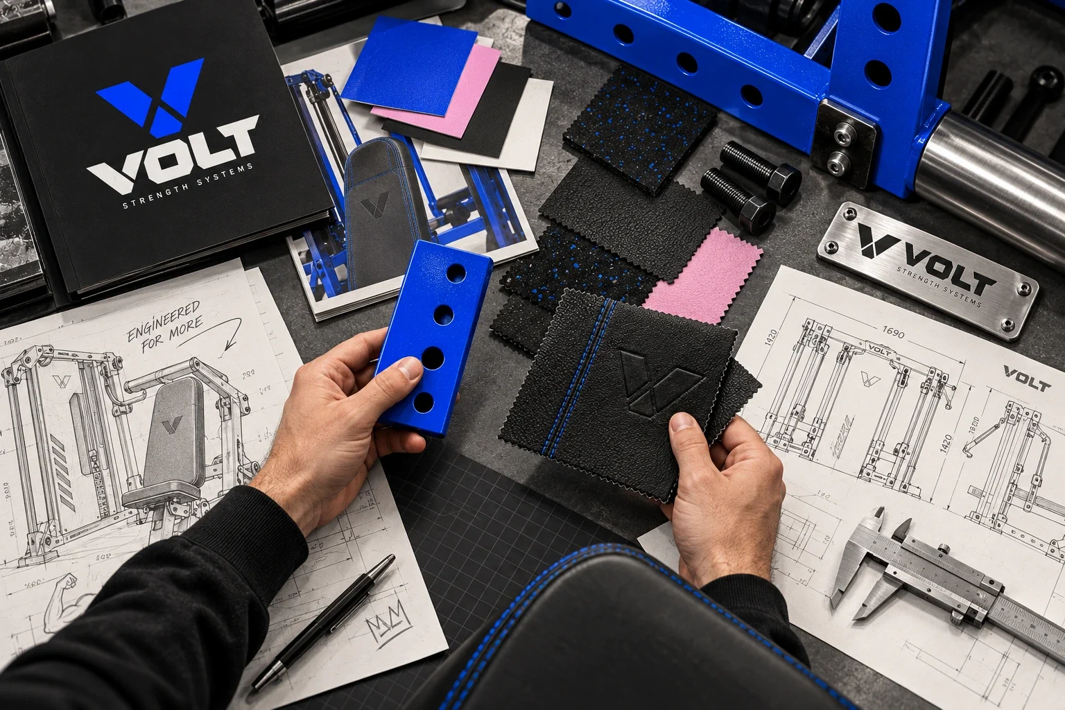
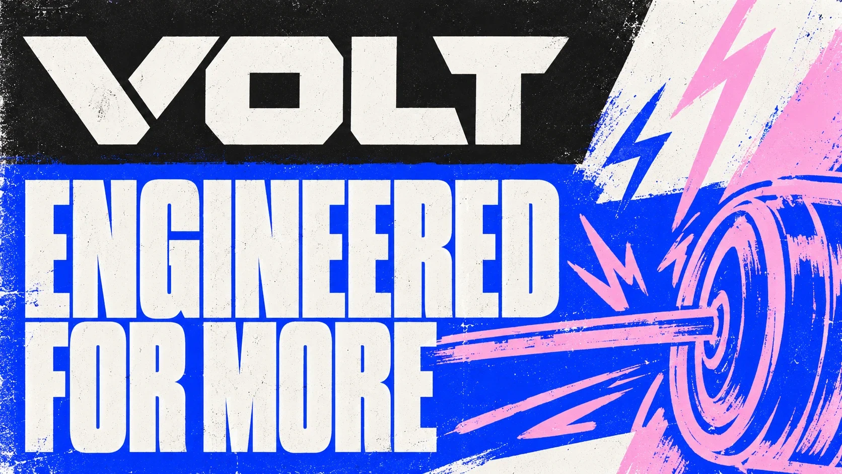
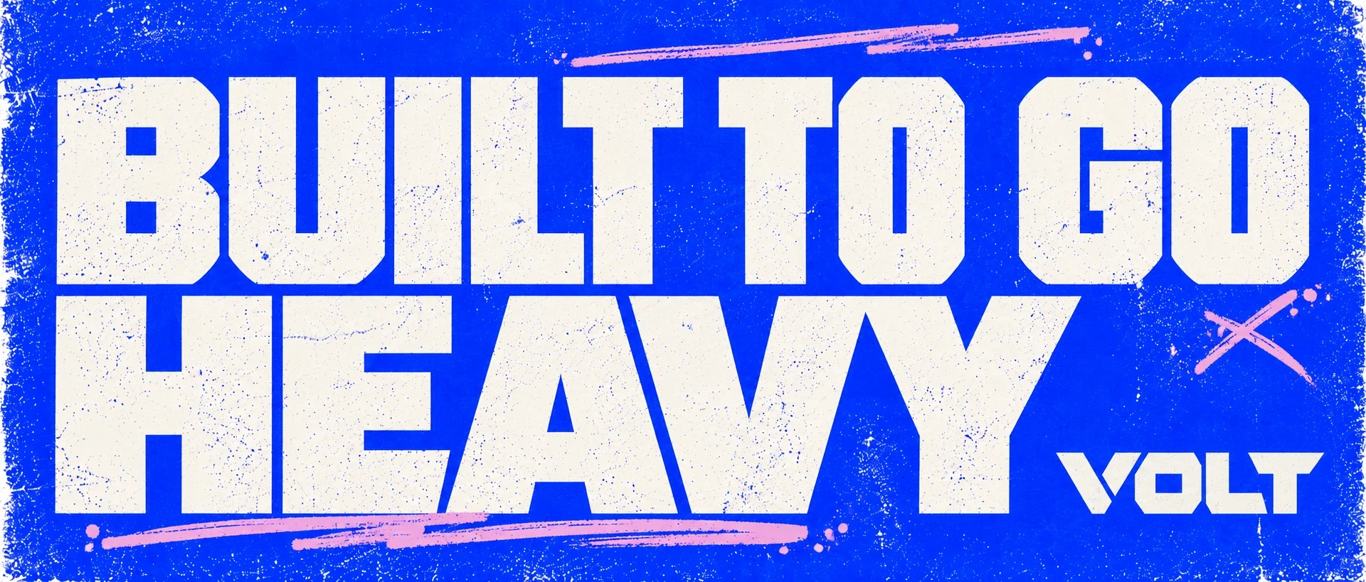
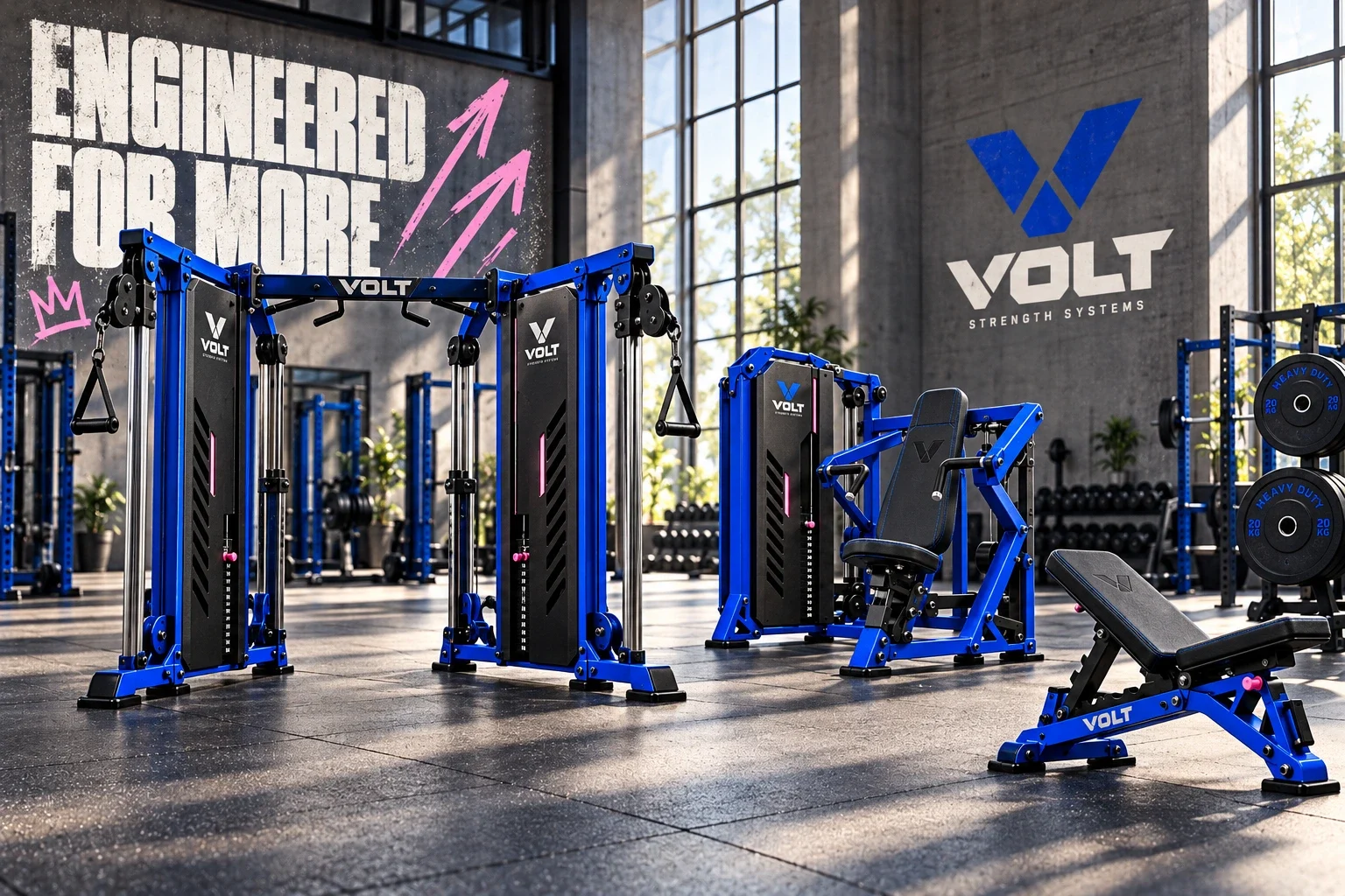
Tall condensed headlines give short messages a large presence. Lightning, weight plates and hand-drawn strength symbols add a more spontaneous layer around the structured wordmark. Blue anchors the system; black and off-white provide contrast, while pink appears as a small accent in the graphics.

From machine to training space
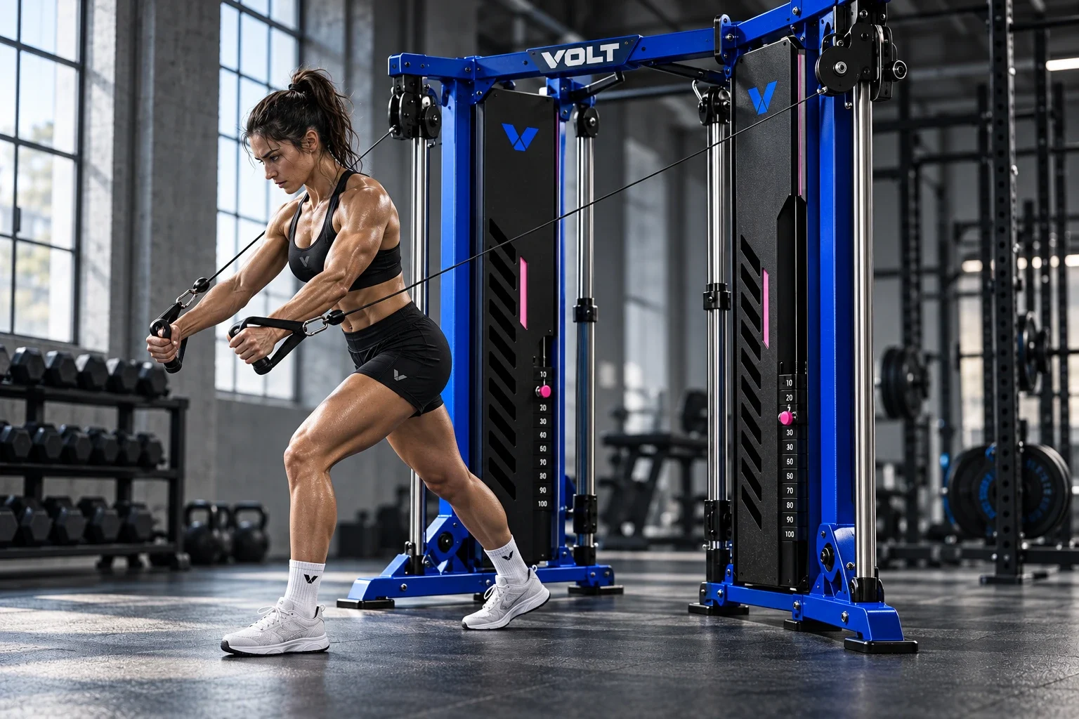
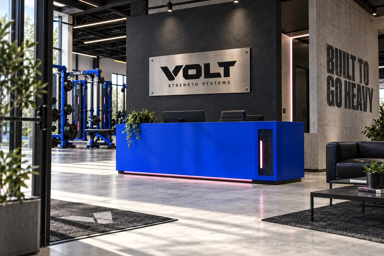
The applications show the same identity at several distances: an embossed pad detail, a blue equipment frame and a large gym wall. Product-led views keep the machine visible; environmental graphics extend the brand around it. These mockups illustrate the system rather than documenting an installed rollout.
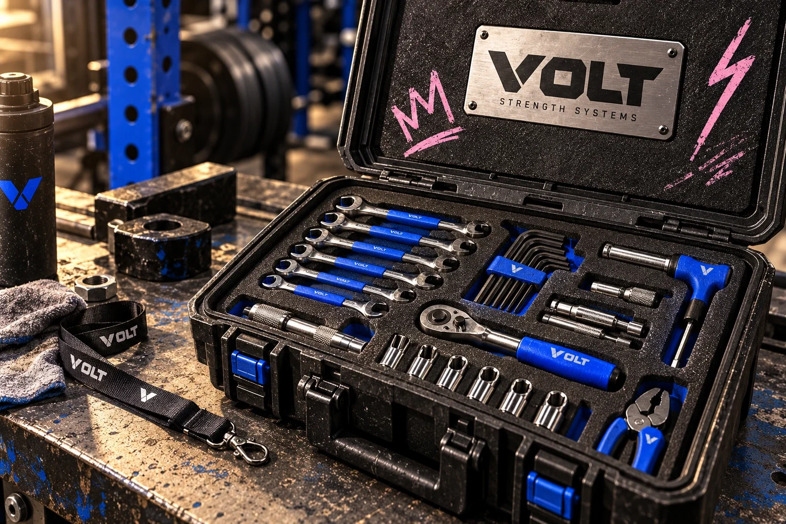
Durability in the details
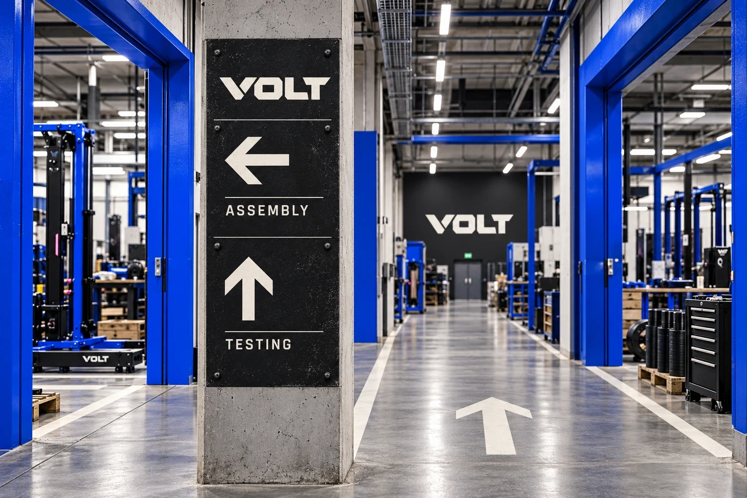
The supporting presentations place Volt in a practical working context: technical drawings, equipment maintenance and a fitted tool case. Together, they give the identity a life beyond promotional posters. The result is a coordinated visual system whose physical performance would still require production and material testing.