Vyro — Open to Sound
A Korean induction headset identity with flowing sound graphics, orange packaging and a clear open-ear product story.
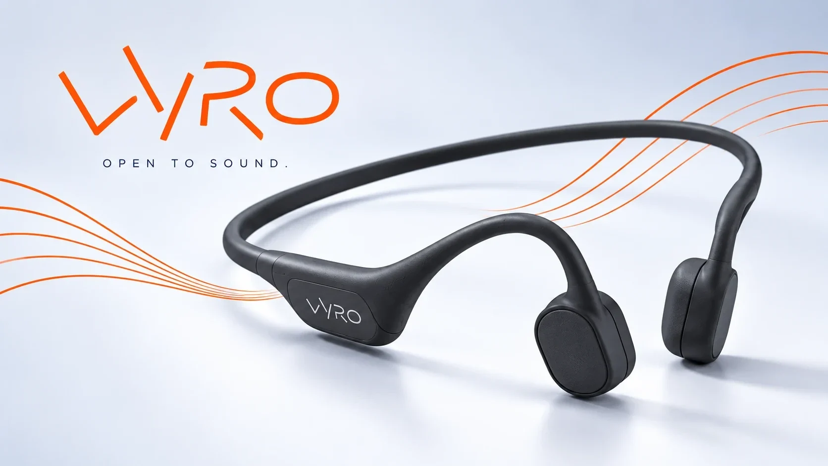
Vyro is a Korean induction headset brand introduced in 2025.
Vyro needed a brand language that made an advanced induction headset recognizable while keeping the hardware and open-ear idea clear across packaging and spaces.
Visual identity, packaging design and art direction by Ali Komeili at Desartly Studio.
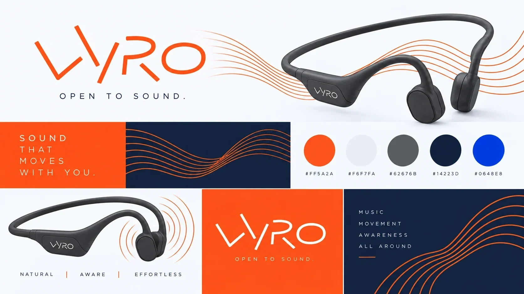
Wordmark, color and typography system, sound graphics, packaging, product imagery direction, campaign and environmental applications.
An integrated brand system carries Vyro from the headset to award-winning packaging, campaign imagery and physical brand touchpoints.
Ali Komeili — designer and art director; Desartly Studio — creative studio.
Sound that leaves the world open
Vyro is a Korean induction headset built around an open-ear listening experience. Desartly gave the 2025 product a visual identity that feels as mobile as the people wearing it: a sharp orange wordmark, flowing sound lines and a clear view of the headset itself.
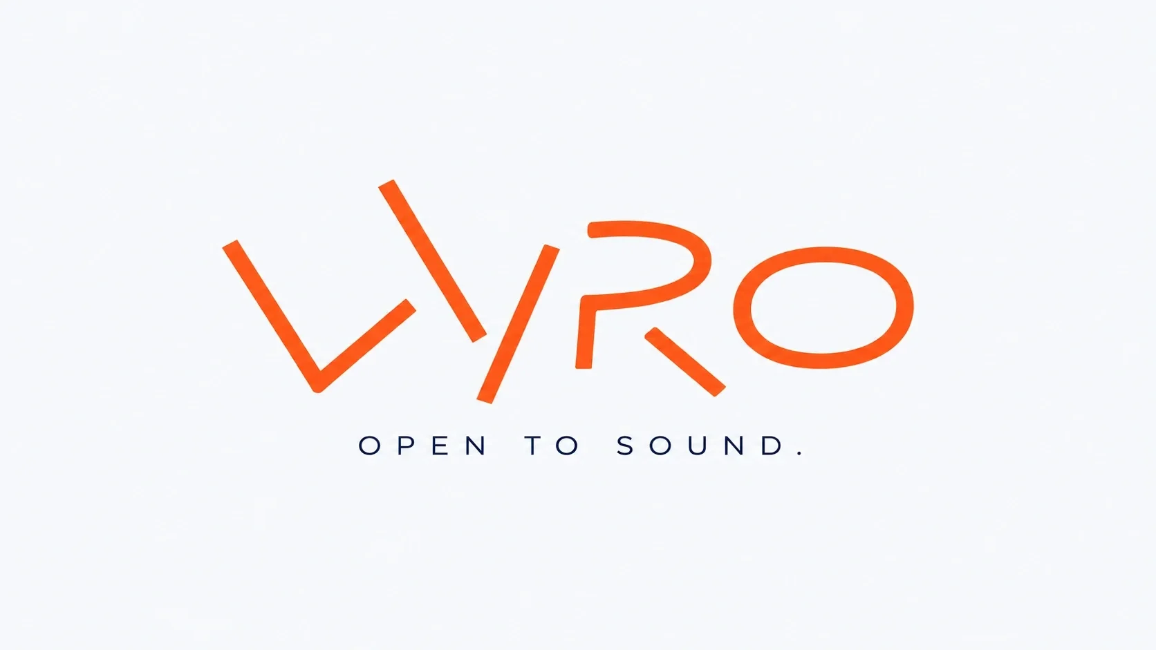
A signal you can recognize
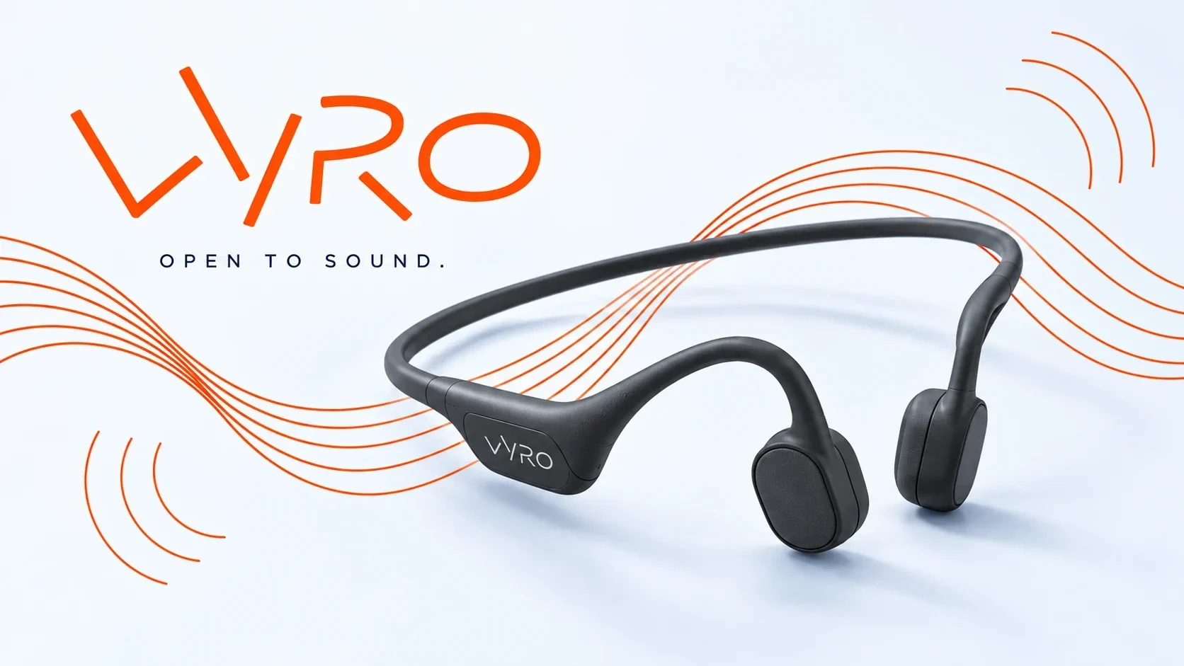
The angular Vyro wordmark carries the brand’s energy without a complicated symbol. Orange leads, while white, deep navy and electric blue create contrast across typography, graphics and product imagery. Curved lines suggest sound moving through space and connect the identity to the open-ear form.
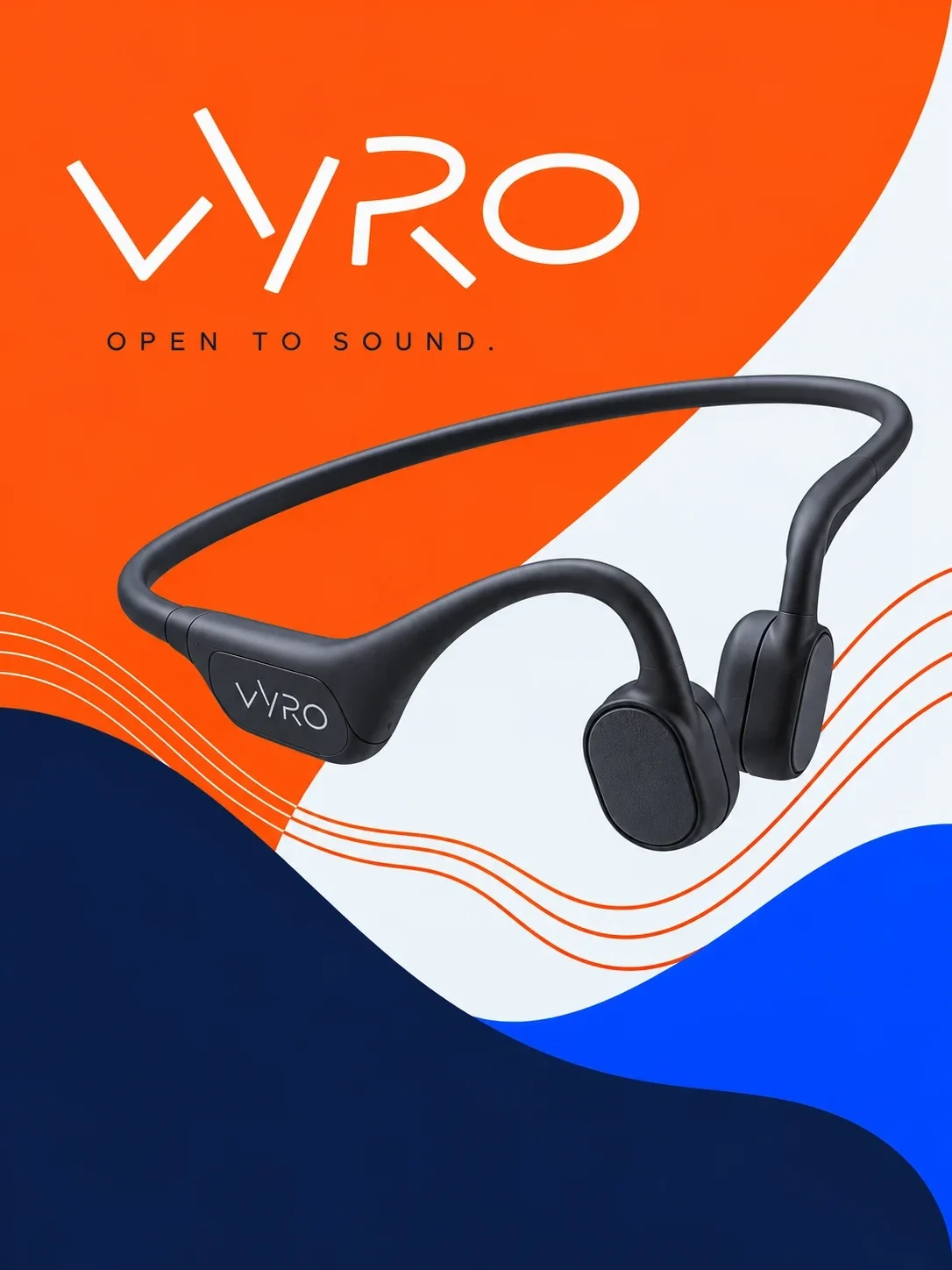
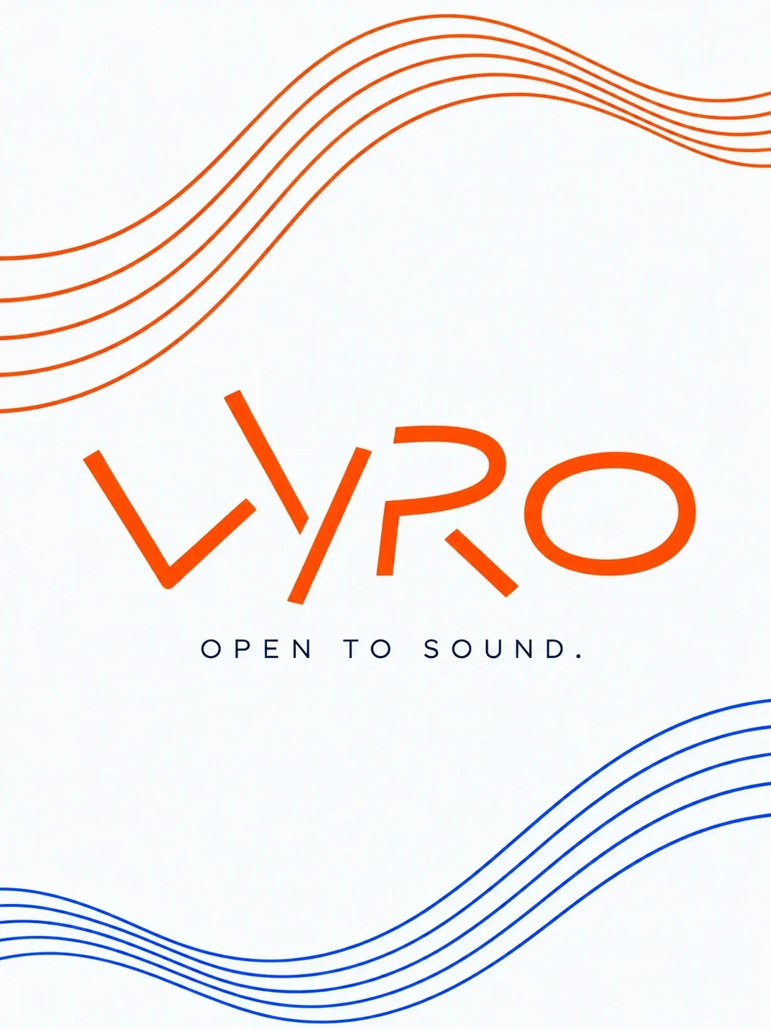
The headset stays in focus
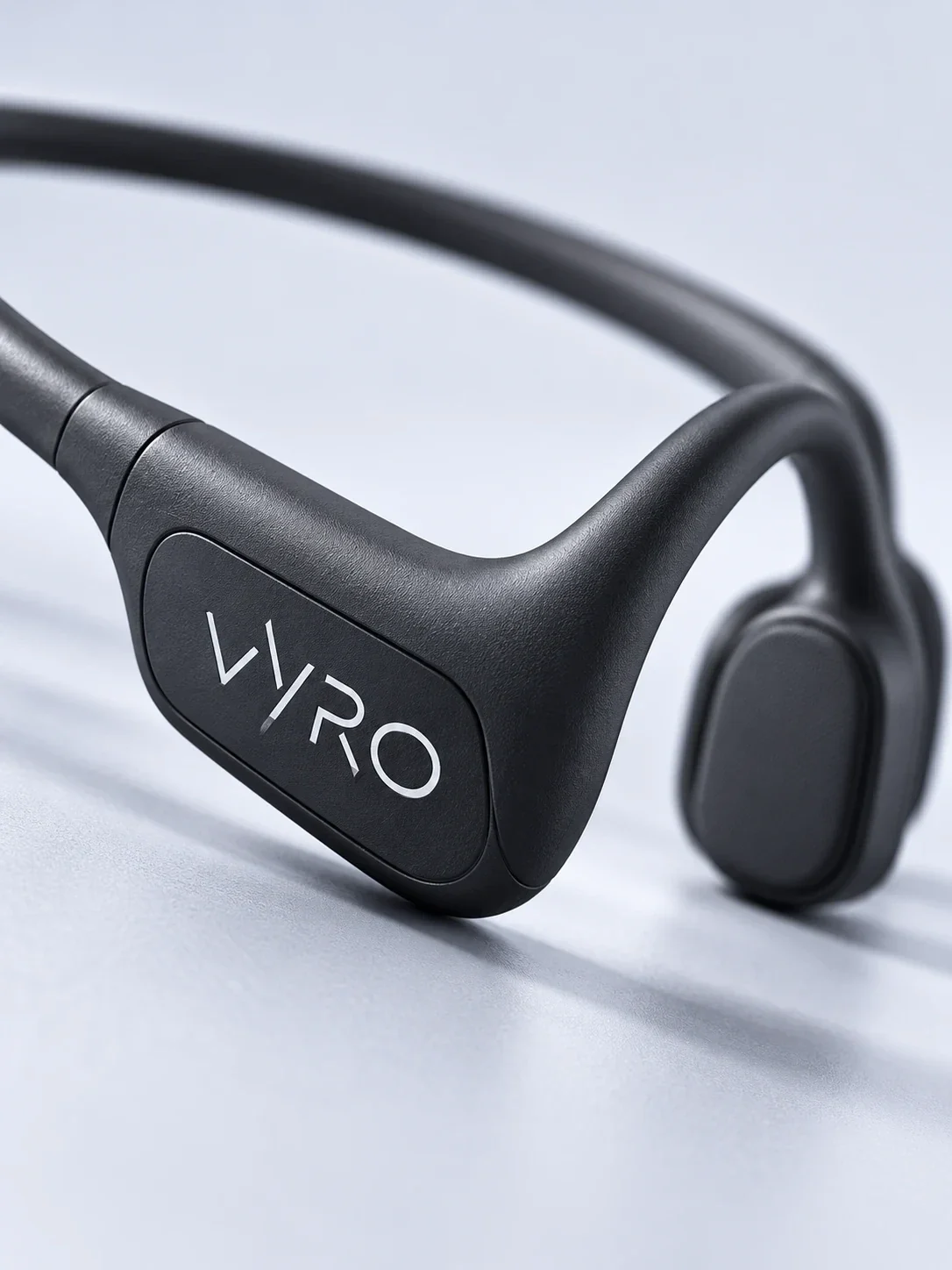
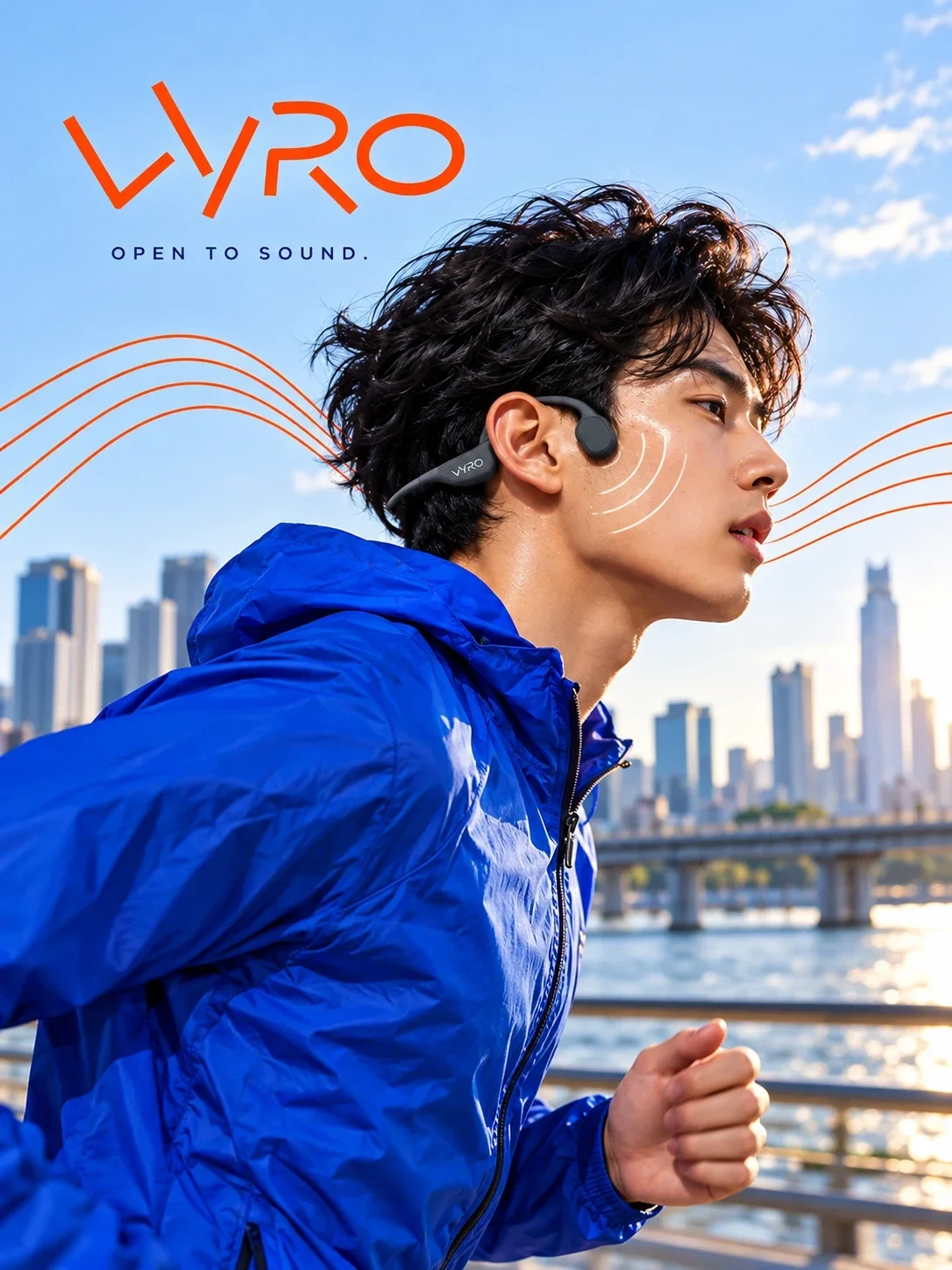
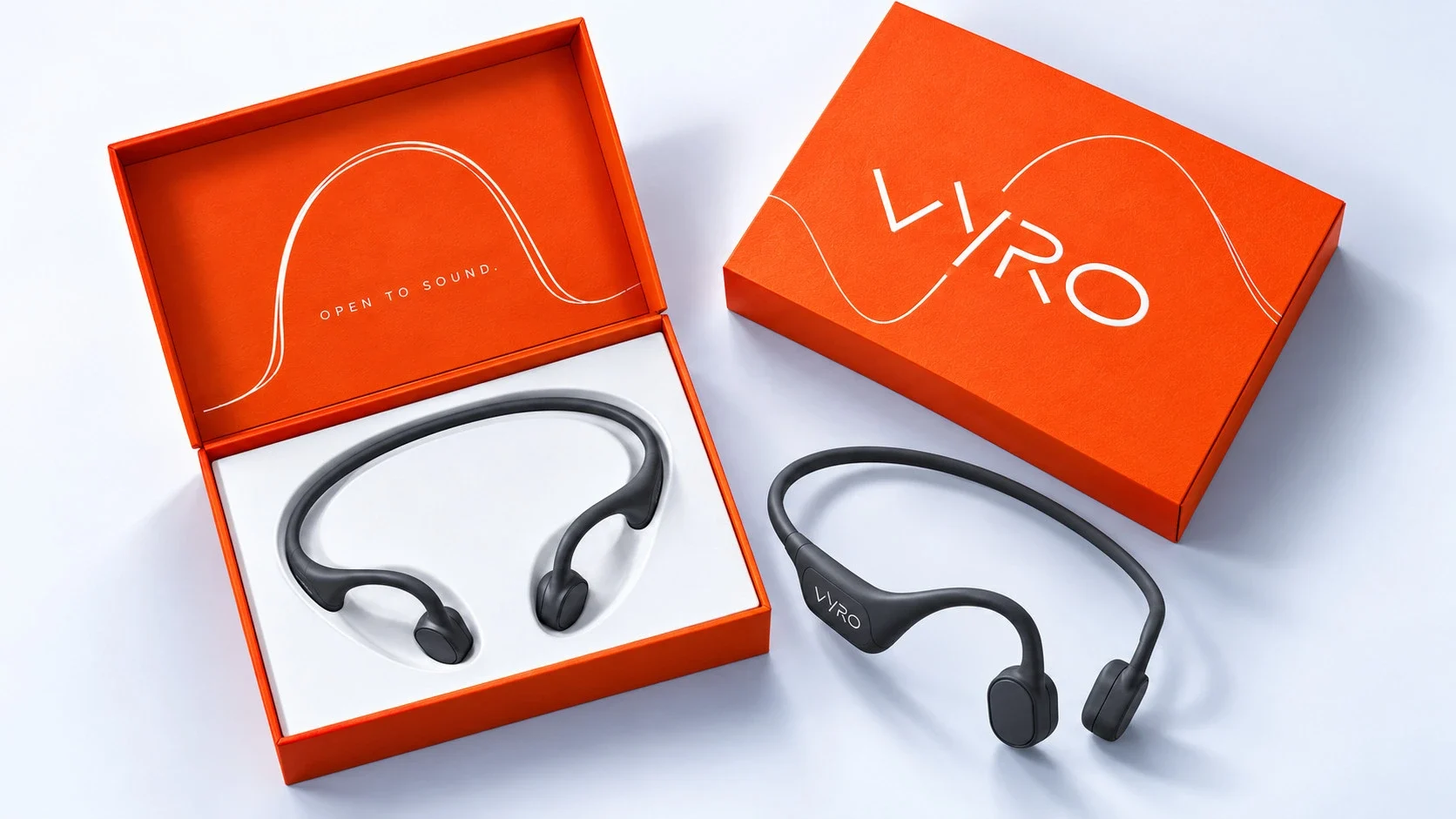
Clean product photography shows the shape and finish first; a close view makes the mark and ear pieces legible. A running portrait then places the headset in a real use setting. The graphic lines travel between these scales without hiding the hardware.
An opening moment with impact
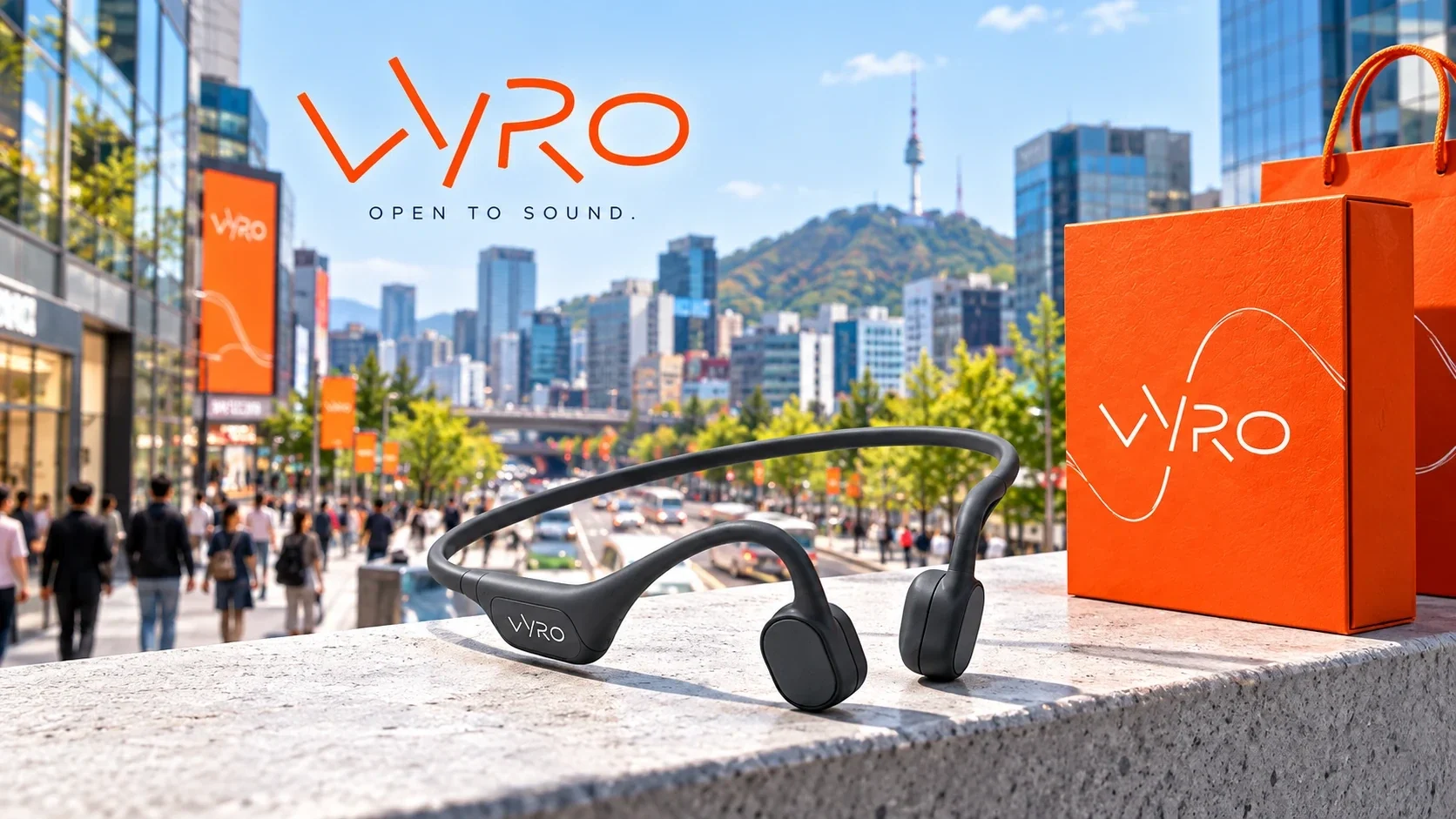
The orange box turns the brand into a tactile experience. Its wordmark stays prominent on the lid, while the opened pack presents the headset directly and neatly. This packaging won a design award, and its visual logic carries into the city campaign and the wider branded environment.
One language across touchpoints
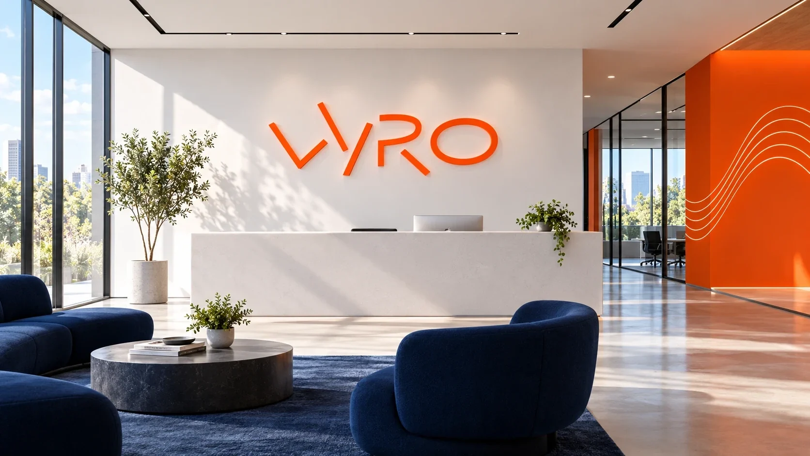
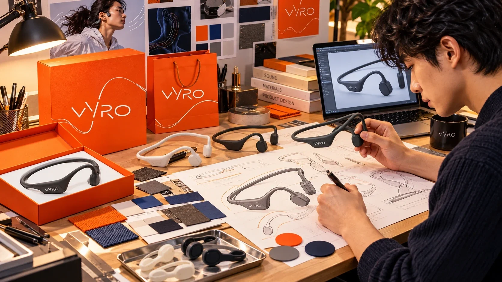
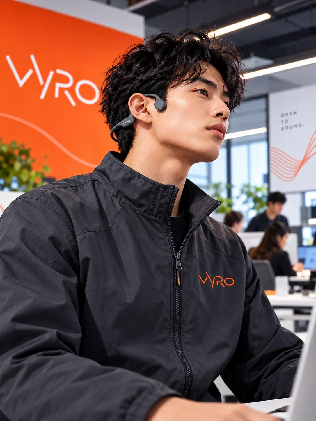
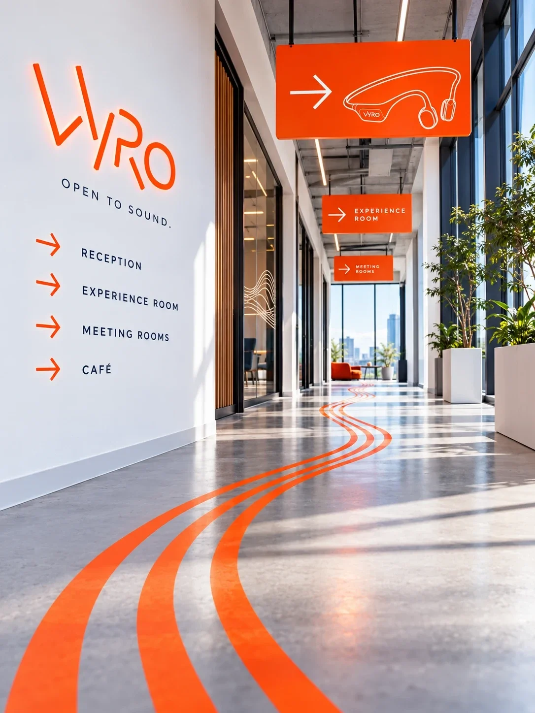
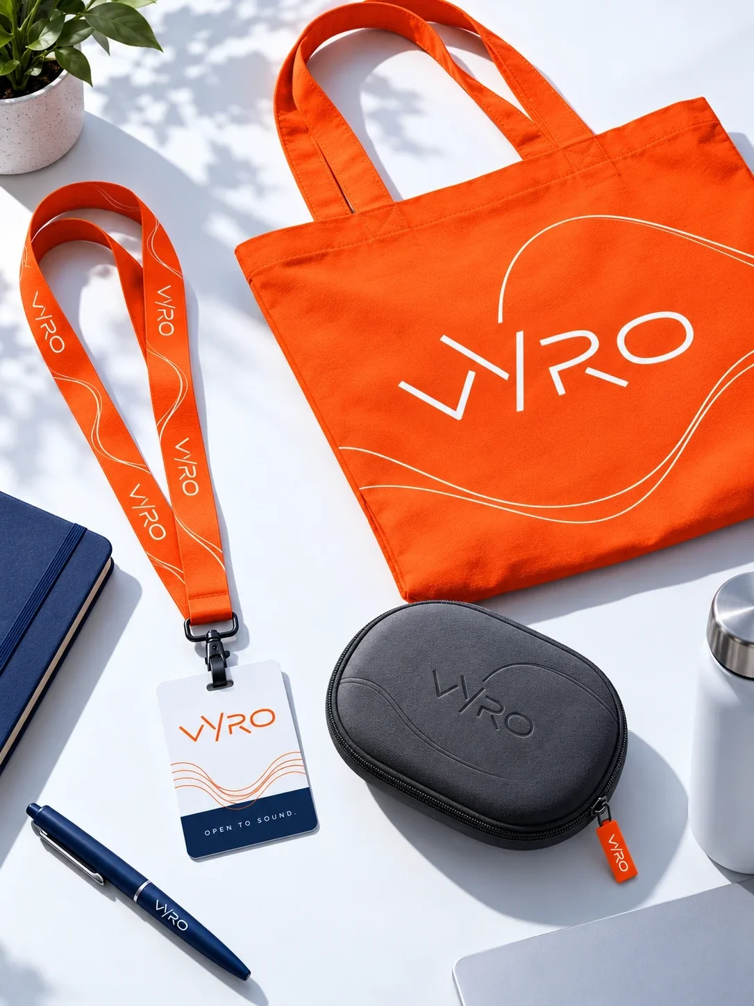
The same orange signal appears in the urban campaign, reception, design workspace, staff clothing, wayfinding and everyday accessories. Each setting changes scale, yet the wordmark and sound lines keep Vyro recognizable from a product detail to a large interior wall.
A connected brand experience
Vyro now has a visual system that links its Korean headset, award-winning packaging and the places where people encounter the brand. The result is direct and energetic: the product remains visible, and every touchpoint speaks in the same voice.
- Korean headset branding
- induction headset
- packaging design
- technology brand identity