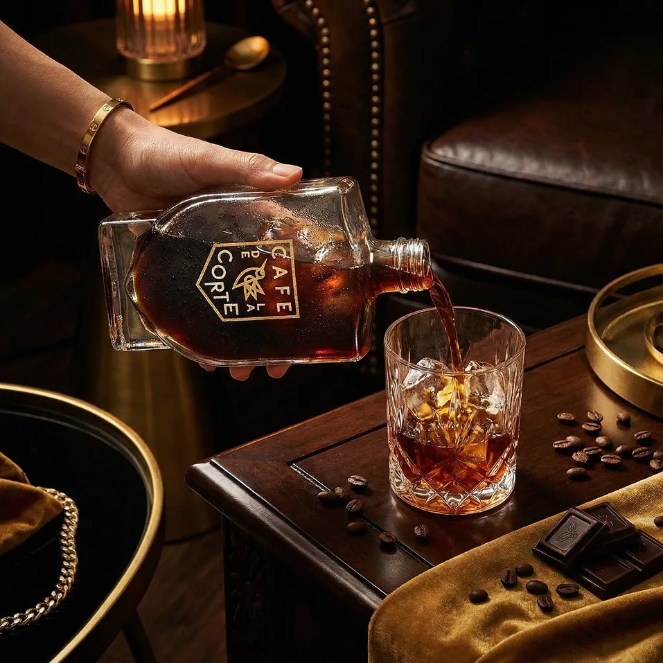
 Café De La Corte
Coffee packaging extends Café De La Corte’s established identity through clear glass, a woven sleeve and a considered serving ritual.
When the name carries the identity, the letters need careful attention. I am Ali Komeili. We agree on the scope, review stages and usable files before starting. The applications, sizes and production requirements follow where the identity will be used.
Café De La CorteCoffee packaging extends Café De La Corte’s established identity through clear glass, a woven sleeve and a considered serving ritual.
 Noghteh
A focused identity for Noghteh Design House uses geometric forms and material contrast to connect print, objects and space.
 ToyPet
A friendly pet-care identity helps owners recognise animal categories across food packaging, accessories and a shared retail environment.
When the name carries the identity, the letters need careful attention. I design wordmarks around the rhythm, spacing and character of the name, with legibility in the places your audience will see it.
A wordmark is artwork for the brand name. A complete custom typeface, extra language versions and trademark registration require separate scope.
We begin with your existing material and the task you want to solve. I propose a scope before detailed design, then we review the work at agreed stages. Decisions and revision rounds have a clear owner.
A custom wordmark direction, refined letterforms, spacing and the agreed arrangements. Deliverables include vector artwork and the colour or single-colour versions needed for use.
We check letter relationships at small sizes and consider the name's pronunciation and reading order. A bilingual wordmark needs balanced Latin and Persian or Arabic versions rather than a simple font swap.
I prepare the approved artwork in the formats agreed for its actual use. We check export sizes, colour requirements and editable source files where included. Your supplier confirms production specifications, and any sample or proof is reviewed before final approval.
Café De La Corte extends an established identity into coffee packaging. Noghteh connects geometric forms with print, objects and space.
Café De La Corte · NoghtehYes. We agree on shared proportions and visual character while respecting how each script is written. The two versions can be related without forcing identical letter shapes.
Share the goal, the materials you already have and where the work will be used. If the scope is still unclear, we can identify the priorities together before preparing a proposal.
A wordmark is artwork for the brand name. A complete custom typeface, extra language versions and trademark registration require separate scope.
I quote for a defined scope. The number of screens, items or formats, readiness of content and required review stages affect the cost and schedule. Deliverables, revision rounds and responsibilities are written into the proposal.
Yes. I work from Majidiyeh, Tehran, and collaborate remotely. We agree on the language, review contact and file handoff before starting.